
The Complete Guide to Mid-Fidelity Wireframes
Learn about mid-fidelity wireframes, when to use them, and how to create them. Our step-by-step guide includes our expert insights and best practices.
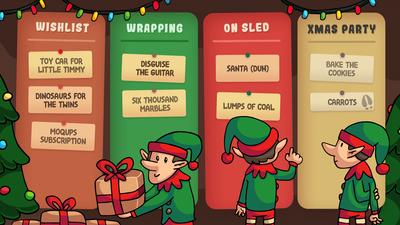
Wrap up work for the holidays!
What to do between now and winter break? These templates can help with vacation scheduling, team retrospectives, finishing up projects, and even party prep!
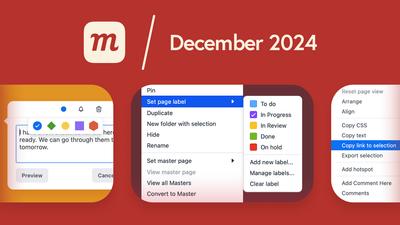
What’s New: December 2024
Page labels, comment colors, new template pages, link to selection, a better project search, plus a bunch of new improvements and fixes.

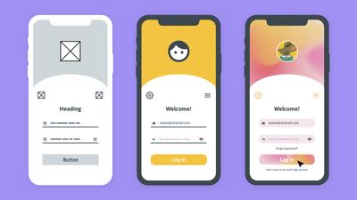
How to create a dashboard wireframe
Building a dashboard? Our step-by-step guide to dashboard wireframes has useful tips, best practices, and even some key pitfalls to avoid!

Never miss a thing.
Catch the latest updates, insights, and best practices in our newsletter.

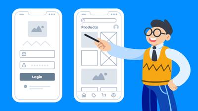
Quick UI Wireframes: A Step by Step Guide
Need to build quick wireframes? Our guide covers what you need to know, what to do, and how to do it.

Introducing Page Labels and Colors
Project management just got easier! With page labels, teams can quickly set priorities, align workflow, and track progress.
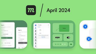
What’s New: April 2024
A new image patch tool, more comment updates, copy individual properties of a style, category filtering for fonts, more stencils, and new templates.
Dimming the Light with Dark Mode
New year, new look! And it's not just dark mode. We've got a fresh UI, sticky comments, and dozens of user-driven improvements.
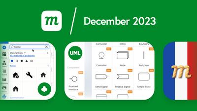
What’s New: December 2023
We’ve revamped our Team plan, icon library, UML stencils, image and zoom controls, expanded login options, added French, and improved our tables.
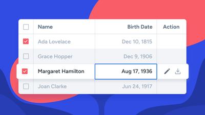
New Table Features and Functionality
We’ve made working with tables quicker, easier and more intuitive by adding a bunch of new features and improving the stencil’s overall functionality.
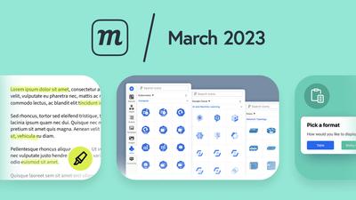
What’s New: March 2023
Spring Arrivals: Format pasted data, replace color in selection, new icon packs, freehand highlighter, lo-fi placeholder text stencil, plus more great templates.
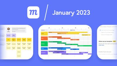
What’s New: January 2023
Start the year with new and custom templates, a better outline panel, enhanced admin and project controls, custom SAML, and paste CSV to tables.

Turn Your Projects Into Shareable Templates
Create custom templates with a turn of the toggle. Share with your team, your account or, more widely, with the world!
Get Started With Moqups
Curious about what you can do with Moqups? Here's a quick overview of our tools, features and functionalities to help you get started!
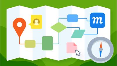
What is a wireframe?
Discover why wireframing is so important in UX design, and how teams use wireframes to speed workflow, boost collaboration, and create better products.

How Decision Foundry Uses Moqups to Deliver Better Data Experiences
CEO Ross C. Jenkins explains how Moqups helps them get early buy-in, foster strong accountability, and lower the risk of failed projects.

How to wireframe a website.
Whether you’re new to UX design or need a quick refresher, our complete guide to wireframing will bring you up to speed!
Wireframe vs Mockup vs Prototype: What’s the difference?
This quick guide will help you understand wireframes, mockups, and prototypes – and demonstrate how to use each effectively.
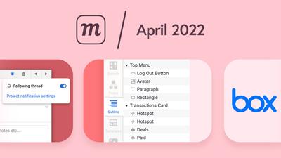
What’s New: April 2022
Better comment notifications, a Box integration, and quicker stickies are just part of our new spring collection of features and improvements.
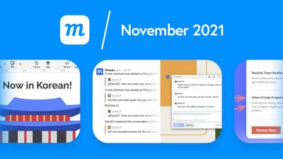
What’s New: November 2021
Our fall focus is on helping larger organizations streamline communication, enhance security, and simplify their workflow.

Explore the Universe of Gradients
These four simple tricks will help you get the most out of gradients by adding light, depth, and character to your designs.

Low Fidelity vs High Fidelity Wireframes: Which should you use?
To establish an effective workflow for your team, it’s important to understand the difference between low-fidelity wireframes and high-fidelity prototypes.

Introducing Multiple Teams
Streamline your company’s workflow by creating multiple teams. Organize by department, initiative, or client to help keep everybody focused.
What’s New: March 2021
Look what’s popping up for spring! A bunch of oft-requested features, streamlined functionality, and a bit of tidying up.
What’s New: December 2020
Getting ready for the holidays, here are some great new features and improvements, all wrapped up and ready to go!
It’s Raining Icons!
We’ve added 1000s of icons, including AWS, Azure and Emojis, and improved our library so it's easy to find what you need!
What’s New: October 2020
We have 8 new features, all of them by popular demand. Did your request make the list? Read on to find out!
What’s New: July 2020
The big news is that you can now enable SSO with SAML in Moqups. We’ve also improved our stencils, pre-made templates, and zoom controls.
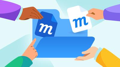
Pull Work Together With Project Folders
New project folders help remote teams collaborate more effectively, organize around specific initiatives and keep relevant work handy.

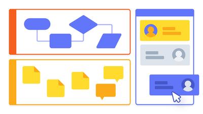
Introducing Live Chat in Moqups
Pull your team together and have essential conversations right within your Moqups project. No need for external chat apps!
Stick and Stack Our New Containers
Our new sticky Container makes it easy to create swimlane diagrams and provide structure for your team’s virtual whiteboards.
What’s New: May 2020
New project folders, live chat, sticky containers, device stencil category, insert template button, and ability to click through grouped objects.
How to Run Effective Meetings with Templates
Learn how to run effective meetings with practical tips and templates built to support your sessions. Use our top tips to navigate meetings successfully.

Work in the Time of Quarantine
Remote work and collaboration have never been more critical to people’s lives as they are now. Here’s how Moqups can help.

7 Free Wireframe Templates for SaaS & Software Companies
Our free wireframe templates help you scale up your business. Create pages to capture new customers & cater better to the existing ones with our wireframes.

4 Essential Website Wireframe Templates
Build web pages in minutes with our website wireframe templates. Create ecommerce shops, landing pages, blogs and pricing pages with pre-made wireframe examples.
What’s New: February 2020
We’ve added Teams & Roles, Sharing & Permissions, live avatars, a quickdraw toolkit, a character counter, Chrome and Firefox extensions, global text search, and more!

Introducing Team Roles, Project Permissions, and Improved Live Collaboration
Manage your team, assign roles, set granular permissions and edit in real time. Productivity and collaboration now go hand in hand!
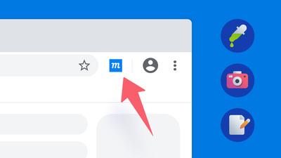
Our New Google Chrome Extension
Use our Chrome Extension to enable the color eyedropper, capture screenshots to your library, and jump right to Moqups with a single click!
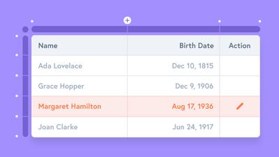
Introducing Our New Visual & Customizable Table Stencil
Our new Table offers a completely visual editing experience. Mock up complex data grids quickly and intuitively without any quirky syntax.
What’s New: October 2019
Our new Table replaced the old Grid stencil and introduces a full, visual editing experience. Plus, we have sticky-note annotations and more iPhone frames.

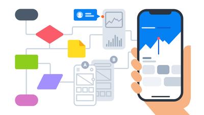
New Chart Templates & Features Make Data Visualization a Breeze
With new features – and dozens of chart templates – we've made it easier for teams to create stunning dashboards, presentations, and reports.

Tidying Up with Moqups: 6 Tips to Declutter Your Projects
Eliminate confusion, reduce stress, and maintain your team's momentum by cleaning up and organizing your projects. Channel your inner Marie Kondo!

How Online Collaboration Tools Boost Team Performance
Using an online collaboration tool like Moqups transforms workflows, boosts organizational efficiency, and helps your company thrive in a digital world.
To Wireframes and Beyond!
Wireframing doesn’t happen in a silo. That's why Moqups has evolved to include diagramming, prototyping, white-boarding, charting, annotation, commenting, and collaboration.
What’s New: June 2019
With this update, you can color or highlight text selections, quickly change chart types, and make any callout or annotation sticky.
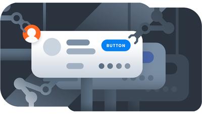
Speed Up Your Process With Components
Create reusable elements that instantly sync across all instances within your project. Iterate and update without the tedium of reformatting over and over!
What’s New: May 2019
We’ve added new features for charts, plus a Welcome screen so you can start projects fast from pre-made templates or a blank page!
What’s New: March 2019
Live cursors make it easy to collaborate in real time. Identify where your colleagues are working, and jump right there to join them!

Go Further and Faster With Diagrams
Complicated diagramming software can discourage collaboration and experimentation. But with Moqups, you can skip the learning curve and get right to work!
What’s New: February 2019
This update includes a new Components feature, ERD and Use Case diagram stencils, and export to password protected PDFs.

Introducing Gradients – Red, Green, and Everything in Between!
A great gradient can become almost a color unto itself – instantly recognizable and at the very core of any branding.
What’s New: December 2018
You can now apply gradients to fill or stroke colors. We’ve also improved our diagram tool by adding both UML blocks and start-end markers.
What’s New: November 2018
This update includes a paste-to-folder function, improvements to page numbering and hotspots, plus a bunch of bug fixes.
What’s New: October 30, 2018
You can now set Default Styles in Context Menu, attach relevant files to the Contact Support form, and paste automatically into the Paragraph stencil.
What’s New: October 22, 2018
We’ve rolled out a new Fit Page To Content function, improved snapping, and added our full template library to Moqups for Jira and Confluence.
What’s New: September 25, 2018
This update is all about diagrams! You can now expand diagrams fast, replace blocks on the page, and swap your start and end markers.
What’s New: September 12 2018
We’ve made it easier to select objects on the page, tweaked the Pages, Templates and Images panels, and improved performance of our library thumbnails.

All-Request Round-Up: 5 New Features Your Team Will Love!
We’ve redesigned our image and template libraries, improved image cropping, added touchpad zoom, enhanced real-time editing, and introduced copy and paste pages between projects.
What’s New: August 2018
We’ve tweaked the app for better performance, added time and date stamps to Comments, and aligned the features for Templates and Images libraries.
What’s New: August 2018
This update offers touchpad zoom, enhanced cropping with background removal, image library redesign, collaborator presence, and copy-paste for project pages.

Charts for Business Intelligence and Data Visualization
With our chart stencils, anyone in your team can explore the data imaginatively, identify hidden patterns, and mock-up effective BI dashboards.
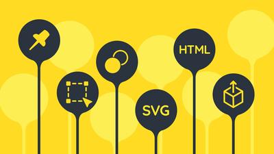
What’s New: June 2018
We've added Pinned Pages and Thumbnails, Smarter Shapes, Replace Colors, SVG Import, Export for Objects, an Offline Viewer, and more!
What’s New: June 2018
Charts are now easier to find, edit, and style! We've also added a Blur filter and a Replace Colors tool to the Format panel.
What’s New: November 2017
Learn how you can best use the new Atlassian Cloud integrations - Moqups for Jira Cloud and Moqups for Confluence Cloud - with unlimited project plans.
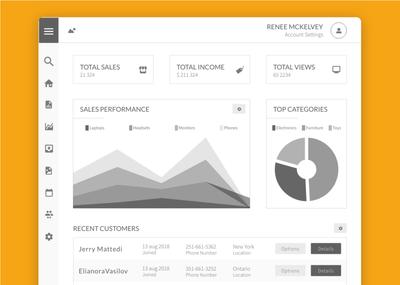
New Dashboard,Improved Performance, Global Opacity, and More Goodies!
This update offers a new dashboard, global opacity for objects, page layout enhancements along with an improved resizing behavior for text.
Build Interactive Prototypes With Our New Interactions Tool
With our new Interaction feature, you can use Moqups to take your project all the way from ideation and wireframing to interactive prototype.
Introducing Powerful Page and Folder Management Tools
A place for everything and everything in its place with our effective page management and organization features.
What’s New: August 2016
Discover our newest updates: From connector labels for diagrams, to background color for pages, full screen mode for viewers, and more.
Diagramming: Charting New Territory
Diagrams were once created primarily by System Architects and Business Analysts. Now, almost every kind of project begins with a diagram.
Manage Feedback by Resolving Comments
Resolve, or resolve and reply to comments, notify your team about those changes, reopen resolved threads, or clean up your page by hiding resolved threads.
What’s New: March 2016
Add @mentions in comments, align objects faster, select text in view mode, hide contents beyond the page, and use the Object panel to organize complex projects.
New: Bootstrap 3 Stencil Kit is Now Available in Moqups
Discover another nifty addition to our stencil library: the Bootstrap framework. Our new stencils come handy for quickly designing high fidelity websites.
Introducing the New Material Design Stencil Set
A wide range of Material Design stencils are available within Moqups. You can find this collection under the Material Design category.
New Export Improvements
We've rolled out new export functionalities. Transparent background and trim to content bounds are now available!
Improved Export to PNG and PDF
We've completely revamped our PDF and PNG export to deliver better, crisper results.
What’s New: February 2016
With this update, you can now use markdown in comments, apply font weights to text, and transfer your projects to other accounts.
What’s New: December 2015
We've rolled out Moqups 2, including a bunch of great new features like Zoom, Rotation, Web fonts, Group Editing and so much more!
What’s New: May 2014
You can now style all your stencils, host PDF and image exports directly on our servers, and add Moqups to Google Drive.
What’s New: February 2014
You can now nest pages, export links with PDFs, add avatars, and use Presentation mode to hide your toolbar in Preview.
What’s New: October 2013
With this update, you can now create teams, adjust opacity, drag and drop images, cut and paste stencils, and search and filter your projects.
It’s Here: Moqups Premium
Introducing our new paid features. Discover what Moqups is all about, and how our new and updated features can significantly improve your work.
What’s New: February 2013
We've added the Blokk font as a lorem-ipsum/redacted alternative, markdown in the grid stencil, and an About Us page.
What’s New: January 2013
Over the last few months, we've added page grids, avatars, and PDF/PNG export to both Dropbox and Google Drive.
Get your entire team on the same page. Literally.
Connect your team and fuel their collaboration with a unified set of tools.
Check Our Team Plans