At Moqups, our whole team reads your feedback, whether it arrives via interviews, support tickets, or as answers to our surveys.
As a result, our last couple of releases have focused squarely on practical improvements and user-inspired changes. We’ve made working with tables, icons, diagrams and images much easier – and we did it by listening to you.
Our commitment, in this release, remains the same: To deliver a bunch of new, relevant and tangible enhancements that respond directly to your needs and suggestions.
And our new Dark mode is just the tip of the iceberg! We’ve refreshed our UI, overhauled comments, streamlined interactions, and made the UI more responsive.
These changes, along with a host of other refinements, are part of our ongoing effort to make Moqups more versatile, accessible, and powerful.
So, let’s dive in and check out what’s new! And if you want to click down through the list, here’s the gist:
- New Themes
- Better Comments
- Refreshed UI
- Clearer Interactions
- Simpler Workflow
- UI Responsiveness
- Improvements and Fixes
New Themes
This is one of our most-requested updates. You can now use the Settings button to choose between Dark, Light and Classic themes. You can also choose our Match System option if you want Moqups to mirror your browser’s settings.
Better Comments
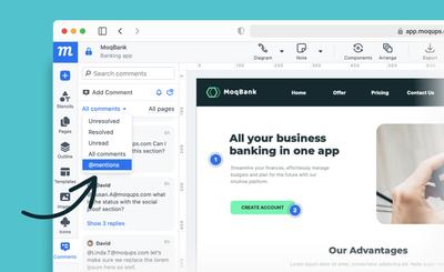
We’ve revamped our comments so they’re easier to make, find, and read. Here’s a quick rundown of changes that will make managing team feedback simpler and more efficient.
Sticky comments
No more lost and orphaned comments! Threads now stick to specific objects within a design, even when the design is rearranged. This long-overdue update should streamline your workflow, and bring clarity to ongoing discussions.
Comment search
At the top of the Comment Panel, you’ll find a new search bar. Use it to quickly locate specific feedback throughout the project, or on a selected page. This makes it much easier to track and participate in discussions.
Comments panel
Comments are now grouped by thread, mirroring their arrangement on the page as well. This provides immediate context for new comments, and makes it easier to catch up on discussions at a glance.
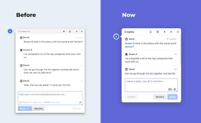
Clicking a thread or comment in the panel opens it on the page and auto-scrolls to the end of the thread for easy replying. Clicking on an individual comment takes you right to its place in the discussion.
We’ve also added a new @mention filter so you can quickly zero in on the info most relevant to you!
And then there are a few small changes that should have a big effect on the overall clarity and usability of the panel:
- Cleaner button icons
- Rearranged controls that stay visible as you scroll.
- A unified symbol for unread comments
- A clearer switcher from Page to All Pages comments
Comment threads
Our redesign extends to comment pop-overs on the page. First, we made them less intrusive, so they won’t obscure your designs. We did this by limiting their height, and making them both responsive and scrollable.
We also made the pop-over cleaner by reducing the size of its buttons, moving the Reply buttons to the right side, and changing the ‘Markdown’ and ‘Send’ hints into on-hover tooltips.
As for markdown itself, we’ve added better styling and emoji support.
Lastly, we made editing comments easier – just double click to add, update or correct a comment!
Refreshed UI
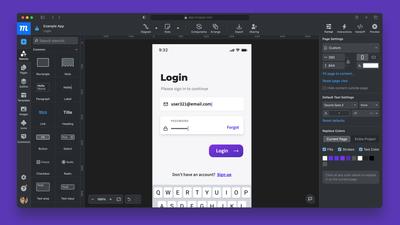
Our goal with the updated interface was, quite simply, to improve the experience of our app. We wanted to make it easier on the eyes, quick to read, and lighter on your cognitive load!
Ideally, the new UI is so much more intuitive that you might not even notice some of the changes. Still, if you’re interested in what’s changed, let’s pull back the curtain.
Refined sidebars
You’ll find a lot of changes to our sidebars, starting with a more balanced feel since the width of the right and left panels finally match! Now, here’s a quick rundown of the changes to the panels themselves:
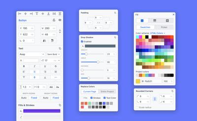
Format Panel
To make formatting clearer, we’ve unified the size of the panel’s field inputs, fonts and interface icons – and freshened the look of the icons themselves. We also updated the sliders and made both the toggle and active states more visible by highlighting them in blue. And there’s a restyled color picker that now includes the HTML Colors palette.
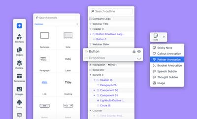
Stencils and Outline Panels
In the Stencils panel, we’ve updated thumbnails for the whole library, added a new Pointer annotation, and unified the borders/strokes for all our flowchart stencils.
In the Outline panel, we’ve added lots of new icons – to make identifying, selecting and arranging objects faster. And, hopefully, the new ‘eyelashes’ on the visibility button make it both clearer and more playful!
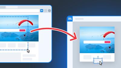
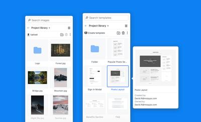
Images & Templates Panels
Both these panels now have a better grid view with bigger, easy-to-read thumbnails for your assets.
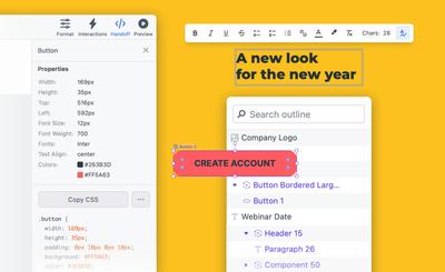
Streamlined menus and toolbars
We’ve done a lot of work on the menus and toolbars to make navigating them feel effortless and natural.
First, we moved the Handoff button over to the right side of the top menu, so now its panel opens directly beneath it. We’ve also removed tabs, and added a switcher to jump from CSS to JSX.
Next, we unified the look and positioning of our context toolbars, streamlined our color-picker, and created larger clickable areas for both menus and toolbars in order to improve the mobile experience.
Finally, we changed Components from orange to purple to reflect the current color consensus amongst most design and wireframing apps.
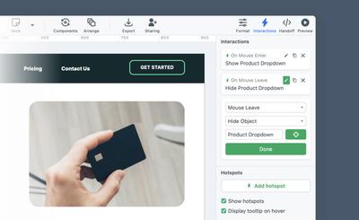
Clearer Interactions
Interactions now stand out in green. We’ve also made it easier to tell when you’re in edit-interaction mode, improved both object and page targeting, and removed unnecessary options from the dropdowns. And, the single Add Hotspot button now adjusts automatically to your selection size – or drops the hotspot in the middle of the viewport if no object is selected.
Simpler Workflow
It’s frustrating when an app seems to be working against your own intent. We know that! So, here are a couple of small changes that should alleviate irritation and improve quality of life. They both involve remembering your choices as you work:
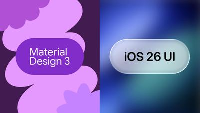
- If you choose the color picker or a specific swatch (i.e. Material Design or iOS colors) it now stays that way, across your projects – until you change it.
- The app now maintains your page zoom level and scroll position throughout a project. No more trying to reorient yourself as you jump back and forth between pages.
UI Responsiveness
To make Moqups accessible on mobile, we’ve made the following changes:
- The welcome screen, which lets you select previous projects, now fits on any screen.
- Our sidebars are now hidden, by default, for fast viewing (you can click to open them).
- Menu and toolbar buttons no longer overlap on small screens.
Improvements and Fixes
Finally, here are couple of miscellaneous changes:
- All our in-app modals now have a unified design and placement of buttons.
- If you change your interface language, the size of the buttons and labels adapt their size to your lexicon.
- We’ve revised our Chart editor to make the color change field easier to click, and to ensure that it doesn’t cover the editor’s controls.
Well, that’s all for now. But stay tuned! We have lots more changes and improvements in the pipeline. Once again, thanks to all our faithful, dedicated, and diligent users who reached out to offer their feedback and suggestions.
We especially appreciate those of you who took time to explain the role Moqups plays in your workflow, and how we can best meet the needs of your team.