Everything that’s touched by light reveals itself in shades and tones. In the natural world, gradients provide important cues – some subtle, some stunning – to ripeness, readiness and change. Our eyes are naturally attuned to these signals and we’re adept at decoding the transitions they represent.
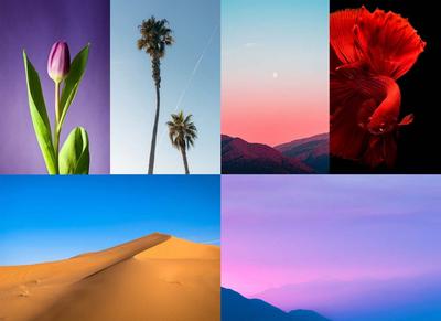
It’s this instinctive human response that has driven the resurgence of gradients in UI design. Because of how we naturally track transitions in color and saturation, gradients are great for guiding users’ eyes throughout designs. Gradients can put the focus on logos, highlight content, or coax the user’s attention below the fold.
When we first launched gradients, we covered some of its most familiar use cases. Now, we thought we’d dig a bit deeper – and show you a few cool ways to apply gradients to your design.
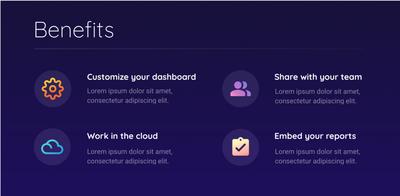
Dualtone Icons
Icons are essential to web and mobile app design. Because they are universal, and immediately recognizable, they provide instant meaning and clarity. However, because they’re so common, it can also be hard to make them stand out.
Applying dualtones is one simple trick that can make even the most familiar icons look fresh and, well... iconic. And, if your design already incorporates gradients – in backgrounds, buttons, or text – then dualtone icons can also help harmonize your branding.
To create a dualtone icon in Moqups, open the Format Panel and choose the Linear Gradient option. Then pick your colours and use the slider to adjust the distance between the stops. Add additional stops, where necessary, until your gradient looks smooth and natural.
Experiment with the balance of colour, light, shading and depth until you have the perfect, eye-catching icon!
Text Fading
On the web and app pages, the ‘fading-text’ effect is most commonly used to indicate ongoing, but hidden content.
This technique has several advantages over using mere ellipses. Not only is its soft edge smooth and appealing, but it also helps guide the reader's eye to the ‘Read more’ button – tempting them to click.
It’s great for pages that aggregate several articles or, in the case of subscription-based content, for modal overlays that pop-up to require sign-up.
The trick to creating the fading-text effect is to adjust your gradient’s opacity. Start with a solid white overlay or, if you’re designing for dark mode, grey/black.
Apply the gradient, setting the stop at one end to 0% opacity and the other to 100%.
Use the angle control to match the direction of the article’s scroll. And, if you’re planning on adding a CTA, don’t forget to adjust the slider to leave room for the button.
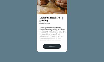
Vignette

UI cards generally have a background image with a title overlaid, but they can sometimes include both a subtitle and CTA.
Cards are perfect for news aggregators, blogs, and E-commerce pages because they make it easy for users to scan and select from a variety of content. A single card can act as the page’s focal point, or multiple cards, of differing sizes, can quickly establish a page hierarchy.
Despite the simplicity of a UI card’s elements, getting the design right can be tricky. With a UI card, it’s the image that catches the user’s eye, but it’s the text that drives them to click. However, when it comes to user attention text and images are natural competitors. So, the challenge is to balance those two elements so that a bright or busy image doesn’t overwhelm the card’s title.
That’s where the vignette comes in. You can use gradients to darken the edges of an image so that the focus remains on your text and title.
Normally, you’ll want to use grey or blue tones, but you may also want to try matching the color to other parts of your design.
Adjust the opacity to find the right degree of vignette; after all, you don’t want your page to look too dark. A lot will depend on the number of cards, their colors and their brightness, but generally a 40% opacity gradient will give the image a natural look – and ensure your card remains cognitive-friendly.
The best gradient to use here is the radial one. The circle shape of this gradient makes it perfect for the vignette effect. You can center the radius so that the brightest part of your gradient aligns with the focal point of your image. Adjusting the stop markers on the slider will expand or contract the vignette effect.
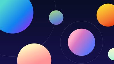
Gradient overlays
If you just can’t get enough of gradients, then you are going to love this last tip! By layering several gradients, you can create stunning effects for a logo or background.
The advantage of overlays is that it lets you incorporate multiple colors – and blend them smoothly – without making your gradient look either muddled or clichéd. This is the trick behind the ubiquitous Instagram branding.
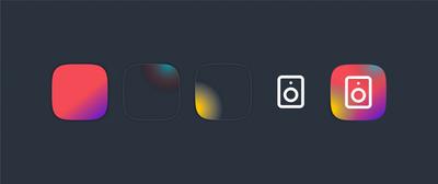
By stacking layers, you can experiment with all our gradient controls – combining linear and radial gradients, multiple stops, all kinds of different angles – and open the door to endless creative possibilities.
Because gradients’ effects are often subtle, they can be easy to overlook. But, once you start looking for them, you’ll see them everywhere.. In fact, it is exactly gradients’ subliminal power – and their ability to tweak and heighten other effects – that has kept them from fading away in the world of design.