8 New Features and Additions
Easy patch tool for images
Need to quickly mock up alternative text or designs over current screenshots? Now you can just click and drag to mask any part of an image. This feature makes it much quicker to iterate, update, or maintain a website or app UI. Now you see it… now you don’t!
Copy individual properties of an object’s style.
In Moqups, you’ve always been able to copy/paste a style from one object to another. But users told us they wanted more granular access to a style’s individual aspects. In other words, they wanted to select and apply specific properties – like shadow, color, rounded corners, blur, padding, or opacity – one at a time.
This is especially important if you’re trying to maintain a consistent visual style across all types of objects in your design. So now, all properties in the Format Panel have their own ‘Copy properties’ button!
More comment updates!
In February, we rolled out a better commenting experience. We introduced sticky comments, improved filtering, revised the look and feel of the Comments panel. We also asked for your comments on our Comments!
The feedback was wonderful, and included some terrific suggestions that we’ve already incorporated with these new tweaks:
Pinned vs Free-floating comments
One of our customers pointed out that it was impossible to distinguish between comments that are stuck to objects and those that are unattached. Since his team typically deals with 40-50 comments per page, that’s a problem. So, we found a terrific solution.
Now, when you attach a comment to an object, the bubble will transform to a pin-shape and automatically change direction depending on where you place it. Comments in the page’s empty space will appear round and remain free-floating.
Mark all comments as read
In response to a different customer request, we’ve also added a ‘Mark all as read’ filter to the dropdown. To keep things clean, you’ll only see this option when you have unread comments on the page.
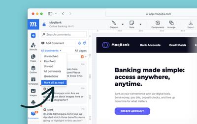
A small note: We’ve also made 'Hide replies' the default for our comments sidebar; that way, you can quickly scan all new comment threads before expanding them. Your suggestions really help make our features better, so please keep the feedback coming!
Font filtering by category
We’ve added categories to the font dropdown in the format panel. This is very useful if you are searching for a specific look for your design, or trying to match an existing font. You can still choose to ‘Show all fonts’ but you can quickly narrow your font search by choosing between 30 category filters (i.e. Popular, Sans Serif, Serif, etc.). We’ve also updated our list of Google fonts.
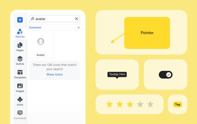
New stencils and other related improvements
We’ve added the following new stencils:
- Pointer annotation
- Tag
- Tooltip
- Toggle
We’ve also improved the Rating stencil so you can add a specific number of stars.
And, we’ve introduced contextual search tips at the bottom of the panel so that you can find what you need – even if it isn’t in the stencils library!
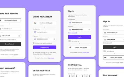
New Sign-in/Sign-up template bundle
We’ve had a lot of requests for this one! The template has pop-ups for signing into an account, and for creating a new one. It also includes a full sequence of modals for password reset and verification. And, you can choose between lo-fi and hi-fi examples depending on the fidelity of your project.
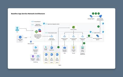
New network diagram symbols and templates
So you can meet all your diagramming needs within Moqups, our library of network icons includes AWS Architecture, Azure Services, Kubernetes, Google Cloud, and Cisco. Now, so you don’t have to start from scratch, we’ve also added five new network diagram templates:
- AWS Overview Diagram
- Azure App Service Network Architecture
- Azure Network Diagram
- Kubernetes Cluster Architecture
- Google Cloud Sample Architecture
16 Improvements
Color Picker
- Color swatches now include both Tailwind and IBM palettes.
- You can enter HTML color names into the input (i.e. red, green, blue, tomato) .
- Input is auto-selected when you open the color picker.
- We support new formats as input: 3 digit hex, 8 digit hex, rgb, rgba, hsl, hsla, lab, lch.
- We now utilize a native eyedropper in Chrome; you no longer need the Moqups extension.
- Picking a color with eyedropper sets opacity to 100%.
- We’ve moved gray colors in each palette to the top since they are the ones mostly utilized for wireframing.
- The picker scrollbars on Windows are now thinner.
- We’ve increased the size of the swatches list for large screens.
Workflow & Performance
- We’ve added our floating zoom controls to both Preview Mode and the Offline Viewer for quicker control no matter how you view your project.
- Rendering of page-thumbnails is now faster and more efficient.
- The ‘Hide content outside page’ now applies per page, not to all pages in the project.
Stencils, Icons & Components
- We’ve updated the Font Awesome Brands library, as well as our selection of AWS and Azure icons.
- We’ve improved the tags for stencils.
- Instances of Components now have their own identifier-icon in the Outline Panel so you can find them more easily.
Interactions
- Normally, when you apply show/hide/toggle interactions to groups, the visibility of the grouped elements automatically resets to their initial default value each time the interaction is triggered. However, sometimes, you may want to apply additional interactions that change the visibility of grouped elements and want to preserve that state of visibility when the interaction resets. The most obvious use case would be a dropdown in which the selected option remains selected. Accordingly, we now provide the option to override the automatic reset.
19 Bug Fixes
- Copy and pasting styles from one sticky note to another now works as expected.
- Fixed a problem with drop shadow rendering when exporting images with transparency.
- Zooming in and out now ignores any locked-object selection.
- The floating zoom bar now displays properly in the Offline Viewer
- You can now edit the Rating stars stencil by double clicking.
- Connector labels now adopt the page color as their background by default.
- Fixed a bug that caused connector marker ends not to display after changes.
- Fixed a bug that caused the wrong arrow endings to display when free drawing with the Quick Draw toolkit.
- Your browser’s tab will now display a play symbol when you have your project in Preview mode.
- The keyboard shortcut list displays better.
- Made a change so that the badge color of search results in the Stencils and Icons panels is now distinct from the badge color of unread comments in the Comments panel.
- Fixed issues with the replace function for the image placeholder stencil, especially when the placeholder was inside a component.
- Fixed a bug when creating new projects or adding templates to folders in the Dashboard.
- Improved text formatting behavior.
- You can now group elements inside a Component just as you can with normal stencil groups.
- When an Instance is a group of stencils, and those grouped elements are removed, the instance now properly reverts to a single element and loses its ‘group’ status in the Outline Panel.
- You could always double-click on any object in the Outline panel to instantly scroll to that object on the page; this functionality now applies to Components as well, fixing an oversight.
- Made the text-selection color consistent for all browsers.
- Fixed a bug that prevented the size of multiline text objects from updating after bold styling was applied to the tex