Before we get into a list of the new additions, a bit of background and context:
Tables and grids are at the heart of what our users love – and need – to create with Moqups.
So much of the public discussion around both design and UX has to do with aesthetics, whitespace, and maximizing conversions. But for many of our clients, aesthetics often takes a back seat to functionality. And, for many, the question isn’t how much of the page to leave blank, but how much data can be displayed on a single page.
These customers don’t need eye-catching designs or animations. They just want their web and app pages to be practical, clear, and comprehensive.
So, for folks working in insurance, banking, public administration, health care, logistics, and system monitoring (just to list a few), what really matters is how complex information can be displayed as simply and clearly as possible.
For their end-users – agents, technicians, engineers, operators, brokers, administrators – to do their jobs well, they need complex data requirements right there, at their fingertips, effectively and accurately displayed.
These users have been sending us a steady stream of requests and suggestions about how to improve our table stencil. And we’ve listened.
To be honest, when we first introduced the Table stencil four years ago, we figured our customers would use it primarily as a visual stand-in for future data, just as our Image Placeholder stands in for eventual hi-fi photos.
Boy, were we wrong!
Yes, sure, they might have started with a simple placeholder, but as they moved from low to high fidelity – one of Moqups’ strengths – they expected more from the table stencil. They needed it to accommodate large datasets that accurately reflected the complexity of the work that their end-users perform.
For these types of clients, it’s no exaggeration to say that data is the mainstay of their work – and their projects might consist of hundreds, if not thousands of pages of tables.
And that’s not all we heard from our users. They also wanted to use the table, not as a wireframe or mock-up, but as a practical repository for info related to the project itself. A lot of the time, they prefer to stay within the Moqups context, and collate all kinds of workflow data right there, especially if they don't need the full feature set of a spreadsheet.
This didn’t come as a total surprise, since our team does the same in our own projects. We add tables all the time to help us record and track our work.
So, for all of you who work with tables, we’ve revisited our stencil and added a bunch of improvements that should bring the experience closer to what you’re familiar with from dedicated spreadsheet software.
Sticky Tables
First off, we’ve added stickiness to the table!
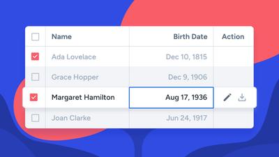
Now, like all of our Notes & Annotations and Containers, you can stick all kinds of other objects – like icons, avatars, or images – and they’ll stay in place as you move the table. And that means you can mock up the kinds of realistic data sets that include all sorts of badges and links.
Although Tables are not sticky by default, you can quickly turn their stickiness on (and off) in the Format Panel.
And don’t worry about tables in pre-existing projects; they’ll remain in their previous normal state, with the Sticky Behavior control now appearing in the Format Panel.
Move Row and Columns
Because of user feedback and changing business practices, there’s often a need to swap the positions of rows and columns within a design.
To make these changes both quick and painless, we’ve added a Move function to the Quick Edit toolbar. Once you’ve made a selection, just use the arrows to move it up and down or back and forth.
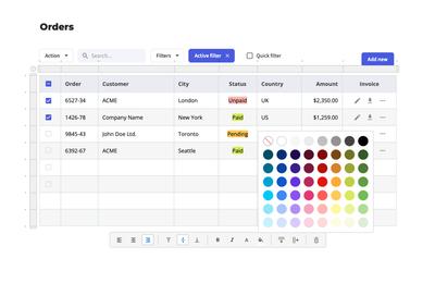
Zebra Striping
The bigger and more complex the table, the harder it can be to scan. That’s why shading alternating rows or columns makes it easier to stay within your lane – and find the right data point. Now, you can add both horizontal or vertical Striping right from the Format Panel.
Start Fast with a Blank Table
Now, you can get going quicker. We’ve removed the sample text from the stencil. With an empty default state and an active cursor in the first cell, all you have to do is drag and drop…and start typing!
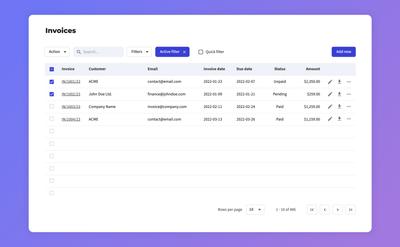
New Data Table Template Bundle
If you want to kickstart a project with something pre-made, and prefer having sample text in a table, don't worry. We’ve added a professionally designed Data Table to our template library so you can quickly insert it in any project.
It‘s already pre-populated with sample entries, checkmarks, links, filters, icons, search bar, row counter, add button, and navigation arrows – so it’s ready to go.
The three-page template bundle also includes two color variants, and a page of handy elements for quick customization. And don’t forget that you can use the Replace Icons feature to make it your own in seconds!
Insert Row or Column
You could always duplicate a row or column by clicking on one of the little dots along the headers. But that function also duplicated the data in your selection.
A lot of you said that you preferred an empty default when you added a row or column, so we’ve put a new insert function right in the toolbar. Just make a selection, click the button, and presto!
More Toolbar Options
Along with the Insert feature (above), we’ve also added Bold and Italic styling options to the table toolbar. And, we’ve improved the color picker to provide a more consistent experience no matter where you are in the app.
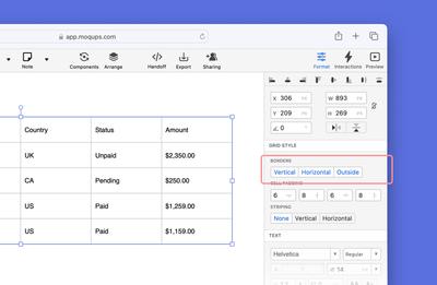
Hide Outside Borders
Using the Format Panel, you can now choose to hide or show outside borders just as you always could with the internal, horizontal and vertical borders.
Improved Keyboard Shortcuts
We’ve tweaked the behavior of the following hotkeys to help you work faster and smarter:
Enter Key
- Pressing the Enter/Return key will move your cursor down to the cell below so you can quickly add data.
- If you are at the bottom of the table, hitting Enter will add a new row.
Arrow Key Navigation
- Use the arrow keys to navigate up and down or sideways within the table.
- Along the top row, the Up arrow will take you to the cell on the far right of that row.
- Along the bottom row, the Down arrow will take you to the cell on the far right of that row.
Shift + Arrow to Select
- You could always use Shift + Click to select groups of cells around your original cell.
- Now you can hold down Shift and use the Up/Down/Left/Right arrow keys to make your selection.
We hope these additions and improvements help speed and simplify your workflow.
If you need more detailed info about the stencil, please check out our Help Center article on Tables. And, as always, we’d love your feedback at support@moqups.com.