Data visualization used to be the province of financial analysts, sales teams, and graphic designers, but it is now ubiquitous throughout competitive organizations. Departments at all levels are being asked to set their own goals, establish KPIs, track progress, and evaluate outcomes.
In a data-driven world, all kinds of teams need to create charts and graphs for their dashboards, presentations, and reports. And to turn data into compelling stories, they want to be able to experiment with different forms of representation – and customize the results to suit both their business and their audience.
Last year, we introduced Charts so that teams could create quick charts and graphs – right where they work – without switching apps or creative context. Since then, we’ve worked hard to improve every aspect of that experience, making it faster and easier for your team to start, experiment, customize and communicate their data in visual form.
New chart & graph templates to jump-start your work
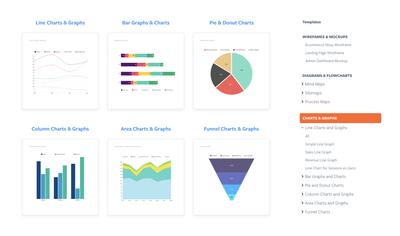
You can always start your chart from scratch. But it is often helpful – and quicker – to browse a collection of pre-made templates. Relevant examples can provide inspiration, and suggest all sorts of ideas for customization.
But more importantly, they can help your team understand the types of charts well suited to specific categories of data – and the best-practices for each of those graphs.
To help your team get going, we’ve added 46 charts and graphs to our template pages.
Browse by chart type and use case, and then simply click Edit this chart to open your template in Moqups and start customizing it to fit your requirements.
Switch between chart types to find one that best suits your data
Chart stencils now have a popover toolbar that lets you experiment with a variety of chart types – to find the one that works best for your data, context and audience.
As well as the Chart Type buttons, we’ve also added a handy Edit button. This makes it easy to cut and paste data from CSV files, customize colors, and label your values and categories.
Visualize and analyze any kind of process with our new funnel chart
Funnel charts are used to represent and analyze the progressive stages of any process or procedure.
They can help identify bottlenecks and problems, and are great for visualizing website conversions, sales pipelines, purchasing funnels, customer retention, order fulfillment, employee and volunteer recruitment, and PPC promotional campaigns.
You’ll find our new Funnel Chart stencil in the Charts section of the Stencils library.
If you want to learn more about common use cases – or start with a ready-made example – check out our Funnel Chart template page.
Show value labels right on the chart itself
Sometimes the chart speaks for itself, and values along the axis are sufficient. Other times, you may want your audience to focus on the specific values themselves. That’s why we’ve added the option to show values right on the chart – either as count or percentage values.
To show or hide value labels:
- Click on any chart on the page
- Navigate to the Chart Style section of the Format Panel
- Enable
Show values
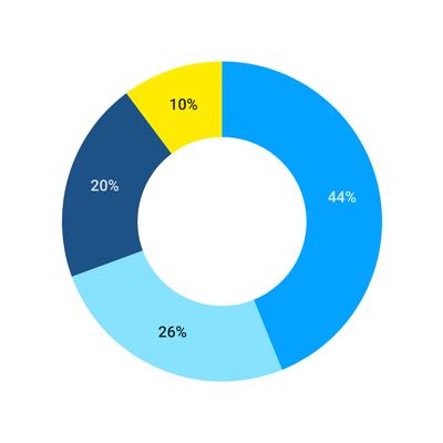
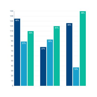
Render chart values as percentages
You now have the option to render chart values as percentages. This is useful for any chart that shows the relationship of parts to a whole, especially Pie and Donut charts, Grouped Bar and Column charts, and Stacked Column, Bar and Area charts. You’ll find this option in the Chart Style section of the Format Panel, right next to Show Values.
For Pie and Donut charts, rendering values as percentages simply shows, for each slice, that section’s percentage of the whole:
For Grouped Bar or Column charts, this option displays the percentage for each subcategory that makes up the larger, grouped category:
For Stacked charts – whether Bar, Column, or Area – render as percentage has a much more dramatic effect, changing the visual representation of the chart to a ‘100% Stacked Chart’:
We’ve made all our charts easier to read
Finally, a couple of smaller notes! We’ve improved the presentation of all our charts, making them easier on your audience’s eye!
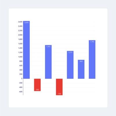
We added digit-group separators to large value numbers making it possible for actual humans to read! Instead of 10000, you'll now see 10,000. And, we also improved the representation of negative values in our Stacked Bar and Stacked Column charts, making them simpler to parse at a glance.
We hope these new features and templates make it easy for your team to build BI dashboards, prepare reports, and create presentations.
What’s next for Charts? Well, that’s partially in your hands. We need your feedback and suggestions to make charting and graphing even better in Moqups. So, please send us your thoughts at support@moqups.com.
On our side, we’re already at work improving our color themes, and creating additional templates – like SWOT, 5 Whys, Business Model Canvas, Empathy Maps, etc. – as part of a new ‘Business Strategy’ section. So stay tuned!