Although glyphs and icons have been around since before the pyramids, they owe their modern renaissance to the advent of personal computing, and more specifically, to the smartphone.
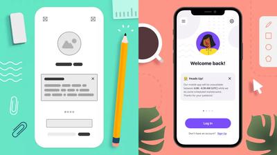
Not surprisingly, icons are also one of Moqups’ most popular and...well...iconic features. Now, we've given them some long-overdue love, revamped the Icon Library, and made the overall experience better, faster, and more flexible.
Expanded icon sets and themes
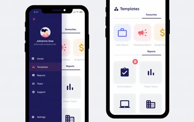
We’ve expanded our Material Design, Font Awesome, Hawcons, and Bootstrap icon kits – and added a whole variety of themes. These new additions give you lots of stylistic and aesthetic options as you design and mock your UI.
For instance, our Material Design kit now includes Filled, Outlined, Rounded, Sharp, Two-Tone, and Community themes; the Two-Tone is a colorful option, half-way between traditional monotone and the full illustrative palettes of emojis. We’ve also added a Feather icon pack to give you even more choice.
These icon kits are the workhorses of responsive design – and essential tools for UI wireframing and prototyping. Because icons are compact and free up space, they’re useful in any UI layout – and critical for mobile UX.
Since established icons are already familiar to users, they’re quick and easy to recognize. This makes them perfect, clear targets for both touch and click. And, because icons are universal, and require no translation, they make the process of language localization far easier.
Icons can stand on their own, or be used in combination with text or tool tips to reassure users. But the most important thing is that they be clear within their context. Picking the wrong icons results in both a confusing experience, and an unnecessary mental load on the user. That’s why we’re aggressively expanding the icon library – so that your team can find just the right icons for your style and intent.
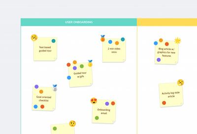
Emojis have arrived
Everybody loves emojis! You’ve always been able to add system emojis (Apple, Google, Microsoft) using any of our text stencils. But now we’ve added both Noto Emoji and OpenMoji packs to the Icons library. These mini-illustrations provide instant clip-art capability for all kinds of UX design, and are especially useful for special offers, promotions, and seasonal touches.
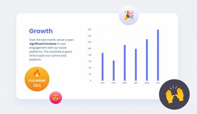
Their colorful and decorative nature also make emojis perfect for reports and presentations. They can make slide decks more engaging, playful and fun – and more importantly, they can direct your audience's eye to key data and messaging.
Emojis also come in handy for project management and strategic planning. You can use them to mark work status. Or use them as votes, badges, feedback, and annotations on everything from a Daily Stand Up Meeting to an online Dot Voting Board.
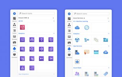
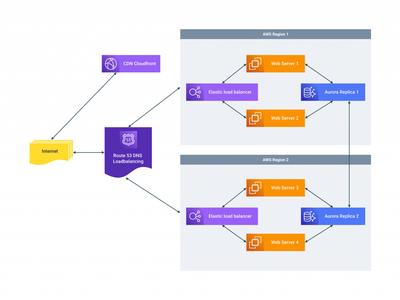
New AWS and Azure architecture icons
We’ve had a lot of requests from folks building architecture diagrams. So, we’ve added both the Azure architecture icons and the official AWS Architecture Services & Resources icon set.
You can incorporate these into your network model, or include them in presentations and technical documentation.
We’ve made icons easier to find, select, add, and replace
We haven’t just added a ton of great icon sets, we’ve also revamped the Icons library and improved the overall icon experience.
First, all our icons are now tagged, making it easy to search, find, compare and choose the right one for your context.
We’ve also added lots of categories – so you can drill down on a particular subject or action. No more infinite scrolling to find your focus! And we’ve made it easy to expand and collapse all categories for fast navigation; you can do this through the More actions menu, or by holding down Alt/Option when expanding or collapsing a single category.
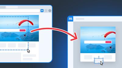
As your design evolves, you may want to test different icons and themes in context – without the hassle of resizing and styling. That’s why we’ve made it easy to replace icons. Just drag and drop a new icon onto an old one and it will automatically adopt its size and style. Or, even easier, just select an icon on the page, and double-click a new one from the library to instantly swap it in!
To make your icon experience better, we’ve also tweaked performance with some substantial changes under the hood. Now, using the library is both faster and more memory efficient.
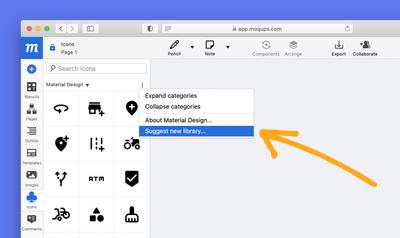
You can quickly request new icon sets
In spite of all the new additions and improvements, are we still missing your favorite icon set? No problem, just let us know. We’ve made it quick and easy to send us a suggestion – right from the library – and make sure it goes straight to our dev team!
Finally, keep checking back on the library cause we’re adding more icons all the time. Or you can follow us on social media for the latest news and updates!