Template Name
Description
Excerpt
- No results found.
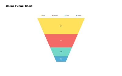
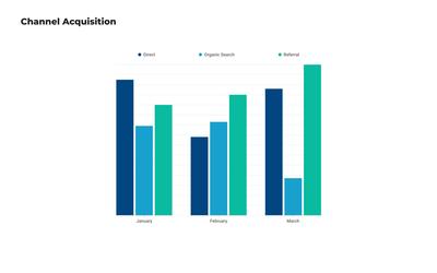
Chart, Graph and Infographic Templates
Visualize data and make numbers beautiful with high-quality graph and chart templates. Create professional presentations and display critical KPI metrics for BI dashboards.
Which chart or graph template should I choose?
Whether you’re asked to present data, establish KPIs, or build dashboards to track key performance metrics, pre-designed templates can help you get professional results.
But, each kind of data visualization is designed for a specific sort of analysis, so it’s good to match your use case to the right type of chart or graph template. Here’s a quick primer:
There are a couple of visualizations that don't display data like conventional charts or graphs – like the Gantt chart or the KWL chart – but still have ‘chart’ in their name. They’re more like business frameworks, and you’ll find them with our Strategy and Planning templates.
Why use a chart or graph template?
With Moqups, you can always start your chart from scratch. But it is often helpful – and quicker – to browse our collection of pre-made examples.
For one thing, a template can bring your team up to speed about optimal layout, styling and graphic design. And, because pre-made templates contain sample content, they offer a quick preview of the final product.
The Moqups template collection contains examples of each type of visualization, and their variants – and that makes it easy to choose visualizations that best suit your data and your analysis.
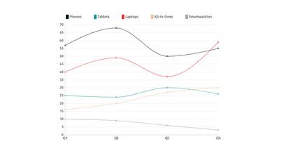
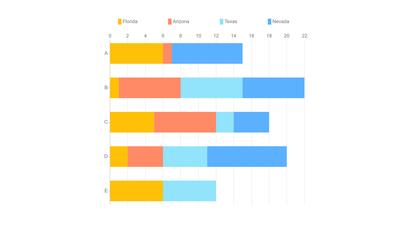
For instance, by quickly comparing templates, you can assess the relative impact of stacked versus grouped bar charts. Or decide whether your audience might find it easier to parse line graphs or area graphs.
Whether you’re building business intelligence dashboards, or creating reports and presentations, a chart or graph template is a great way to kick-start your project.
Customise your graph or chart templates in Moqups
With Moqups, your team can collaborate online, in real time with professional design templates that are ready to go. Just cut and paste your Excel or CSV data and start making our pre-made example your own.
Put the art in your chart by customizing the fonts and colors to reflect your branding – or to create a palette you love! Then, use our lighting-fast controls to quickly adapt the legend and axis lines to reflect your categories, values and requirements.
At any point, you can still cycle through the full range of graph and chart types – to make sure you have the optimal visualization and orientation for your data points.
The best thing about Moqups is that you can quickly integrate your visualizations into dashboards, wireframes and prototypes - all within the same project, workflow and app!
And, once you’re done, you can share your project link with stakeholders, or export your report as a PNG or PDF. You can explore all our customization features by choosing a chart or graph type from our collection of over 100+ free templates.
Choose from 100+ pre-designed templates
Match your use case and get your team going!
Sign up for free