In this article:
Charts and graphs are useful in all kinds of apps, websites and presentations – and are the essential component of Business Intelligence dashboards.
With our Charts stencils, you can create stunning visualizations and quickly mockup realistic BI dashboards using bar and column, pie and donut, line, area, and funnel charts – including stacked variations.
In this article, we’ll explain each of these chart types. We’ll also show you how to add chart stencils to the page, enter your own data, and how to style, format, and color your charts and graphs.
Types of charts and graphs
In the Stencils Library, you’ll find a wide variety of charts that can be quickly customized to fit the needs of your project and team. Here’s a quick primer for each type of chart and graph.
For a more detailed breakdown and use cases – including explanations of the grouped and stacked variations available for some types – click the links in the following descriptions:
Bar
Bar graphs, also known as bar charts, are great for comparing large numbers of entities, tracking changes over time, identifying best-to-worst performers, or ranking values from largest to smallest. Their horizontal orientation allows for categories with longer names.
Column
Column charts, sometimes called column graphs, are used to present all kinds of business, financial, and logistical data. Because they display their values vertically, they take advantage of our natural sense of height – and are a good choice for representing negative values.
Line
Line graphs, or line charts, connect continuous data points using line segments. They are most often used – in business, finance, sales, marketing, and the experimental sciences – to visualize progress over time or distance.
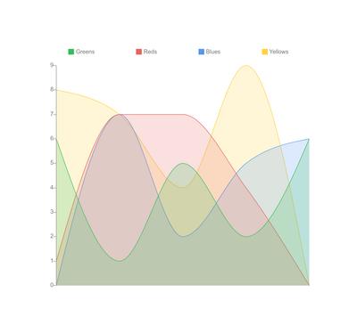
Area
Area graphs are similar to line graphs in that they’re used primarily to track changes over time. But because area charts fill in the spaces below their plotted lines, they’re effective for presenting part-to-whole relationships, and tracking related groups within a category.
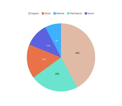
Pie
Pie charts are circular graphs that show individual categories as slices – or percentages – of the whole. The pie graph gives a strong and immediate sense of overall proportions, and makes part-to-whole relationships easy to grasp at a glance.
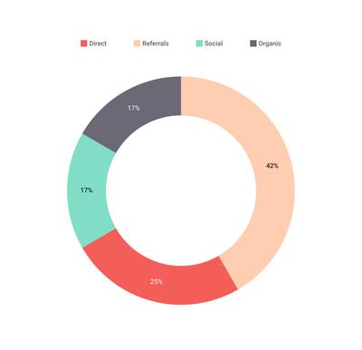
Donut
Donut charts are a variant of pie charts that display categories as arcs, rather than as slices. With a hole in their center, they allow for additional information to be displayed – and tend to create a narrative as they lead the reader’s eye around the arcs of their circle.
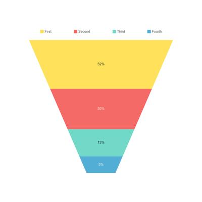
Funnel
Funnel charts can be used to visualize and analyze the progressive stages of any process or procedure. Its slices represent the winnowing and reduction of data as it passes from one stage to another – making it perfect for identifying problems or bottlenecks.
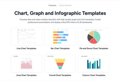
To see practical examples of these types of charts, check out our collection of free Charts & Graphs Templates. Your team can use these examples to jump-start a project, explore best-practices, or just to experiment.
Add charts
All our Chart stencils are found in the Stencils Library and, just like all stencils, can be added to the page, as objects, by single click or drag and drop.
Once on the page, charts display a range of ‘Chart Type’ buttons that let you quickly compare different visualizations – to pick the chart that best suits your data.
Enter data in chart
To add data to a chart or graph, just click the Edit button in the pop-up toolbar. Now you can enter your values manually, or paste the numeric (CSV) values directly from Excel, Google Docs, or other apps.
Style and format charts
There are two levels at which you can format and style charts and graphs.
- The Format Panel lets you customize the overall appearance of the chart.
- The Edit Data & Color button lets you enter content, label categories, and customize colors
To style a Chart stencil:
-
Select the stencil to reveal the Chart Style section of the Format Panel.
-
Use the pop-up toolbar or the Format Panel to pick the chart type that best suits your data, no matter which stencil you originally chose, from the Chart type options.
-
Choose from a range of pre-set colors themes – or custom set your colors in the Chart Data Editor (see below).
-
Depending on the Chart type you can customize a range of options including:
- Applying and styling a Grid
- Creating and locating a Legend
- Applying and customizing the Value axis (as Line, Ticks or Labels & placement)
- Applying and customizing the Category axis (as Line, Ticks or Labels & placement)
- Rendering values as percentages
- Showing values directly on the chart
- Styling and coloring the Text
And, as with any other stencil, you can also apply a Drop Shadow or Blur.
To label, add or change content, and customize the colors of any Charts Stencil:
- Select a stencil to reveal the popup menu, and then click the Edit button.
- You can cut and paste CSV data directly from other apps.
- Edit the Chart like a spreadsheet and the visualization will update as you adjust the cell values.
- Click on the Legend (Series) or Category cells to rename them.
- To Insert or Delete columns and rows, hover over Legend or Category names and the drop-down menu arrow will show your options.
- To customize the Chart’s colors individually, click on the color-picker button of any row on the leftmost side of the data editor; you can customize colors even if you have chosen a Chart theme in the Format Panel.
Chart and graph templates
If you want to determine what kind of chart best suits your needs and data, why not browse through some popular use cases – or look for inspiration – in our collection of free Charts & Graphs templates.