Template Name
Description
Excerpt
- No results found.
Column Chart Templates
Turn complex data into clear visual stories with our column chart templates. Highlight key metrics across multiple categories or time periods with simple, grouped or stacked column graphs.
Benefits of using column chart templates.
Column charts are versatile data visualization tools that take advantage of our instinctive sense of height to compare values across different categories or time periods. With their vertical values and horizontal categories, column chart templates are ideal for sequential progressions of data from left to right – like times, dates, or income groups.
Choose one of our customizable column chart templates to present your business, financial, and logistical data for dashboards and reports.
- Simple Column Chart
- Column Chart for Channel Acquisition
- Simple Stacked Column Chart
- Web Traffic Stacked Column Chart
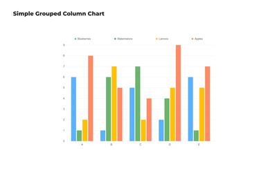
Simple Column Chart
This simple grouped column chart uses vertical bars to represent data values, making it easy to compare individual metrics across its horizontal categories. It's perfect for presenting sales figures, survey results, or any data set with distinct groups.
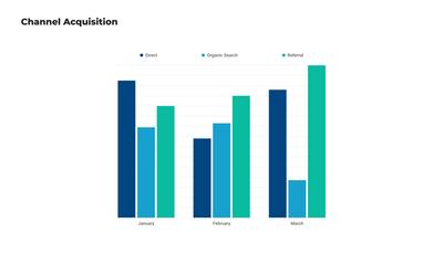
Column Chart for Channel Acquisition
Analyze and present your marketing channel performance with this free column chart template. Visualize the performance of different acquisition channels, side by side, to identify which bring in the most traffic and conversions.
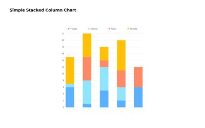
Simple Stacked Column Chart
This stacked column chart template shows multiple data series layered on top of each other to demonstrate the cumulative effect and individual contributions of each series. This column chart example is ideal for displaying data with subcategories, like market share or budget allocations.
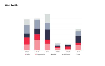
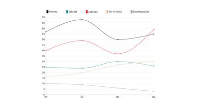
Web Traffic Stacked Column Chart
Visualize your website's traffic sources and their relative contributions over time. This free, editable column chart template can help your team understand and communicate the strength of your online traffic across multiple channels.
Choose from 100+ pre-designed templates
Match your use case and get your team going!
Sign up for free