Template Name
Description
Excerpt
- No results found.
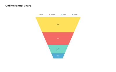
Pie and Donut Chart Templates
Turn proportional data into visual stories with donut and pie chart templates. Customize colors, labels and segments to create stunning circular graphs for reports, presentations and dashboards.
What's the difference between a pie chart and a donut chart?
A pie chart is a circular graph that shows individual categories as slices – or percentages – of the whole. The donut chart is a variant of the pie chart, with a hole in its center, and it displays categories as arcs rather than slices. Both make part-to-whole relationships easy to grasp at a glance.
Choose one of the following circular diagram templates to create stunning donut and pie chart examples for dashboards, reports or presentations.
- Simple Pie Chart
- Customer Satisfaction Donut Chart
- Pie Chart for Marketing Budget
- Simple Donut Chart
- Spending Plan Pie Chart
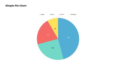
Simple Pie Chart
This versatile template provides a classic circular diagram for showcasing proportional data. Ideal for a wide range of applications, it offers a clear and concise way to represent parts of a whole.
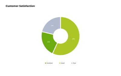
Customer Satisfaction Donut Chart
Designed to visualize customer feedback, our free donut chart template can help your team gauge overall satisfaction levels at a glance. Use our donut chart generator to track progress by creating regular monthly reports.
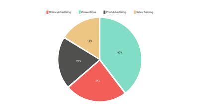
Pie Chart for Marketing Budget
Use this free pie chart template to visualize past, current, and future marketing budgets. Our easy-to-use pie chart maker can help your team plan their spending and divide costs effectively by displaying departmental expenditures at a glance.
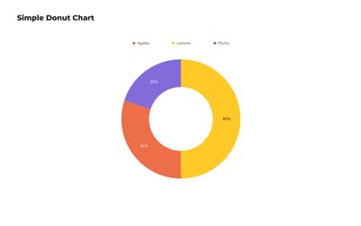
Simple Donut Chart
The classic donut chart is one of the most versatile circular diagram templates. With its hollow center, it can display proportional data while still leaving space for additional information or summaries, making it ideal for dashboards and infographics.
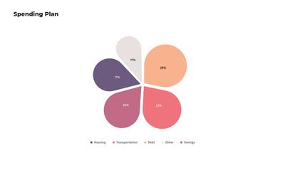
Spending Plan Pie Chart
This customizable pie graph template is perfect for personal financial planning. The playful flower-petal design of this free pie chart template provides a clear overview of budget allocations across different expense categories.
Choose from 100+ pre-designed templates
Match your use case and get your team going!
Sign up for free