Template Name
Description
Excerpt
- No results found.
Area Chart Templates
Visualize data trends over time with Moqups area chart templates. Create stunning stacked or single area graphs to highlight volume and showcase cumulative totals in your dashboards and reports.
When to use an area chart template?
Area charts are powerful data visualization tools that show changes in data over time. By coloring in the space beneath their plotted lines, they highlight the magnitude of changes and have a striking visual impact. Stacked area charts show the cumulative impact of groups within a category and are ideal trend analysis graphs for both dashboards and reports.
Make cumulative data visualization beautiful and dramatic with one of our customizable area chart templates.
- Simple Area Chart
- Area Chart for Retail Store Profits
- Area Chart for Revenue vs Expenses
- Page Visitors Area Chart
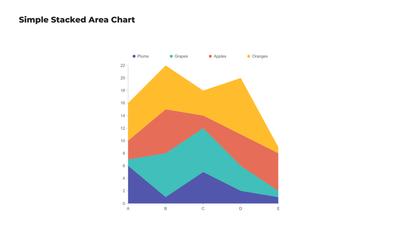
- Simple Stacked Area Chart
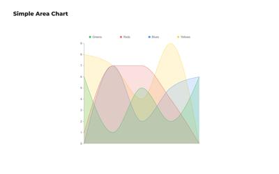
Simple Area Chart
This editable area chart template provides a quick and easy way to track data patterns over time. It’s perfect for visualizing changes in related datasets, helping your team see overall volume and trends more clearly.
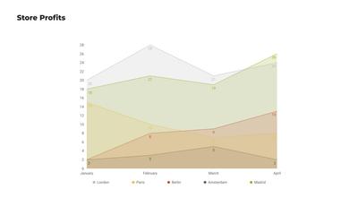
Area Chart for Retail Store Profits
Designed specifically for retail businesses, this area chart example visualizes profit trends at different store branches. It's useful for analyzing both seasonal patterns and long-term growth potential at specific geographic locations.
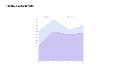
Area Chart for Revenue vs Expenses
This editable area chart compares two datasets to show the relationship between income and costs. Your team can use it to identify periods of profit and loss, and to track the financial health of your company or division.
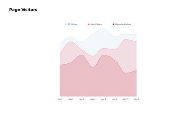
Page Visitors Area Chart
Tailored for web analytics, this area graph template visualizes website traffic trends. As a data visualization tool, it helps digital marketers and SEO specialists understand user engagement patterns and the impact of marketing campaigns.
Simple Stacked Area Chart
This customizable area chart template breaks down data into multiple categories that are stacked on top of each other. It shows the cumulative contribution of each category to the total, making it easy to compare multiple datasets over time.
Choose from 100+ pre-designed templates
Match your use case and get your team going!
Sign up for free