Template Name
Description
Excerpt
- No results found.
Bar Chart Templates
Jump-start your data visualization with our professionally-designed bar graph templates. Use simple, grouped or stacked bar charts to compare ranked values across categories, locations, and time.
Benefits of using bar graph templates.
Bar graphs can compare large numbers of entities, track changes over time, identify best-to-worst performers, or rank values from largest to smallest. Grouped Bar charts color-code and cluster bars together within each category to show shared sub-categories, whereas Stacked Bar charts display sub-categories within each bar to show how sub-groups contribute to the total.
Choose one of our free, editable bar graph templates to create professional bar charts for dashboards, reports or presentations.
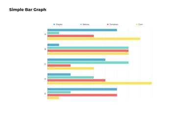
Simple Bar Chart
This grouped bar graph is perfect for categorical comparisons. Achieve professional results in minutes by adapting this customizable bar graph template to suit your needs. Quickly edit to add your data, colors, categories and a legend!
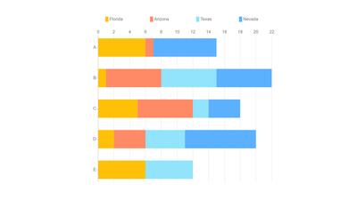
Simple Stacked Bar Chart
This free, printable bar graph template displays multiple data series stacked within single bars. It’s used to highlight the composition of each category, and show how different subcategories contribute to the whole.
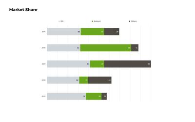
Market Share Bar Chart
This stacked market share bar chart displays the market share for different products or companies over time. Use this free data visualization template for strategic planning and competitive analysis, and to understand your position relative to competitors.
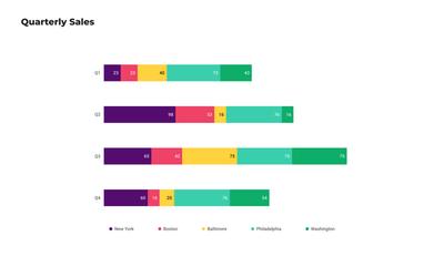
Stacked Bar Chart for Quarterly Sales
This stacked bar chart template breaks down quarterly sales data by geographical location, but can easily be customized to compare the contribution of different divisions, categories or product lines over time.
Choose from 100+ pre-designed templates
Match your use case and get your team going!
Sign up for free