Template Name
Description
Excerpt
- No results found.
Funnel Chart Templates
Illustrate the progressive stages of any process with our funnel chart templates. Pinpoint bottlenecks, measure drop-off rates, and streamline sales pipelines to improve customer acquisition.
What is a funnel chart used for?
A funnel chart visualizes the stages of a sequential process from initial engagement to final outcome, and its tapering shows the winnowing of data from one stage to another. By measuring these drop-off rates, funnel chart templates can help your team identify bottlenecks, pinpoint inefficiencies, and optimize workflows.
Use the following funnel chart examples to simplify your analysis of customer journeys, sales pipelines, and employee recruitment efforts.
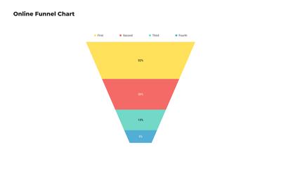
Simple Funnel Chart
Use this simple funnel chart template to provide a clear view of each stage in any process from start to finish. Just add data and customize in minutes to create your own marketing funnel charts or customer journey funnels.
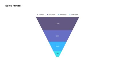
Funnel Chart for Sales
This editable funnel chart template breaks down the sales process from lead generation to closed deals. As a funnel analytics tool, it helps sales teams improve conversion rates by pinpointing where their potential customers drop off.
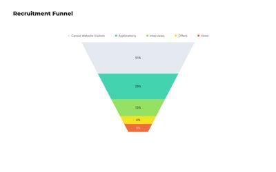
Recruitment Funnel Chart
This specialized process flow funnel chart visualizes an online hiring process from job posting to successful employment. By tracking candidate journeys, this customizable funnel chart template helps HR professionals identify bottlenecks and improve their recruitment pipeline.
Choose from 100+ pre-designed templates
Match your use case and get your team going!
Sign up for free