Template Name
Description
Excerpt
- No results found.
Line Chart Templates
Our editable line graph templates are quick and easy to customize. Add your own data, colors, labels and legends to create professional line charts in minutes, no matter your skill level.
When to use line graphs?
Line graphs are used in business, finance and marketing to illustrate trends over time. They help teams analyze sales performance, monitor website traffic, chart revenue, and track critical metrics. Multi-line graphs plot several data series at once, and are used to compare the performance of different groups or follow simultaneous trends.
Choose one of our free, customizable line graph templates to create professional line graphs for dashboards, reports or presentations.
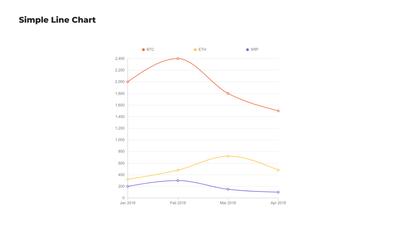
Simple Line Chart
This versatile data visualization template provides a clean, straightforward design to track trends across any dataset. Perfect for beginners and professionals alike, it's easily adaptable to various data types and industries.
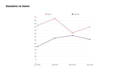
Line Chart Template for Sessions vs Users
Ideal for web analytics, this free line graph template compares website sessions to unique users over time. It helps identify traffic patterns and user engagement trends to help teams optimizing their digital marketing strategies.
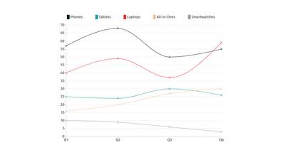
Sales Trend Line Chart
Designed to track sales trends, this business line graph template visualizes the performance of popular products over several quarters. By identifying strong performers, seasonal patterns, and long-term potential, teams can make informed forecasts and decisions.
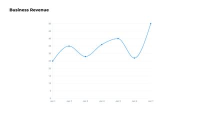
Revenue Line Graph
Use our simple revenue line chart template to monitor your business income over time. Customize this printable line graph in minutes with your own data, colours and categories.
Choose from 100+ pre-designed templates
Match your use case and get your team going!
Sign up for free