In this article:
Once design elements – stencils, templates, images and icons – are added to the page, they are called Objects.
All objects – Stencils, Icons, and Images – can be styled and customized in the Format Panel – and they share many of the same formatting controls.
Images also have additional editing tools like cropping, background removal, and patching which you can read about in Format, Edit, and Replace Images.
In this article, we’ll introduce you to the Format Panel, and show you how to customize stencils using the general formatting controls that apply to all objects. We’ll also show you how to save a custom style for a particular stencil.
Some stencils have their own, additional formatting controls specific to their usage: Notes & Annotations, Smart Shapes, Charts, Tables and all Diagram and Text-Based stencils. We’ll cover each of these specific cases in this section’s subsequent articles.
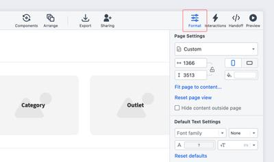
Format panel
Go to the Right Sidebar and click the Format Tab. The tab will turn blue, and will open the Format Panel. The Format Panel also opens automatically when you double-click on any non-text stencil (whereas double-clicking on a text stencil will open the Quick-Format Text Window).
The Format Panel is divided into Sections with specific formatting controls. The sections are collapsible, so clicking on a section’s name will hide or reveal that section.
The panel will always display the default sections that are common to all stencils: Size & Position, Fills & Strokes, Opacity, Drop Shadow, and Blur.
If a stencil comes with additional styling capabilities specific to its usage, the panel will display a dedicated section with those options. We cover each of these cases in the following articles.
Select, size, position, rotate, and flip
When you select a single object, that object’s name is displayed at the top of the panel, just above its coordinates. This makes it easy to locate and identify that object in the Outline Panel.
When you select multiple objects, the panel displays the number of objects in that group, in order to help you confirm your selection before applying any style changes or transformations.
Size, Position, Rotate, and Flip controls are grouped together below the coordinates, and each of these actions can be performed both in the panel or on the page.
We also have a Bulk Transform feature which allows you to apply these controls to multiple objects at once. You can learn more in the dedicated section below.
Size
On the page, use the resize handles to change the size of the object.
In the Format Panel, use the Width & Height inputs for precise values and fine-tuning, and use the arrow keys, on the keyboard, if you want to change these values incrementally.
Lock an object’s proportions with the Lock Aspect Ratio button. After an object is locked, you’ll have to unlock the aspect ratio if you want to resize it on the horizontal or vertical axis.
Position
On the page, select an object and drag it to the desired position.
In the Format Panel, set the object’s position by entering the exact coordinates in the input fields. Your object’s position is measured in pixel-distance from both the left and top margins. You can use your keyboard’s arrow keys to change these values incrementally.
- Once an object is selected on the page, the arrow keys move objects pixel by pixel – for fine adjustment.
Shift+↑↓→←moves objects 10 px
Rotate
On the page, click the rotation handle at the top of the object and drag to rotate.
In the Format Panel, enter the degree-value in the Rotation Input Field. You can change the value by using the keyboard’s arrow keys.
Double-clicking on the Rotation handle quickly resets the Rotation Angle to ‘0’.
Shift + rotate will turn the object by 15° increments.
Flip
You can flip an object both horizontally and vertically.
On the page, select a Resize Handle and drag it across the centerline of that object to simultaneously resize and flip.
In the Format Panel, the vertical and horizontal Flip Buttons flip the object while still maintaining its size and aspect ratio.
Bulk Transform
Our Bulk Transform tool lets you format multiple objects simultaneously. This feature is enabled by default and user-based (i.e. when you enable or disable it, that preference is applied to all your projects).
Once you’ve selected the objects you wish to transform, you can apply the same sizing (width and/or height) or the same X or Y coordinates. You can also mass rotate or flip them, either horizontally or vertically.
This helps keep things tidy and organized – no matter whether you’re working on wireframes, diagrams, or whiteboards. Consistent sizing and positioning makes any layout easier to read at a glance.
To use the Bulk Transform tool:
- Check the Format Panel and ensure that the Bulk Transform button is enabled.
- Select multiple objects by mouse-dragging over elements or using Shift + Click in order to select them individually
- Enter new dimensions into the Width/Height inputs, or new coordinates into the X/Y inputs.
- If you want to disable the bulk transform feature, just click the button again.
You can also apply the size or coordinates from one object to the rest of the objects in the selection:
- Click on any object within a selection to designate it as a reference object.
- The reference object will be highlighted with a thick blue frame.
- The reference object’s dimensions and coordinates will show in light grey in the inputs.
- To apply any of those values to every object in the selection, just type those exact input numbers over the gray ones, and hit the Enter/Return key.
Color fills & strokes, and gradients
You can apply color changes to object Fills and Strokes by using the Color Picker in the Fills & Strokes section of the Format Panel. As you add colors, the Project Colors list at the bottom of the picker will aggregate those swatches.
Fills
To fill an object with color, go to the Fills & Strokes section and click on Fill Color to open the Color Picker Popover.
The Color Input accepts the following color formats: 8, 6, and 3 digit HEX, RGB, RGBA, HSL, HSLA, LAB, LCH, as well as HTML named colors (i.e. red, green, blue, tomato, etc.).
-
Select the Swatches Tab to choose a color scheme from Moqups Classic, Material Design, Bootstrap, iOS, HTML, TailwindCSS, or IBM Carbon Design colors. This tab also displays the colors you’ve already used in your project.
or
-
Select the Picker Tab to create your own custom colors.
In both tabs, you can…
- Enter a color format code
- Adjust the fill-color opacity
- Use the eyedropper to match a color; to activate the eyedropper, use either our Chrome or Firefox extension.
Strokes
Stroke refers to the line of the object itself.
To adjust the stroke color, go to the Format Panel, and in the Fills & Stroke section, click on Stroke Color. Here, you can also set the stroke opacity.
Under the color settings, you can choose the Stroke Width, and set Stroke Style to Solid, Dotted or Dashed.
The stroke size is 1 pixel by default. If you don’t want any stroke at all, just select 0 pixels from the dropdown.
Gradients
Gradients create gradual color blends between two or more colors. They can be applied to both Fills and Strokes.
To apply a gradient…
- Click on the Fill or Stroke Color
- At the top of the Color Picker Popover, you can choose from three Fill Types: Solid, Linear gradient, and Radial gradient.
- For gradients, select either Linear or Radial gradient.
- The Gradient Slider has two default Stops that can be moved back and forth to adjust the start and end point of the gradient.
- Click on a Stop to apply a color from the Color Field. The Stop will remain blue while active. You can make further color adjustments below by using either the Hue or Opacity sliders, or by selecting from a range of color swatches derived from the currently active color.
- To add more stops, hover anywhere along the Gradient Slider until you see the ‘+’ icon; click on the slider to add a new stop.
- To remove a stop, drag it downward until it disappears.
- Use the Flip icon on the right of the Gradient Slider to reverse the order of colors.
The controls in the upper-left corner let you adjust the gradient’s Angle (for Linear) or Center (for Radial). For even more precision, you can set the Linear Angle by degree, or the Radial’s Center by X/Y coordinates in the accompanying input fields.
The Radial gradient also has a Stretch option that expands the Radial gradient to the margins of the object.
Replace colors
This feature makes it possible to quickly update your color scheme as you move from lo-fi wireframes to hi-fi mockups – and finally to polished designs and prototypes.
You can choose to replace a color throughout an Entire Project, on the Current Page, or within a specific Selection of objects.
To replace a color within the Entire Project or on your Current Page:
-
Deselect all objects on the page
-
Expand the Replace Colors section in the Format Panel
-
Select Current Page or Entire Project
-
Check boxes to choose Fills, Strokes or Text Color
-
Click on the project color you wish to replace
-
Select the replacement color from
- Project colors
- Swatches
- Picker
- By entering a hex code
To replace a color within a Selection of objects:
-
Select one or more objects
-
Expand the Replace Colors section in the Format Panel
-
Select Current Page or Entire Project
-
Check boxes to choose Fills, Strokes or Text Color
-
Click on the project color you wish to replace
-
Select the replacement color from
- Project colors
- Swatches
- Picker
- By entering a hex code
Opacity, shadows, and blur
Opacity
The Opacity slider adjusts the global Opacity of a whole object, or group of objects. If you want to customize opacity more precisely, you can also adjust the Stroke opacity (see above), together with global Opacity, for a combined visual result.
Shadow
To add a Shadow to an object, navigate to the Format Panel and open the Drop Shadow section.
Enable shadow to set the color, opacity, angle, distance, and size of the shadow.
Blur
To add a Blur to an object, navigate to the Format Panel, open the Blur section, and enable the Blur slider. The Blur feature is particularly useful when mocking up a popover or modal window.
You can bulk-apply opacity, strokes, shadows, and blurs to multiple objects. Hold down Ctrl/Cmd + select your objects, and then edit them simultaneously.
Rounded corners
You can round an object’s corners both from the Format Panel, in the Rounded Corners section, as well as directly on the page, using the object’s custom handles.
To round corners from the Format Panel:
- Use the Rounded Corners section and enter values in the inputs. By default, the four input fields are synced. Entering a value in one input will propagate that value to the other corners.
- To enter differing values for each corner, deselect the Sync all corners icon located between the four inputs.
- Enable Scale Radius if you want the rounded corners to scale proportionally as you resize an object.
To round corners directly on the Page:
- To round all corners simultaneously, drag any of the light-blue custom handles towards the center of the object.
- To round a specific corner (Rectangle stencil only) hold
Option/Altand drag the relevant handle towards the center.
Copy and Paste Styles
Once you have customized an object, you can apply that customization to another object or group of objects.
To copy and paste styles:
- Select the object from which you want to copy the styles
- Right-click and choose Copy Styles or press
Alt/Option+C - Select the object where you want to apply those styles
- Right-click and choose Paste Styles or press
Alt/Option+V
Copy Properties
If you want to copy specific aspects of an object's formatting, you can use the Copy properties tool.
For each of the styling sections within the Format Panel, you’ll find a button in the upper right corner that copies the settings for that particular formatting option (i.e.Text, Opacity, Padding, Drop Shadow, etc).
To copy properties of an object:
- Select the object from which you want to copy its properties
- Open the Format Panel and find the formatting section you want to copy
- Click the Copy properties button
- Select the object where you want to apply those styles
- Right-click and choose Paste Styles or press Alt/Option + V
Save custom styles for stencils
When you save a custom style for a stencil, every time you add a particular stencil type to the page, that object will adopt your custom style.
To save a custom style for a stencil type:
- Style a stencil object on the page using the Format Panel
- Select that object
- Right click to open the Context Menu
- Choose the Save custom style for that stencil type
- All subsequent objects of that type will now reflect that style
If you’re looking to apply Default Text Settings to your project, check out our article about Text Stencils.
Setting a custom style for your stencil types is most useful at the beginning of a project, or when you are applying a comprehensive design system.
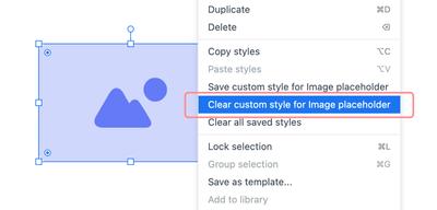
To remove a custom style from a stencil type:
- Select the stencil object on the page
- Right click to open the Context Menu
- Choose Clear custom style for that stencil type
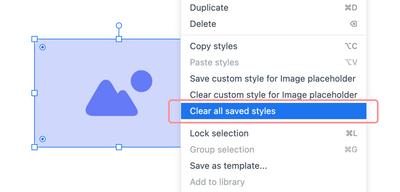
To remove custom styles from all your stencil types:
- Select the stencil object on the page
- Right click to open the Context Menu
- Choose Clear all saved styles
Questions & answers
How can I see examples of stencils that have already been formatted – either on a page or within a project?
Our website has a whole section dedicated to pre-made Templates. There, you’ll find professionally designed examples and use-cases in four categories: Wireframes and Mockups, Mapping and Diagramming, Charts, Graphs and Infographics, and Planning & Ideation. Clicking on any of these templates will open them within the Moqups app, and will let you experiment, customize, and save them.