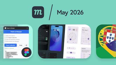
9 New Features
We have a bunch of new features designed to improve your workflow and make it easier to work with your team. We already covered a couple of these in dedicated posts at the time of release, but we thought we’d review them here as well.
We often hear from users who are surprised by the features and utility Moqups has, and we want to make sure everybody has a chance to discover them – even if they missed them the first time around.
Figma plugin
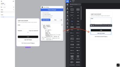
Switching to Moqups as an alternative to Figma? Or maybe you’ve got a designer who prefers to work in Figma, while the rest of the product team uses Moqups for iterations, commenting, feedback, and maintenance. Either way, we have a plugin that makes it easy to bring Figma designs directly into your Moqups project in seconds.
First, visit the Figma to Moqups plugin page in the Figma Community and click the ‘Open in Figma’ button. The plugin will now be available in your Figma account under ‘Plugins’. Once the plugin is installed, you can copy and paste any selection from Figma.
Then, just open your Figma project and select the objects or frames you want to bring into Moqups.
- Right click to open the Figma to Moqups plugin
- Click the Export Selection button to convert to JSON
- Click the Copy button to save the JSON to your clipboard
- Paste the copied JSON directly into your Moqups project
iOS 26, Material 3 and M2 Design kits
We recently added three new stencil kits to Moqups – iOS 26, Material Design 3, and Material Design 2 – all with resize constraints applied.
The iOS 26 kit includes navigation bars, tab bars, buttons, toolbars, alerts, form controls, and more, available in both light and dark mode. Elements hold together as you adjust layouts and adapt between different viewport sizes.
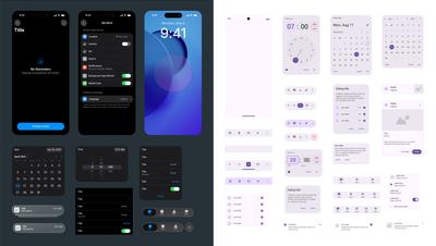
Our new Material Design 3 kit covers the full component set, and also includes the recent M3 Expressive update with split buttons, button groups, docked toolbars, and expanded FAB menus. As with our iOS 26 kit, everything is fully resizable and available in both light and dark mode. We've also added the latest Material Symbols icon set, so you can work with the same icons used across the M3 system.
And, since M3 adoption on the web is still catching up, we've included a new M2 kit as well. All three kits are available now in the Stencils panel. For a deeper dive, check out our full post.
Resize constraints and bulk transform
These two features were released together because they both make it easier to work with multiple objects.
Resize constraints let you anchor elements within a group so they stay in logical, predictable positions as you resize. Anchors are applied automatically by default, but you can also set them manually for finer control. This feature is especially useful for building flexible, reusable components that adapt cleanly across different screen sizes and devices.
Bulk transform, meanwhile, lets you select multiple objects and standardize their dimensions, position, or rotation in one step. Whether you're tidying up sticky notes after a brainstorm, standardizing diagram blocks, or aligning repeated UI elements for a polished look, bulk transform helps you clean things up fast and bring visual consistency to your work.
If you want to experiment with either of these features, you can read the original post here, or look them up in our Help Center.
Expand comments
Some of our power users have hundreds of comments per project – even per page! And they rely on the thread window to specify requirements, add documentation, and log sign-off. That’s a lot of heavy lifting for a little window.
So, in response to customer requests, we’ve added expandability to comment threads. Click the new ‘Expand thread’ button and you’ll instantly have more room to review messages and reply in detail.
Team asset libraries
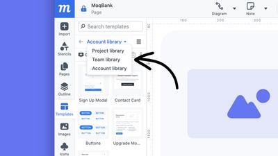
Previously, when you uploaded images, or created object templates, you could assign these assets to either your Account or a Project library. That helped keep the libraries clean of clutter, and made sure that essential elements were easily identifiable and accessible.
Because of user requests, we’ve now added a third option – a Team library – to both the Images and Templates panel. This way, you can designate assets for teams that work across a number of related projects.
More UI themes
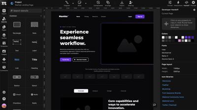
To make Moqups easier on your eyes, we’ve extended and improved our UI themes. You now have six options – including new Neutral and Midnight – so you can match your preference, workspace, or time of day.
Portuguese language
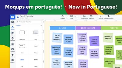
We have a lot of users in both Portugal and Brazil, so we’ve added localization in Portuguese to make it easier for teams working there. You can switch to Portuguese – or to German, Italian, Spanish, or French – in the Account page of your Dashboard, under the Profile and Password tab.
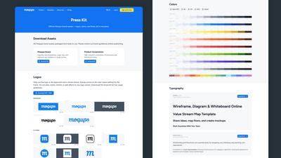
Moqups press kit
For those of you who write about or review Moqups, we’ve made it easy to find the official Moqups brand assets – logos, colors, and fonts – all in one place. Our new Moqups Press Kit has all our Moqups brand assets and guidelines packaged, downloadable and ready to use.
8 Improvements
- If you’re adding users to your Moqups account with SAML, and you exceed your quota, any extra team members will be added as Reviewers (view and comment permission only) rather than being blocked.
- We’ve improved Handoff in a bunch of ways, including:
- Reorganize handoff panel
- Handoff now remembers your settings and preferences
- The color list now includes the chart/graph palettes
- Hide text related properties section if there’s no text in the selection
- When you use search or page-label filtering to find and select a page in the Pages panel, when you remove that search/filter, the page tree now automatically scrolls to highlight the selected page.
- We’ve also added a ‘find text in objects’ suggestion to page searches to help you find what you seek.
- Support for AVIF format-type images
- Updated Framework7 (iOS) icons
- Google fonts update
- Performance improvements for projects with large image libraries.
- We’ve added Apple Pay for non-Safari browsers.
6 Bugfixes
- When you create a Trello card from a page in a Moqups project, that page’s URL link now displays correctly.
- Removed the extra space that appeared around a group’s border as you zoomed in on that group.
- Invoices now correctly display non-latin characters.
- Fixed a bug that caused problems with an object's rotation once it was flipped.
- We’ve made it easier to click and edit text stencils that are part of a selection that also includes groups.
- When using the Copy-Properties button to apply Rounded Corner settings to new objects, the lock status is now successfully carried over as well.