5 New Features
Interaction indicators
When you’re prototyping, it’s really useful to see where you’ve already applied interactions. That’s why we’ve added a dedicated Options section to our Interactions panel - so you can choose how your interactions are displayed as you edit. And, we’ve added a new ‘Show interaction indicator’ feature to that list.
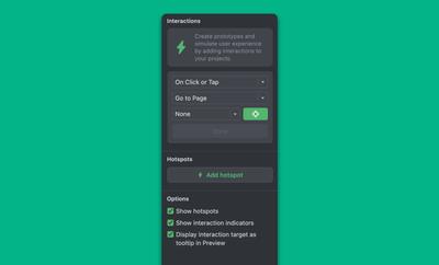
We’ve made it easy to turn each of these features on and off because, although they’re handy when prototyping – to keep track of what’s clickable and what’s not – they can also be obtrusive when designing in detail.
Here’s a quick rundown of how each one works:
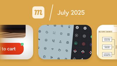
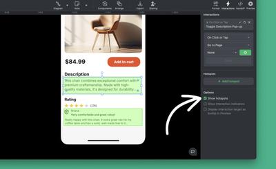
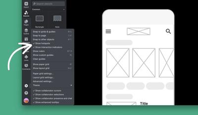
Show hotspots
Interactive hotspots can be moved, grouped, and resized like any other object. And, when you make them sticky in the Format Panel, they’ll move with objects underneath them as you edit.
While you’re in Edit mode, you can quickly hide them so they don’t get in the way of ongoing design work. Just deselect the ‘Show hotspots’ option in either the Interactions panel or workspace Settings menu.
In Preview, Hotspots will respond to user mouse actions (triggers), and you can always hold down the Shift key to remind yourself where they are.
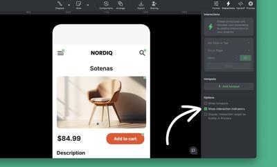
Show interaction indicators
This adds a lighting badge to objects with interactions – on the page and in the Outline Panel – when in Edit mode.
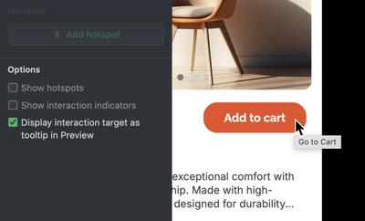
Display interaction target
In Preview mode, this option shows a tooltip with the action and target when you hover over an object.
Both ‘Show hotspots’ and ‘Show interaction indicators’ can also be turned on and off from the workspace Settings menu:
Two new icon sets
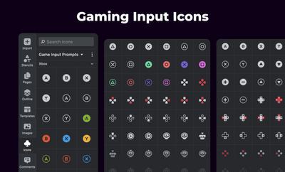
Game input prompts
Game developers, we heard your feedback and we've added a complete game input icon set from Kenney, including the brand-new Switch 2 console icons.
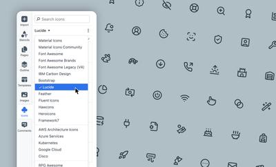
Lucide icons
To support popular shadcn/ui-based dashboards and web apps, we added the Lucide icon set, including nearly 1,500 icons designed for building applications.
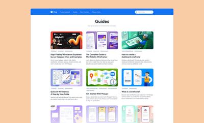
Guides to wireframing
New to wireframing, want a quick refresher, or need some expert advice? We’ve got you covered with a bunch of new guides on our blog.
Use these articles to understand basic wireframing concepts – like low, medium and high fidelity – and to use our tips and tricks to build a workflow that follows best practices, and fits your use case.
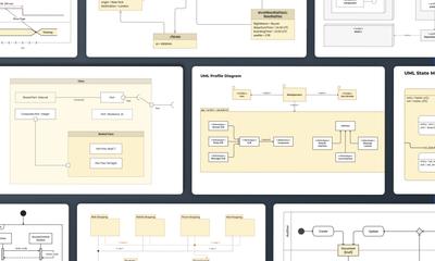
14 UML diagram templates and new stencils
We’ve improved and expanded our collection of UML stencils – and now have templates for all 14 types of UML diagrams. Check out our UMl Diagram Tool page for an explanation of each type, its use case, and a link to its corresponding template.
To find all 14 UMP templates directly from the app, just click the Import Template button at the top of the left sidebar, and type UML into the search input.
7 Improvements
Dashboard
- Now, when you switch teams using the Team dropdown in the sidebar, we remember that team so it is automatically selected on your next login.
- In the Subscription tab of the Account panel, we now show the expiration date for non-recurring subscriptions, and we correctly show expired voucher status.
Comments
- When you add an @mention to a comment thread, the auto-complete now shows matching results, in logical and alphabetical order, as you type.
- We’ve also improved the cursor behavior in the text-area to make it easier to edit your comment before sending.
Text
- We’ve updated our list of Google fonts, adding 200+ new fonts.
Charts
- We’ve added a ‘Proportions by area’ checkbox to our Funnel Chart. That means that you have the option of showing percentage proportions by height or by area. This is really helpful if you are creating infographics, building dashboard, or illustrating reports.
Page Labels
- In the ‘Manage Page Labels’ modal, when you pick a new label color, that choice is immediately reflected in the ‘Select label’ dropdown.
2 Bug Fixes
Pages
- The ‘Reset page view’ function (in the Pages Panel or the right-click context menu) now resets the zoom and scroll position for all selected pages.
Drawing
- When drawing with the pencil or highlighter tool, the starting point is more precisely located to where you click your cursor.