Updated September 25, 2019
We built Moqups so teams could do foundational work – iterating, experimenting, and building consensus – before committing precious resources to their final product.
With Moqups, teams can diagram user flows before designing screens, create wireframes before going high-fidelity, and test interactive prototypes before writing a line of code.
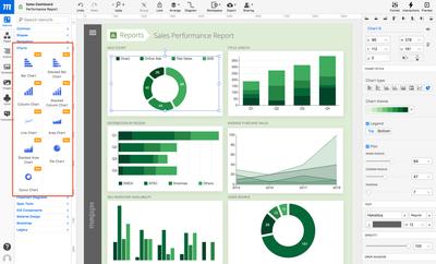
Our Charts and Graphs feature, extends that same principle to the world of business intelligence, making it possible for all kinds of departments and collaborators to experiment with their own data visualization and analysis.
Sales teams can create bar charts to evaluate regional performance, financial analysts can track revenue over time with line graphs, business consultants can highlight developing trends with area charts, and growth marketers may use a funnel chart to show bottlenecks in the conversion process.
Whether they’re incorporated into presentations or BI dashboards – or just provide teams with a temporary snapshot of patterns and anomalies – charts and graphs have become an essential tool for competitive, data driven organizations.
The Importance of Data Visualization in Business Intelligence
As more and more companies empower their businesses with digital ERP solutions, presenting data graphically has become an essential part of their analytics requirements.
Data visualization makes complicated information easier to parse – often revealing new and unexpected patterns. By using these patterns to identify and clarify key business drivers, analysts can address urgent business questions, and provide actionable, value-added insights.
But, since most ERPs come packaged as generic frameworks – applicable to only the widest possible spectrum of customers – they often require extensive customization in order to reflect the exact requirements of individual businesses.
Unfortunately, this realization – that companies need contextual, custom-designed charts – often comes long after the initial ERP implementation phase has already been completed. And that means that someone still has to sift through a sea of information, extract the valuable data, and translate it into a digestible visual analysis.
This task, the creation of complex BI dashboards assembled from a variety of reports, is often assigned to those who understand the business best. Usually, these are non-designers – product managers, business consultants – those directly responsible for monitoring and reacting to quick-changing performance indicators. They’re also the ones who have to communicate with a wide variety of stakeholders in order to decide what visuals connect effectively.
Sure, they could build their charts with number-crunching tools like Excel, but that’s not usually where the rest of the team works. Or, they could simply ask their designers to come up with something – but they’d still have to provide examples, just to show the designers what they had in mind.
And the truth is, sometimes you don’t know what you need until you’ve seen it - and shared it with your team.
Moqups makes this kind of collaboration possible. It brings people of different qualifications and expertise together within the same creative context – and helps companies leverage their collective experience by including all stakeholders in the visualization process.
With our Chart stencils, anyone in your team can explore the existing data imaginatively, identify hidden patterns, and effectively mock-up realistic visualizations and business intelligence dashboards. And most importantly, they can build these charts in the same place where the rest of your project’s requirements live.
How to Use Business Intelligence Charts
To access these stencils, go to the Stencils panel in the Left Sidebar and scroll to the Charts category. From there, you can pick whichever Chart stencil is most relevant to your data, and drag it right onto your page.

A bad chart can provide a misleading conclusion, so it’s important to try a couple of variations before you settle on the type of chart that makes the most sense for your data. To make this process of experimentation easy, we’ve made it possible to change the Chart Type directly from Charts section of the Format Panel.
In that same section, you can customize your chart’s overall appearance by choosing different color themes, enabling or disabling the Legend, toggling gridlines on or off, customizing the axis style, and more.
Of course, you can easily add or edit the chart’s data by entering the values manually, or you can paste the numeric (CSV) values directly from Excel or Google Docs:
- Select the Chart stencil you want to edit, and double-click to begin editing.
- A panel containing the Chart Data Editor will appear at the bottom of the app and the Chart will update instantly as you adjust the cell values.
- Edit the Chart just as you would with a typical spreadsheet.
- To add new values along the chart's Series axis (or Y-axis), hover over the first cell in any row – and then click the drop-down menu arrow to show the options menu.
- Select an option to insert new rows (or delete them) in the Editor.
- Similarly, to add new values along the Category axis (or X-axis), hover over the first cell of any column and click the drop-down menu arrow to reveal your options.
- It’s also possible to customize the Chart’s colors individually; just click the color picker button of any row on the leftmost side of the data editor.
This is only the beginning of our data visualization journey. In upcoming releases, we’ll be adding more chart types, as well as other useful productivity tools like the ability to generate realistic looking random data for your data visualization mockups.
And to make things even more exciting, we’ll open source the JavaScript code behind each chart type, as React Components, so that your team can use them directly in your real dashboard – and adapt them to your needs.


