Why might you want to create a website mockup? Well, maybe you’re about to build a website, or in the process of redesigning an existing one. Either way, there always comes a point where you’ll need stakeholder consensus on the design. You may also want cost estimates from the dev team, preliminary testing with end-users, or final sign-off from clients.
And that’s exactly what a website mockup does. It gives you something to show: a realistic representation of the final product, so that everyone knows what to expect from the concept – and can agree on its general principles before everyone moves forward.
This guide covers what a website mockup really is, why it’s worth creating, and how you can build one in six practical steps – with real examples you can quickly customize to suit your own use case.
- What is a website mockup?
- Wireframe vs. mockup vs. prototype
- Why create a website mockup?
- How to create a website mockup: a 6-step process
- Website mockup examples
What is a website mockup?
A website mockup is a static visual representation of how a website will look – showing layout, typography, color, imagery, and styling – but without full interactivity.
Website mockups occupy the middle space between low-fidelity wireframes and clickable hi-fi prototypes. Like wireframes, they are quick to mock up. But like prototypes, they also have enough high-fidelity and branding elements to show the overall direction of a project.
Mockups are commonly used in the middle of the design process. In the early, conceptualization and ideation stage, most teams use wireframes to work out the basic structure and user flow. Then, at the end of the process, they create prototypes to realistically simulate the finished product.
In between, teams can use a mockup – sometimes called a mid-fi wireframe – to get broad alignment on a project’s aesthetic direction. To show that overall vision, they normally include logos, colors, representative images, and draft or final copy.
Since every project is different, teams may polish their mockups to different levels of fidelity. For instance, a mid-fidelity mockup will use draft content, stock images, and approximate styling to establish a design direction and build consensus. A high-fidelity mockup gets closer to the final product by incorporating finalized copy, brand-accurate colors, and more precise (if not pixel perfect) spacing.
Most teams work somewhere in between – and that’s where a lot of the most productive design work happens. For a deeper look at how that mid-fi sweet spot works in practice, see our Complete Guide to Mid-Fidelity Wireframes.
Wireframe vs. mockup vs. prototype
These three terms are often used loosely and interchangeably. So, here’s a quick and practical primer to clear things up: wireframes, mockups, and prototypes represent different stages in the design process, each with a different level of detail and a different purpose.
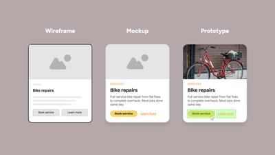
Wireframes are low-fidelity layouts that are deliberately built in grayscale using placeholder shapes and dummy text. Since these rough drafts are quick to create – and easy to throw away – they are perfect for early stage experimentation. They can act as a blueprint for later designs, and allow UX teams to figure out the intent, hierarchy, and user flow of each page – before anyone invests time in high-fidelity graphics.
Mockups add substance to a wireframe’s blueprint as the project evolves. With a layout’s basic structure in place, teams can start to get more specific about proportions, spacing, and content. By adding more realistic elements, they help bring the page to life. A mockup doesn’t require the exact final copy, colors, or graphics, but these details need to be close enough that stakeholders – including people with no design background – can evaluate the direction and give meaningful feedback.
Prototypes take a mockup, polish it to high-fidelity, and make it interactive. Generally, prototypes are pixel-perfect and have all the final content in place, both text and images. Additionally, the buttons click, the pages transition, and the menus open. A good prototype mimics the finished product close enough for user testing and final sign-off before development begins. However, by the time a design reaches the prototyping stage, big changes are much harder to make – which is exactly why the mockup stage is so important.
| Wireframe | Mockup | Prototype | |
|---|---|---|---|
| Fidelity | Low | Mid to High | High |
| Interactivity | None | Limited | Full |
| Style | Grayscale with placeholders and dummy text | Realistic colors, logos, images, draft-to-final content | Pixel-perfect, brand-accurate, interactive |
| Best for | Hashing out concepts, iterating, establishing consensus | Aligning design direction, getting stakeholder buy-in | User testing, investor pitches, developer handoff |
For a more detailed comparison, see our full guide: Wireframe vs Mockup vs Prototype: What’s the difference?
Why create a website mockup?
Experiment with aesthetics
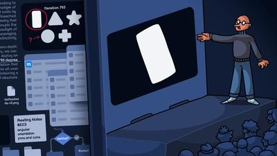
Wireframes establish purpose and functionality – mockups let teams explore the visual identity. Try different hero images, color palettes, fonts, and gradients as you work toward a look that everyone agrees upon. Putting two mockups side by side is a quick, cheap way to compare design directions without building interactive prototypes for both – especially useful early in a project, when its visual identity is still taking shape.
Align and inspire the team
Use mockups to build cohesion and momentum. Give your copywriters and graphic designers the context they need by setting colors, font sizes, spacing, and proportions early. They'll work faster and with less back-and-forth when the layout is close to its final form. And, as the design starts to feel more like the eventual product – and the team sees their work taking shape – their enthusiasm will build.
Find problems early
The narrative flow of a webpage isn't always apparent until real copy and visuals are in place. That's when you notice sections in the wrong order, gaps in the story or logic that need filling, or a mismatch between the writing and the imagery. Use a mockup to identify these kinds of issues. Rearranging blocks or adjusting content density only takes seconds at this stage, versus hours once development is underway.
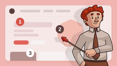
Make feedback more concrete
Some stakeholders engage easily with wireframes; others need to see something closer to the real thing before they can provide useful input. A mockup gives them that. And whereas wireframes invite structural feedback, mockups allow for conversations that are more about tone, messaging, and branding. They close the gap between what the designer imagines and what everyone else can see.
Skip the prototype to save time
If your dev team already works with an established design system, they don't need a pixel-perfect prototype to start building – just an accurate layout, realistic content, and clear component specifications. Give them a well-built mockup and they can get to work. This is common in data-heavy industries like finance, healthcare, and logistics, where accuracy matters more than visual polish.
How to create a website mockup: a 6-step process
This guide assumes you've already decided on your website's purpose, audience, and content. But, if you're still in the exploration phase, doing research, brainstorming, and planning – don’t worry. With Moqups, your whiteboards, flowcharts, and sitemaps can all live in the same workspace, so you don't need to switch tools when it's time to start designing.
Now, if you're ready to create your website mockup, here are six quick steps to get you there.
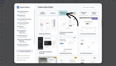
Step 1: Create a free Moqups account
Sign up at moqups.com – it’s free, no credit card required. Moqups runs in the browser, so there’s nothing to install, and your whole team can access the same project from anywhere.
Step 2: Start with a wireframe or template
Every good mockup starts with a solid structure. You can start from one of our website wireframe templates, or build a wireframe from scratch using our drag and drop library of grayscale components. At this stage, focus on basic layout blocks, content hierarchy, navigation, and page flow. These structural choices are much easier to make before any detailed design elements are added. For a complete walkthrough of this lo-fi process, see our guide on how to wireframe a website.
Step 3: Customize the structure and content hierarchy
With your wireframe in place, start customizing it. Add or remove elements, resize sections, and reorder the blocks to fit your needs. Decide what messages deserve the most visual prominence, how much space your content requires, and where the calls-to-action should sit. If you’re working with a copywriter, bring them in so they can write directly on the page, matching their text to the layout’s proportions and density.
Step 4: Introduce branding, colors, typography, and graphics
This is where the wireframe starts to become a mockup. Replace the grayscale palette with your brand’s own colors and fonts. Swap all the placeholders with actual images, icons and graphics. With Moqups’ replace tool, just drag the new elements onto the old placeholders and go from lo-fi to mid-fi in minutes. Remember, the goal isn’t pixel perfection – it’s to establish a visual direction your stakeholders can respond to.
Step 5: Add real content and refine proportions
Replace any remaining ‘lorem ipsum’ or dummy text with real headlines and copy. Once you’ve added that content, refine the spacing and proportions until the visual weight feels balanced and the page reads fluidly. For data-heavy designs like dashboards or admin panels, import CSV data directly into your charts to see how your visualizations look with actual numbers in place.
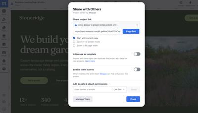
Step 6: Share, gather feedback, and iterate
Share the project link with your team, stakeholders, and – if possible – end users. Work together – async or in real time – by leaving comments and notes directly on the design. The kind of feedback you’re looking for depends on the mockup’s purpose: broad reactions to visual direction if you’re still establishing that, or detailed rules and requirements if the mockup is intended as a spec for developers.
Website mockup examples
Nothing explains a website mockup better than a few concrete illustrations. Here are five examples from the Moqups template gallery, each designed for a different use case. Every one of these samples is a working template that you can open and use as a starting point for your own project.
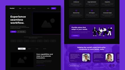
SaaS website landing page
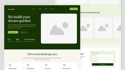
This template lays out a complete SaaS landing page: hero section with a value proposition and CTA, feature highlights, social proof, and a conversion-focused footer. It's built at mid-fidelity – enough detail to evaluate layout and hierarchy, but with room to add your own branding and copy. It’s a good starting point if your team wants to work on the overall structure before the visual design work begins.
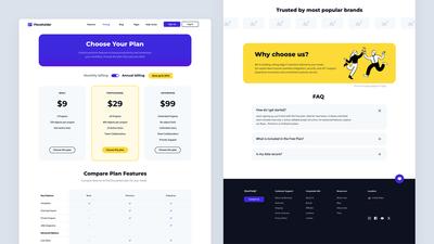
Pricing page mockup
A single-purpose page focused on plan comparison and conversion, with tiered pricing columns, feature comparison rows, and prominent CTAs. Pricing pages are deceptively complex since small changes in how the information is grouped can dramatically affect user decisions. This is why it’s important to mock them up – and work through all the options – before development begins.
High-fidelity website mockup
This template shows what a website mockup looks like at the higher end of the fidelity spectrum – refined typography, realistic imagery, and precise spacing. If your team needs a near-final visual reference before handing off to developers, this is the level of detail to aim for. Compare it with the mid-fi examples above to see how much difference fidelity makes, even when the underlying process is the same.

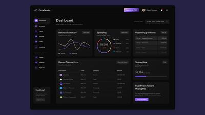
Financial dashboard
Dashboards are a different kind of website mockup challenge – dense data, multiple visualization types, and navigation built for daily use. In data-heavy industries like finance, insurance, and healthcare, the mockup is often created by engineers and domain specialists who understand the requirements better than a designer would. And if the dev team already works within a design system, they can build right from the mockup.
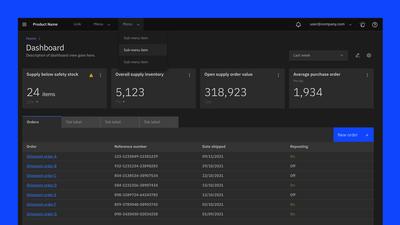
Carbon Design dashboard
Built on IBM's Carbon Design System, this template shows how a website mockup can work within an established design framework. The visual language – components, spacing, interaction patterns – is already defined by the system, so the mockup's job is to specify what gets built, not how it should look. This is another scenario where non-designers – product managers, business analysts, domain specialists – can create mockups that a development team can implement directly.
All of the templates above are available in the Moqups template gallery. Pick the one closest to your use case and start customizing!
Make mockups work for your team
The whole point of a website mockup is that you don't have to jump from a blank page to a polished design. Start with structure, add branding and content, then refine based on feedback. Each step increases fidelity, and each step gives your team another chance to iterate – or course-correct – before the expensive work begins.
For some teams, the mockup is just a stage on the road to a pixel-perfect prototype. For others – especially those in data-heavy industries with established design systems – a mockup is actually the final deliverable. Either way, the process is the same: mock it up, get feedback, and iterate until the design is right.
Moqups is built for exactly this workflow. It's easy enough that non-designers can contribute from day one, flexible enough to take a project from rough wireframe to polished mockup, and collaborative enough that every voice on the team gets heard.