Outline panel
We've made it much easier to navigate through the structure of complex projects. This is particularly useful if you have many elements on your pages. Also, it should make it much easier to work with those compound stencils from the Material Design, Bootstrap or iOS kits.
But there's more to it! You can now assign meaningful names to the items on your page. Doing this helps you easily find them later on and stay organized as the complexity of your pages will grow. Your colleagues will also appreciate it.
Do you have work in progress that you need to hide because you're not ready to show it yet? You can hide it by toggling the visibility of your stencils. It even works for groups!
Here's the summary of this new feature:
- Click the
Outlineicon on the left sidebar to open the new panel (or pressALT+3) - To select objects, click the items in the outline tree. If the selection is a group, you can expand it by clicking the left arrow icon and access its inner structure
- Hovering the items in the outline tree will highlight the corresponding objects on the page with a blue border
- Double click the items in the outline to rename them
- To toggle the visibility of your items, hover them in the outline panel and then click the small eye icon
- Search for specific objects from the top search input
@mentions in comments
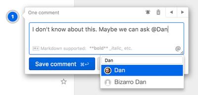
Do you need to draw the attention of your collaborators or team members on a specific comment thread? Do this by mentioning them in a comment. You've already used this functionality on those time wasting social networks. To mention someone, type the @ character, followed by the first letter of their name, username or email. An autocompletion popup with suggestions should show up once a match is found. You can also trigger it by clicking the small "@" button on the bottom right of the comment popup. Once you send the comment with @username mentions, those users will get an email notification.

Select text in view mode
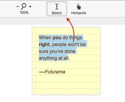
Selecting text in the viewer was not possible until now. This made it hard to share copywriting content with your peers. This functionality was conflicting with the interactivity features (e.g. hotspots), so we had to disable it. To fix this issue, we've added a Select text mode in the viewer. Click the button with the cursor icon on the top toolbar of the viewer to enable this mode. Once toggled, all the texts on the project will be selectable so you can copy them to the clipboard.

Inspector align toolbar
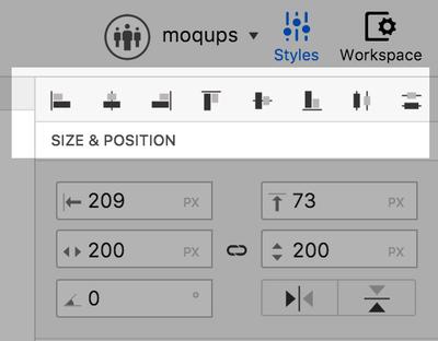
We've added a toolbar for getting a speed boost when aligning your objects. No more extra clicks. We made sure it stays sticky if the inspector needs scrolling, so you’ll always have it handy when you need it. One of our customers was persuasive enough to make us start a hackathon and deliver this within a day. Thank you!

Hide contents outside page
It's now possible to clip the content that's sitting outside the page bounds. We've noticed that some users find it useful to have objects sitting outside the page for easy reusing, while others like the app to automatically hide the excess content. What to do, what to do? This is now an option in the workspace settings, below the page size inputs. Yet another heavily requested feature that we implemented during a productive coding spree.


