If you’re already working with wireframes, or just seeking the right solution for your team’s wireframing and prototyping needs, you’ve probably encountered the terms ‘low fidelity’ and ‘high fidelity’.
The general meaning of lo-fi and hi-fi isn’t that hard to intuit. But if you’re a founder, designer, developer, business analyst, product manager – or any part of a cross-functional team – it can be useful to dig a little deeper.
Understanding fidelity, in the specific context of UX design, can help you build both a better product and a more efficient team. So, let’s take a look at wireframing’s importance in development, explain the difference between low and high-fidelity wireframes, and discuss how you can use both of them to maximum effect.
What is wireframing?
The term ‘wireframe’ predates its current use in digital design. Web and app designers borrowed the term from the world of CAD (computer-aided design) and CGI animation. And they, in turn, borrowed it from earlier fields of car modelling, stop-motion animation, and sculpture.
In fact, most people are first exposed to wireframing when they’re children in primary school, and use chicken-wire to build frames for their papier-mâché puppets, masks and dinosaurs!
In each of these cases, a wireframe serves the same purpose: to act as a rough approximation of the final product before the addition of final elements like surfaces, skins, colours, textures, lighting, etc.
Think of a wireframe as the blueprint for a final design. It makes sense to experiment with this kind of skeleton – early in the design process – before a lot of time and money has been invested in a polished product, or the final coding begins.
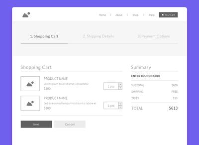
To get a sense of what wireframing looks like in web design, here’s a wireframe of a shopping cart, taken from our e-Commerce Website template bundle. You can see that most of the important elements of the page are already in place. However, instead of full-color, branded graphics, and descriptive content, the wireframe uses generic placeholders:

To dive more deeply into the wireframing process, check out our article, How to Wireframe a Website: A complete guide.
What does fidelity mean in UI design?
In the same way that the notion of ‘wireframing’ was drawn from pre-existing design practices, the term ‘fidelity’ has been borrowed from the world of sound recording. In the early days of records and radio, low and high fidelity referred to the quality of music recording and playback.
Similarly, in mobile app and web design, fidelity refers to the level of detail in a wireframe, mockup, or prototype. We often talk about low-fi and hi-fi as though they are distinct categories, but what they really represent are the beginning and end points in a product’s design evolution.
Think of fidelity as a spectrum of detail and interactivity.

At the beginning of that spectrum, you’ll find analog paper sketches, as well as low-fidelity digital wireframes. Both use temporary placeholders to represent the basic design elements of a webpage or device screen. And both are useful when sketching out first iterations of an idea.
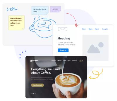
Then, with each new refinement, the product’s representation evolves naturally from wireframe to mockup to prototype – shifting from lower to higher fidelity. Placeholders get replaced, first by draft versions, and then, ultimately, by final renditions of the product’s copy, content, graphics, and branding.
At the tail end of the spectrum is a high-fidelity, fully interactive, clickable prototype that’s almost indistinguishable from the real product – and perfectly suited for user testing.
Although, as we will see, the terms used to describe wireframing can both be quite flexible, this will give you a rough sense of what the range of fidelity looks like:
- Wireframe: Low-fidelity, in monochrome, with placeholder images and text.
- Mockup: Medium-fidelity with draft copy, images, and colors.
- Prototype: High-fidelity with branding, final images, approved copy – and interactivity added.
Although this is the typical process, teams often begin anywhere, and jump back and forth between low and hi-fi. So let’s take a look at both low and high-fidelity wireframes, and discuss both the advantages and disadvantages of each.
What are low-fidelity wireframes?
Low-fi wireframes act as the initial blueprints for web pages and app screens – a rough approximation of the final product. They’re especially useful in the early stages of product development because they put the focus on pure functionality, not aesthetics.
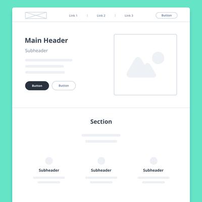
Accordingly, they’re rendered in a monochrome palette – deliberately excluding specific details like colours, fonts, logos, and exact sizing. Instead, low-fidelity wireframes use image placeholders and basic shapes to indicate what elements will ultimately populate a page. Generic ‘lorem ipsum’ text or ‘redacted’ fonts stand in for future content and copy.
Here’s one of our low-fidelity wireframe templates to give you a sense of what all this looks like in practice:

Advantages of Low-Fidelity Wireframes
Low-fidelity wireframes are an important stepping stone between user-flow diagrams and hi-fi prototypes. And it’s precisely their lack of detail that makes them so valuable – and gives them a slew of advantages:
Capturing ideas: Because low-fi wireframes are quick to create, you can get valuable ideas out of your head before they disappear. Just a few clicks can move an abstract idea all the way from concept to creation, maintaining momentum for both you and your team.
Foundational work: A low-fi wireframe’s lack of detail can help your team focus on the fundamental functionality of your product, and its user-experience. Designers can check their assumptions with stakeholders – early in the game – and come to a quick consensus about what needs and doesn’t need to be on the screen, optimal density and spacing, and what information they want to collect and communicate.
Painless iteration: It’s always better to experiment before too much time and effort has been invested in any particular look. The best thing about low-fidelity wireframes is that they’re easy to change – or even discard. And, with a wireframing tool like Moqups, lo-fi layouts are simple to create, so anyone in a cross-functional team can mock up their own variations, or suggest a new approach. Hearing all voices – especially in the early stages of design and development – is one of the best ways to build consensus and optimize user experience.
Streamlined workflow: Nothing is more damaging to momentum than wasted effort and needless backtracking. A low-fi wireframe lets your team resolve basic questions about content, layout, and product requirements before committing to a pixel-perfect digital prototype. By building upon solid decisions, team members can avoid reworking elaborately-rendered assets after the fact. And because lo-fi isn’t very time-consuming, teams can quickly mock up an entire user-flow. By establishing the scope of a project and its information architecture, your team can get early buy-in from stakeholders, and prevent later disappointment from misaligned expectations.
Disadvantages of Low-Fidelity Wireframes
Low-fi wireframes have lots of advantages, but only when they’re deployed at the right time, and for the right purpose. Because of their lack of refinement and detail, they also have a couple of drawbacks you need to consider:
Low visual impact: If the goal is to convey the look and feel of your future, finished product, then a low-fi wireframe is probably not the right choice. Their unpolished nature makes them less impressive than high-fidelity wireframes. This makes them unsuitable for some kinds of investor pitches and client presentations – especially if your stakeholders are unfamiliar with the design process. In these cases, a high-fidelity prototype can provide more ‘wow’ factor by mimicking the product’s eventual visual design.
Insufficient for tests: During the development process, UX designers will often use a low-fi wireframe to create a rough, clickable prototype by adding interactions. Low-fidelity prototyping can work well for the purposes of internal experimentation, but it’s often inadequate for public user testing. That’s because low-fidelity prototypes lack a full set of visual cues (shape, color, text, spacing). As a result, users may be slow to navigate the UI – and that can make it hard to accurately assess a product’s usability.
Before we turn our attention to hi-fi, here’s a brief summary of low-fidelity’s pros and cons:
Low-Fi Pros
- Quick to build, easy to iterate
- Focuses on function not aesthetics
- Establishes consensus early on
- Works out flow before costly content
Low-Fi Cons
- Less inspiring than hi-fi
- Lacks full interactivity
- Inadequate for unmoderated testing
- Unsuited for investor pitch
What are high fidelity wireframes?
High-fi wireframes are thrilling because they mimic the look and feel of an app or website – before it’s actually developed. They normally include all the branding, copy, colors, logos, fonts, and graphics that will be part of the final product.
Hi-fi wireframes are most useful at the tail end of the design process, after the initial user-research is complete, and underlying decisions about both layout and content have been made. If you plan on working in high-fidelity, check out our article, High-Fidelity Wireframes Explained by our Designer: Uses and Examples, for some great tips and insights.
A high-fidelity wireframe becomes an actual prototype once interactions, transitions, or animations are added. With clickable menus and buttons, hi-fi prototypes provide a visceral sense of the user experience. This allows teams to tweak usability before final design approvals, testing, and hand-off to the developers.
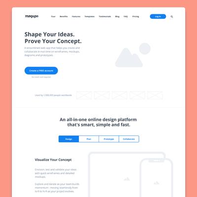
If you have your hi-fi content ready to go, here’s a high-fidelity wireframe template that you can quickly customize. Just swap in your copy, images, graphics, branding, and colors:

Advantages of High-Fidelity Wireframes
With their detail and interactivity, high-fidelity wireframes can provide an effective preview of your product, and offer your team a number of important advantages:
Inspire enthusiasm: The leap from low-fi to hi-fi can be inspiring for everyone involved. After laying the foundations in grayscale, it can be refreshing for teams to see their efforts rendered in full color and detail. And, from a realistic prototype, stakeholders, clients, and investors can better grasp the product’s true appeal. In fact, because of their high visual impact, founders sometimes create hi-fi wireframes at the very beginning of the design process – often using borrowed mood-board elements – just to give team members an early sense of their vision.
Refined feedback: Since high-fidelity wireframes capture the full look and feel of a product, they provide an essential opportunity for feedback in the advanced stages of visual design. The team gets a chance to review everything from big-picture issues like branding and user flow, to smaller details issues like type legibility and exact spacing. Collaborators can comment directly on the design – or even engage in live editing sessions with graphic designers, illustrators, copywriters, and developers. Precise feedback, on a highly detailed wireframe, lets the team make their final tweaks – and establish a final consensus on the project’s deliverables – before handoff to the development team.
Immersive experience: Adding interactions can bring a design to life by turning it into a clickable prototype. Interactivity can be added at any stage in your wireframing, but is most effective towards the end of the design process when your team may want to assess and refine your product’s usability. With active buttons and clickable menus, a high-fidelity prototype can mimic your actual app or website, and give stakeholders a real feel for the eventual user-experience.
Accurate testing: Hi-fi prototypes can be valuable assessment tools, especially if you have the resources to perform unmoderated user-testing. Sure, teams can perform guided tests with anything from paper wireframes to hi-fi mockups. But if your goal is to gather realistic data about user interactions and response times, or test specific UI components, then you’ll want to run unmoderated tests. And for that, you’ll need a high-fidelity prototype. A fully-interactive, clickable prototype will minimize human error and provide more accurate results.
Disadvantages of High-Fidelity Wireframes
With their refinement, detail, and interactivity, hi-fi wireframes and prototypes have a lot to recommend them. But because teams often make the mistake of building them at the wrong time, it’s worth reviewing a few of their drawbacks and down-sides:
Resource intensive: It only makes sense to work in hi-fi if you’re prepared to invest a lot of expertise. A credible high-fidelity prototype requires the involvement of UX designers, graphic artists, and copywriters. It may also require coordination with a myriad of outside collaborators responsible for elements like photos and videos. Creating detailed hi-fi assets – and incorporating them into a polished design – requires both time and money. And that can mean a longer and more expensive deliverable timeline.
Revision resistant: It’s much easier to experiment before everybody’s webbed to a specific design. Because hi-fi prototypes take a lot of effort to create, it’s easy for the team to become deeply invested in a particular approach. At that point, it can be painful to change direction. Altering a hi-fi asset may leave team members the feeling that they’re ‘back to square one’, or have done a lot of ‘wasted work.’ Although much may have been learned through the process, this can still lead to loss of momentum and demoralization. A related problem is that, once stakeholders have seen an inspiring hi-fi rendition, they may become impatient for deployment. The combination of these two factors can discourage exactly the kind of radical revision that’s often needed – and lead to a sunk cost fallacy.
Here’s a brief summary of a high-fidelity prototype’s pros and cons:
Hi-Fi Pros
- Offers look and feel of final product
- Clickable and interactive
- More accurate for user testing
- Delivers design requirements for dev
Hi-Fi Cons
- Needs a longer timeline
- Requires graphics and content
- Iteration takes time and effort
- Polished work discourages feedback
When to go high and when to go low?
High and low fidelity wireframes are really just the bookends for an entire spectrum of fidelity. In practice, most teams move fluidly through that range as their projects evolve, incorporating both hi and low-fidelity elements.
For instance, if you’re working on a new page for an established website – or a new feature for an existing app – your team may jump-start their wireframing by adapting existing designs. They’ll superimpose lo-fi elements on top of hi-fi screenshots to work out the new configuration. Closer to development, they may refine those low-fidelity elements, or simply hand off the work, knowing that the dev team’s already familiar with the branding requirements.
Another example of a hi/low-fi hybrid is when copywriters jump into the design process early in the game. The scope and nature of written content depends heavily on the user-flow, page-layout, and available space. So, in order to create better overall cohesion between copywriting and UX/design, it often makes sense for copywriters to compose directly onto a low-fidelity wireframe. In these cases, the copy goes hi-fi long before the graphical elements, and often dictates design, rather than the other way around.
The Nielsen Norman Group has a great way of thinking about the question of fidelity within a wireframe or prototype. They point out that the level of fidelity can vary in three areas: Interactivity, Visuals, and Content. In other words, as your project evolves, your team will likely mix and match both high and low-fidelity elements from each of these areas, depending on the nature of your workflow.
This hybrid stage of wireframing – more detailed than lo-fi but less polished than hi-fi – is called medium-fidelity. Mid-fi mockups are where many teams – ours included – spend most of their time. For a more complete explanation, some practical use cases, and our own team’s insights, check out our Complete Guide to Mid-Fidelity Wireframes.

Understanding fidelity is important, but so is the freedom to pick and choose. So, the question isn’t about whether to go low or hi-fi, but about how to deploy the right level of fidelity depending on your team’s resources, timeline, and expectations.
At Moqups, we understand that any real-world workflow will inevitably be both messier – and more organic – than any predefined descriptions. That’s why our app is designed to give your team maximum flexibility. With Moqups, you can begin anywhere – in lo-fi or hi-fi – and then jump back and forth, depending on your requirements.
Our app is simple to use, and has a huge template library. So, why not save time and kickstart your app or website design by choosing one of our free wireframe templates and examples.
And because Moqups is an all-in-one collaboration platform, your team can go beyond wireframes and prototypes, and collaborate in real time on digital whiteboards, diagrams, flowcharts, and strategic frameworks – all within the same app and creative context.
No matter how your team incorporates fidelity in their workflow, and no matter where you are in the process of product design, Moqups lets your team work together in real time, hear from all your stakeholders, and leave feedback right on the design.
So, if you haven’t signed up yet, come try us out. Setting up an account is absolutely free!


