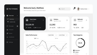
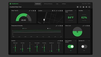
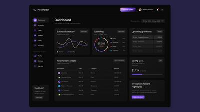
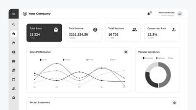
Wireframing dashboards can help teams align on business goals, get stakeholder buy-in, prevent scope creep, and make crucial decisions about data visualization before development begins.
This article is for users who are new to dashboard wireframing, and for teams who are already experienced in creating dashboards.
For those new to the process, we’ll start with a quick primer on dashboards and their most common use cases.
But, if you’re an experienced dashboard designer, and want to skip that explanation, you can just click down to our step-by-step guide on how to build dashboard wireframes in Moqups – and get right to work!
Here's what we'll cover in this post:
- What is a dashboard?
- What is the purpose of a dashboard?
- Who uses dashboards?
- What elements go into a dashboard?
- What is a dashboard wireframe?
- Why wireframe a dashboard?
- How do I make a dashboard wireframe in Moqups?
What is a dashboard?
Digital dashboards are named after automobile dashboards and serve the same basic purpose. A car dashboard provides real-time data about the car’s system to help drivers make informed short term and long term decisions. Its display also provides alerts to warn of impending problems.
Online UI dashboards do the same thing for an app or website. They aggregate data into a central hub so teams of all kinds can monitor performance, get insights, and take action.
What is the purpose of a dashboard?
- To pull together relevant data on a single screen
- To provide at-a-glance info that users need to do their job
- To track performance, spot trends, and aid in forecasting
- To help teams and individuals make informed, timely decisions
- To provide alerts and warnings about immediate issues
Who uses dashboards?
Dashboards are used by any kind of company or team that needs to monitor performance, spot trends, and take action based on relevant data.
In their article, Dashboards: Making Charts and Graphs Easier to Understand, the Nielsen Norman Group breaks down the classification of dashboards into two basic types: Operational and Analytical.
Operational dashboards provide both monitoring and controls for users engaged in time sensitive tasks for complex administrative or industrial systems: Health Care, Manufacturing, Energy, Customer Service, Shipping, Finance, IT Operations, Logistics, and Supply Chain Management.
Analytical dashboards tend to be less time sensitive, and offer at-a-glance information and diagnostic data needed for business intelligence analysis, and for both strategic and tactical decision making: Sales, Marketing, E-Commerce, Human Resources, and Educational Administration, and Website Management.
What elements go into a dashboard?
Dashboards use different kinds of data visualization in the form of charts, graphs, or tables. The hierarchy of that content is typically arranged in an easy-to-read layout that may include navigation, sidebars, filtering. Operational and IoT (Internet of Things) dashboards may also include device controls.
What is a dashboard wireframe?
A wireframe is the blueprint for the final dashboard design and typically goes through three stages of design and development:
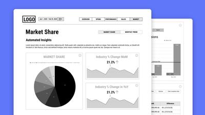
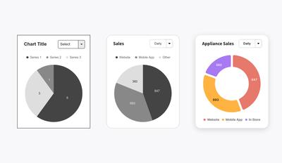
Low-Fidelity Wireframe: This quick draft uses grayscale and temporary placeholders. This deliberate lack of detail helps teams iterate freely before the design is locked in place. Lo-fi wireframes are used early in the design process, to get feedback from end users – and sign-off from stakeholders.
Mid-Fidelity Mockups: Once there’s consensus on the basic layout, teams add realistic data, fonts, and colors to move closer to the final design. Mid-fi mockups allow teams to experiment with different forms of data visualization and color palettes to maximize readability under typical user conditions.
High-Fidelity Prototypes: This is the last stage before hand-off to the developers. Hi-fi prototypes reflect the look of the final design with all the dashboard elements and branding locked in place. Teams often add interactivity to mimic the feel of the end product. This allows them to test the design with stakeholders and end users before coding begins.
Why wireframe a dashboard?
The international data-consultancy firm, Decision Foundry, specializes in creating dashboards for their clients. In our case study, How Decision Foundry uses Moqups to deliver better data experiences, CEO Ross Jenkins highlights some compelling reasons to wireframe dashboards early in the design process. Here’s a brief summary, along with some tips and best practices of our own.
As with any wireframe, most of the benefits of doing this with dashboards have to do with ease and speed of making changes and adjustments while still working with a low-fidelity mockup.
Get everyone on the same page
Building a wireframe at the beginning of the process helps ensure that the design and dev team are aligned with the client’s expectations and business goals. This helps establish a co-creation environment from the get-go.
Prevent scope creep
In initial meetings, wireframe examples help stakeholders come to consensus about the required scope and content of the dashboard before the development process begins. This way, projects stay on deadline and on budget.
Avoid disappointment
It’s absolutely essential to get early approval on a working draft before committing time and resources to a high-fidelity design. Going forward without that vital sign-off is a recipe for frustration on the part of both the design team and your stakeholders.
Make data count
Screen territory on a dashboard is limited, so stakeholders need to decide which data is most actionable. Having quick mockups helps clients make tough decisions about what data to include. It also gives them a chance to check with their tech team about the feasibility of gathering and displaying it.
Get timely feedback
Teams can share lo-fi wireframes with end users to get their ongoing input at key stages in the design process. Getting their feedback – right on the basic design – helps ensure their needs and priorities will be accurately reflected in the final product.
Maximize usability
Make sure that your screens are easy to understand at a glance. To create the best user experience, iterate with different layouts and data content. Optimize the design for the context in which they’ll be monitored. An office, an emergency room, a factory floor, and a windmill farm each have different readability and device requirements.
Ensure consistency
Creating a bare-bones wireframe template can ensure consistency as multiple teams develop multiple dashboards. It also allows teams to customize performance metrics in a way that is personalized for different levels of access or management.
How do I make a dashboard wireframe in Moqups?
Moqups is the perfect tool for creating dashboard wireframes. We have all the elements you need, so you don’t have to add any extra packages or kits. Simply drag and drop charts or graphs from our library, paste in your real CSV data, and customize to fit your use case.
Step 1: Create a Moqups account
It's free to sign up to Moqups. There’s no credit card required, and you can start building your dashboard in minutes!
Step 2: Make a basic layout
Start from a blank page, from one of our own admin dashboard templates, or build over a screenshot from an existing UI. Use our stencil and icon libraries to add the basic elements of your layout, including titles, charts, graphs, tables, sidebars and navigation.
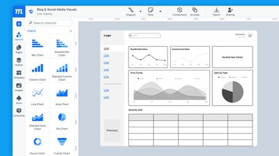
Step 3: Iterate and experiment
While you are still in the lo-fi stage, rearrange freely to try different layouts and configurations. Collaborate with your stakeholders to pick the one that best reflects their priorities. If they use filters to drill down on the data, add those icons and document the requirements with annotations right on the design.
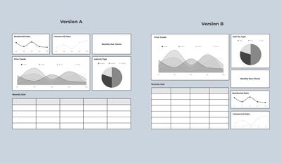
Step 4: Add data and visualization
Move from low to mid or hi-fi by adding your real data via CSV. Use our quick chart switcher to pick the right visualization for each metric you display. At this point, you can also style your charts, experiment with different palettes, and add your graph legends.
- Here's a quick primer about the types of charts and graphs available in Moqups, and the main use cases for each kind.
- For best practices, the NN Group has a great video on Data Visualizations for Dashboards that discusses different visualization styles, and focuses on the pitfall of some charts and graphs.
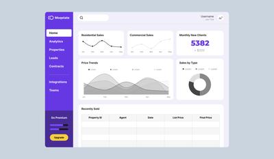
Step 5: Make it real
This is the final step before hand-off to developers. Once the layout and decisions are done, you can add high-fidelity design elements like branding and color schemes. If you want to mimic the feel of the final product, add some basic interactions to your links or filters. Share the design with stakeholders via project link in order to get final approval.
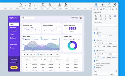
Ready to build your dashboard?
Why not start with one of our pre-made dashboard wireframes? Whether you’re building an analytical or operational dashboard, we have professionally designed templates that you can easily customize and adapt to your specific domain and use case.

