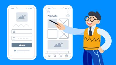
In the world of websites and mobile apps, a wireframe is a monochromatic, low-fidelity design that acts as a rough draft of the final product.
UX designers, founders, business analysts, and product managers use wireframes to work out fundamentals – like page layout, user flow, and information hierarchy – before adding high-fidelity elements like colors and branding.
So whether you’re a beginner looking to create your first wireframe, or an experienced UX designer looking for a quick primer, we’ve put together this guide to help you better understand both the wireframe’s purpose and its value in a design process.
Here’s what we’ll cover:
- A definition of wireframing
- What are wireframes in UX?
- Wireframe vs Mockup vs Prototype
- Why should you use wireframes?
- How do you create a website wireframe?
- Wireframe examples that you can edit
- Conclusion
A definition of wireframing
A wireframe typically consists of generic placeholders like simple shapes and lorem ipsum text that can help teams focus on basic decisions about information architecture and functionality rather than polished design elements.
This lack of detail makes wireframing valuable in the early stages of the design process, as teams decide how to bring the concept to life – and figure out what the screens or webpages should look like.
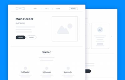
Because they’re so quick and easy to create, low-fidelity wireframes help teams explore competing design options and experiment freely, before investing time and resources in a final, high-fidelity design or prototype.
What are wireframes in UX?
In mobile app and web design, UX (User Experience) and UI (User Interface) are related but distinct concepts. Although there’s a lot of overlap, and both contribute to how satisfied customers are with a product, here’s the basic distinction:
- UX design focuses on the functionality and usability of a product, guaranteeing that it’s easy to use, works as expected, and meets the user’s needs. We’ve all used products that were aesthetically beautiful, but a pain to use in practice. That’s a failure of user experience design.
- UI design focuses on the look and feel of a product, especially how those aesthetics contribute to delight for the user and a faithful expression of the brand. For instance, we’ve all used terrifically functional products that, nevertheless, looked and felt utterly uninspiring. That’s a failure of the user interface design.
When both the UX and UI have been well designed, a product looks stunning and feels great to use.
Although UX design plays a role throughout the entire design process, it is particularly important in the early stages. That’s when design teams and their stakeholders make the most fundamental decisions about the product’s design, functionality and user flow.
Because wireframes are quick to build and easy to modify, they’re great for…
- Making abstract ideas concrete
- Conveying concepts without having to build a polished prototype
- Focusing on the user experience rather than the user interface
- Soliciting early feedback from stakeholders and clients
- Encouraging participation, experimentation, and iteration
- Identifying key issues and solving problems proactively
In practice, wireframes act as blueprints for the later designs, helping teams build consensus about basic user flow, as well as page layout, content and density. And all this happens before teams worry about branding, or about detailed visual design elements like fonts, colors and images.
Typically, wireframing continues along refinement process – from low-fidelity wireframes to mid-fidelity mockups, and then finally on to high-fidelity wireframes and prototypes.
If you want to dive deeper into the full design process, check out our article, Low Fidelity vs High Fidelity Wireframes: Which should you use?
Wireframe vs Mockup vs Prototype
These terms are often used interchangeably, but they each reflect three distinct stages within the design process.
We’ll discuss each of these three stages below but, if you want a more in-depth, point-by point comparison, take a look at our article, Wireframe vs Mockup vs Prototype: What’s the difference?
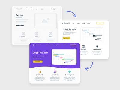
Think of the design process as an overarching spectrum of refinement and detail – called ‘fidelity.’ At one end are low-fidelity wireframes that represent the bare bones of the product. At the other end of the spectrum are fully fleshed-out, hi-fidelity wireframes and prototypes that are accurate visual representations of the final product. Somewhere in the middle lies the mid-fi mockup.
In a typical design workflow, here’s what those three stages look like:
Low-Fidelity Wireframes
UX designers, analysts, and founders work in lo-fi – using grayscale placeholders, simple shapes, and generic ‘lorem ipsum’ text – to communicate initial ideas, clarify concepts, structure pages, define user flows, and get early buy-in. Lo-fi wireframes focus on functionality and usability rather than aesthetics.
Mid-Fidelity Mockups
Draft interface elements – like semi-realistic headers, colors, photos, sketches, and copy – are added to a low-fidelity wireframe in order to create a medium-fidelity wireframe – or what we call a ‘mockup’. Providing a rough glimpse of what the product will look like, a mockup can help inspire the design team, get everybody on the same page, and secure sign-off from stakeholders.
High-Fidelity Wireframes and Prototypes
At the end of the design process, teams create high-fidelity wireframes by adding the final, pixel-perfect content. That includes client-approved copy, typography, and graphics – along with the brand’s color palette, wordmarks, and logos. The goal here is to mimic both the look and feel of the final product. This way, the designers can get final sign-off, and the dev team knows exactly what to build. For a deeper dive, check out our article, High-Fidelity Wireframes Explained by our Designer: Uses and Examples.
When interactivity is added to a hi-fi wireframe, it becomes a ‘prototype’. The clickable elements of a prototypes simulate the interactions of a mobile app or website. This makes them perfect for testing the user interface and user experience with actual users! Prototypes represent the last chance to make changes before coding begins.
Of course, this is just a typical, and highly idealized design process.
In practice, each project has its own workflow that reflects the budget and timeline, the team and its resources, the nature of the product, and the expectation of the stakeholders.
For example, some design teams might add interactivity right to the lo-fi wireframes; some may start with mockups or prototypes and jump over the wireframing stage altogether; and, if a dev team understands the requirements and specification of a project, they may only need a wireframe – not a prototype – to move forward.
Nevertheless, teams working in the UX design field tend to love wireframing because it provides such clear benefits for the extended design process.
Why should you use wireframes?
There are a myriad of benefits to the wireframing process. Here are the most compelling ones:
1. Stronger Collaboration
No matter where you are in the development process, wireframes enable effective visual collaboration. For instance, founders can share their vision with potential team members and investors. And established design teams can communicate concepts clearly to their clients, end users, and each other.
2. Faster results
Inexperienced teams may be tempted to jump over the wireframing stage and start right with high-fidelity designs. After all, it’s counterintuitive to add an extra step when you’re looking for fast results.
But, with low-fidelity wireframes, teams can focus on functionality and usability first – and ask the right questions at the right time. Early feedback and validation is crucial, because nothing’s worse than presenting a final design to a client, only to realize that there’s been a significant miscommunication.
The wireframing process lets teams share requirements, fix errors, and get buy-in early in the game. This minimizes needless back and forth, maintains momentum, and helps teams avoid the discouragement of going back to square one to start again.
3. Better product
A streamlined design process, and clear communication, inevitably leads to a more competitive and user-friendly product.
During the exploratory stage of any new product, design teams tend to work on three tracks. The first captures the vision of the new mobile app or website. The second looks at the existing market and competitors. The third engages in user research for early feedback.
With low-fidelity wireframes, nothing is locked in stone and everything is easy to change. That means that teams can explore widely, experiment freely, and iterate quickly to accommodate new ideas, research and user input. Ultimately, that results in a better user experience and a more effective product.
How do you create a website wireframe?
In the past, designers used pen and paper to sketch out their initial ideas. But given the scope and complexity of current user interfaces, most teams prefer to use online wireframing tools like Moqups.
Our article Top Figma Alternatives for Wireframing in 2026 surveys the most popular apps in this space, and details the advantages of Moqups’ all-in-one approach.
Because Moqups is browser-based, team members can collaborate on digital wireframes – from anywhere – both async and in real time. And they can brainstorm, whiteboard, diagram and wireframe, all within the same app.
Moqups lets you drag and drop design elements directly onto the page. And, with thousands of stencils, icons, and reusable components, Moqups makes building a professional wireframe both quick and effortless. To get a sense of what our app can do, check out our short video tutorial.
And, if you’re looking to create a solid foundation for your project, or want deeper insights into the UX design process, check out these 10 steps on how to create a website wireframe with Moqups.
Wireframe examples that you can edit
If you are creating any kind of mobile app or website, you don’t have to start from scratch. Using a premade template can kick-start your initiative, save you time, and help you build on established best practices for your basic design.
Browse our library of 100+ professionally designed wireframe templates, choose the one that best suits your use case, and start customizing it to fit your needs!
Here’s a quick preview of our most popular types of wireframes:
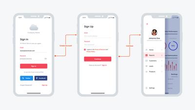
1. Mobile App Wireframe
If you’re creating a mobile app, this template can be a great bridge between your initial idea and final product. Use the series of mobile screens to design the basic functionality, navigation, and user flow. Then customize them to reflect your brand and prove your concept!
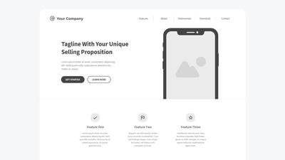
2. Landing Page Wireframe
An effective landing page can capture organic traffic, improve SEO, build brand awareness, and convert visitors into leads. Our landing page wireframe template can help your design team visualize the most important elements of your layout – and act as a terrific starting point for customization and iteration.
3. E-commerce Website Wireframe
This e-commerce website wireframe bundles together the most important web-pages for an online store: Home, Shop, Product, Cart, Shipping, and Payment. Use this template to build the basic blueprint and user experience for your online store.
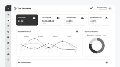
4. Admin Dashboard Wireframe
Want your team to make informed decisions and take meaningful action? With a Business Intelligence dashboard, they can visualize analytics, track trends, and display key performance indicators. Our dashboard wireframe bundle includes page layouts for Sales, Views, Visitors, User Details, and more.
Conclusion
If you’re thinking about integrating wireframes into your own design process, here’s a quick recap of their benefits:
- You can quickly visualize and communicate the initial concepts
- They’re great for exploring a range of design options
- Every member of the team can contribute new ideas
- Stakeholders are likely to give more honest feedback before designs are finalized
- In low-fidelity, the iterative process is quick and painless
- They help get early buy-in and sign-off from clients and end users
If you’re ready to start creating wireframes – either from scratch or from a template – just click the button below to get started with our free wireframing tool. No credit card is required!
