In discussions about wireframing, it’s easy to overlook the value of medium-fidelity wireframes. That’s because most articles (including our own!) put the focus on low-fidelity vs high-fidelity wireframes. That’s a shame because mid-fi wireframing is where a lot of teams – ours included – spend most of their time.
So, with this post we’ll try to rectify this oversight by focusing entirely on mid-fidelity wireframes!
First, we’ll start with a quick refresher about the purpose of wireframing and about the role of ‘fidelity’ in the process. Then, we’ll define medium fidelity and explain the advantages of working in that space. Finally, we’ll dive deeply into some practical use cases in order to show how you can make medium-fidelity wireframing part of your own team’s workflow.
But, if you’re already familiar with wireframing and fidelity, you can always skip the recap and jump right down to the mid-fi sections:
- What does fidelity mean in wireframing?
- What are mid-fidelity wireframes?
- What is the purpose of a medium-fidelity wireframe?
- When to use mid-fi wireframes
- How to create mid-fidelity wireframes
What does fidelity mean in wireframing?
If you’re new to the game and want a complete explanation of fidelity in wireframing, check out our post that looks specifically at wireframes vs mockups and prototypes. Here’s the tl;dr version:
Wireframes are rough-draft blueprints for app screens and web pages. UX/UI professionals use them to visualize ideas, iterate quickly, and build consensus. They’re also instrumental in securing approval before further design work or coding begins.
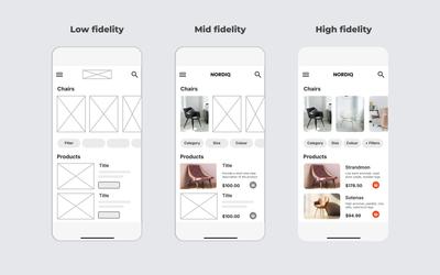
In the world of wireframing, ‘fidelity’ refers to the degree of realism and detail in the design. Think of fidelity as a spectrum with low-fidelity at one end, high-fidelity at the other, and medium-fidelity occupying the space in between.
The design process typically starts with lo-fi wireframes. These are built in grayscale with simple shapes, generic fonts, and dummy text used as placeholders for later content. At the end of the process are hi-fi wireframes, whose pixel-perfect layouts mimic the eventual product – and can be used for investor demos and user testing once interactions are added.
This post focuses on the work that connects those start and end points, as the rough draft evolves into something more detailed, precise and practical. That’s medium-fidelity wireframing – what we call mockups – and it’s the sweet spot that we’ll explore now.
What are mid-fidelity wireframes?
Mid-fidelity wireframes bridge the gap between low-fidelity and high-fidelity wireframes. They generally include draft versions of content and may also incorporate more realistic elements like fonts, logos, and colors. They provide a clear visualization of layout and functionality – like density, proportions, and navigation – without incorporating exact measurements or brand-accurate palettes and typography. Mid-fi mockups offer a balance between the simplicity of lo-fi and the precision of hi-fi.
One reason that mid-fi wireframes aren’t discussed too often is that they’re part of a refinement process that can take a different path with each new project. So, unlike low and high-fidelity wireframes, there’s no one-size-fits-all description that can possibly encompass all the different ways that teams work in medium fidelity.
In the actual design, no one refers to ‘medium-fidelity’. UI and UX designers just adjust their fidelity focus - either higher or lower on the fidelity spectrum - depending on the needs, experience and expertise of the team they’re working with.
That’s why we’ll examine a variety of practical use cases in the subsequent sections. Because the best way to understand mid-fi is to explore how it’s used by designers in the real world.
What is the purpose of a medium-fidelity wireframe?
Mid-fidelity wireframes are used to define the major elements in a design, establish a visual hierarchy and layout density, map user flows, and encourage feedback from relevant stakeholders. And since mid-fi wireframing doesn’t require precise dimensions or pixel-perfect graphics, it can easily be done by non-designers. This makes it an essential stage in any iterative design process.
As teams move from abstract design concepts to concrete layouts, they need to make a whole raft of decisions about the content required, and how users will interact with each screen. To help make those decisions, teams generally mock up lots of variations on a basic design to settle on the best solution (for example, do radio buttons or check-boxes work better in a specific context).
Medium-fidelity wireframes are just detailed enough to explore these UX nuances, but not so polished that they discourage honest feedback and criticism from end-users and stakeholders. At this stage of refinement, wireframes are typically accompanied by lots of annotations to help clarify requirements based upon that input. Additionally, mid-fi mockups can be used to get sign-off before a design is locked in – and resources invested in a hi-fi prototype or coding.

When to use mid-fi wireframes
To get a sense of how mid-fidelity wireframing might fit within your workflow, here are a bunch of practical use cases that answer the question, “When and why should I use medium fidelity wireframes:”
After low-fi wireframing is complete
Once you’ve established a basic layout in low-fidelity, mid-fi wireframes are the next logical step. They add crucial details like typography, hierarchy, button styles, and more accurate spacing, transforming rough concepts into workable representations. They’re especially useful for spotting layout constraints, testing usability, and making decisions around copy length and visual balance. The medium-fidelity stage helps teams validate their assumptions, smooth out rough spots, and identify UX issues before moving on to hi-fi designs.
When you want copywriters to be part of the process
Mid-fi wireframes allow copywriters to write directly on the actual layout, giving them a clear sense of how their content fits within the design's hierarchy and density. While writers can work with placeholder text and draft content separately, most prefer seeing their work in context. To enable this, designers can enhance low-fidelity wireframes by adding accurate text boxes, dimensions, and font sizes that reflect the final product.
When there is already an established design system
With a design system in place, developers don’t need pixel-perfect prototypes, but lo-fi wireframes may not provide enough detail. A mid-fi wireframe provides clearer guidance on spacing, layout, font hierarchy, and interaction types. This helps developers map the design directly onto existing classes and styles – and avoids unnecessary back-and-forth between design and dev teams. A mid-fi mockup with effective annotations is often all that’s needed for the design-to-code workflow to work smoothly.
During the design exploration stage
Medium-fidelity wireframes are a great way to explore visual direction without committing to a final design. With more context and visual nuance than low-fidelity sketches, they help teams have meaningful design conversations as they test layouts, content hierarchy, and early branding choices. They help teams move beyond boxes and labels, adding just enough realism to evaluate ideas and compare options before choosing a direction.
When working on revisions or site maintenance
Most website work involves updates – revising copy, testing new layouts, or refreshing FAQs and Help sections – not full rebrands. The fastest approach is to overlay the revisions onto existing screenshots. For this process to work, the wireframes need to closely match the original styling (fonts, colors, etc.) while incorporating new graphics. This level of detail enables stakeholders to confidently approve the changes, and the dev team to perform the updates.
As projects evolve to increase engagement
As team consensus builds, it’s natural to start adding realistic elements like draft copy, stock images, branding logos and colors. These mid-fi touches help everyone – especially clients – visualize the direction of the design and stay engaged in the process. Sometimes it’s about clearer communication; other times, it’s just to generate enthusiasm and inspire the team as they see their ideas take shape. One of the advantages of a wireframe tool like Moqups is that our app lets you gradually add fidelity to your wireframe without needing to switch tools and start over.
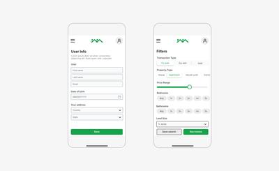
Where requirements are detailed and specific
Medium-fidelity is essential when wireframing logistics, healthcare, insurance, financial, and industrial apps. For these data-heavy designs, lo-fi layouts aren’t specific enough to communicate important data collection and display requirements. Tables, fields, and display logic need to be detailed accurately in order to reflect their real-world use. Before signing off on high-stakes designs, managers need realistic depictions of what end-users will see on their screens. These mockups don’t need to be fully-interactive or pixel perfect, but they do need to be accurate enough to approve safety-critical interfaces.
How to create mid-fidelity wireframes
Step 1: Sign up for free
Sign up for free with no credit card required. You can start from a blank page, one of our templates, or import screenshots from an existing UI and build upon those.
Step 2: Build a base layout
If you’re starting from scratch, you may want to create a basic layout in low-fidelity first. Use our full library of grayscale placeholders and lorem-ipsum text to get a rough draft of your design. Moqups also has a wide range of low, mid and high fidelity wireframe templates that make it easy to kick-start your project. Either way, adjust your layout by arranging and resizing the elements until the density, content, and flow are right for each page or screen. Once you’re done, it’s time to move to mid-fi!
Step 3: Write draft headlines and text
Replace any dummy text – either ’redacted’ fonts or lorem-ipsum placeholders – with real text. If the finalized copy isn’t quite ready, add draft text that’s realistic in both tone and length. Use our character counter tool to adjust the size of text blocks as you go. Then, choose representative fonts and sizes to establish a hierarchy for headings and body text. At this point, you can also add color and styling to enhance the realism of your design.
Step 4: Add images and branding elements
Drop in stock photos and graphics to communicate the feel and direction of your design. Our handy replace tool lets you drag new images right onto placeholders, so updates only take seconds. You can also edit pics and screenshots with our crop, patch and background removal tools. Then, begin to customize your design by adding branding details like typography, logos, and accent colors.
Step 5: Import realistic data to charts
If you’re working with graphs, and especially if you are building dashboards, accurate data visualization is important at this stage. Import CSV files to add representative numbers to charts and graphs, and then use our chart switcher to pick the optimal visualization for your data.
Step 6: Be specific about forms
This is where mid-fidelity wireframes have a huge advantage over lo-fi sketches! Make sure your data-collection requirements are reflected in the design. Choose the right inputs for user data and the right controls (radio buttons, checkboxes, dropdowns, etc) for selections. Being specific at this stage clarifies communication and avoids costly changes much further down the line.
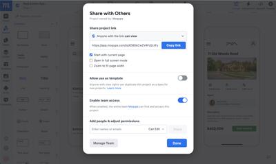
Step 7: Share and gather feedback
Throughout the process, you can collaborate in real time with stakeholders. You can edit together, mock up alternative solutions, and add feedback as both comments and annotations – right on the design. Once you are ready to share more widely, you can create a link to the project, or export as a PDF or PNG.