At Decision Foundry, we do data UX work, and create dashboards, applications, and automate reports.
We specialize in data products within performance marketing. We're certified Implementation Partners for Marketing Cloud, Datorama, Tableau, Tableau CRM, CDP and Pardot.
Quite simply, our primary goal is to create better data experiences for our clients, and Moqups helps us get there.
Since we have offices in New York, Charlotte, Toronto, and Bangalore, online collaboration is essential to our success. That's where Moqups has been a game-changer.
Moqups has helped us facilitate communication between all our stakeholders, build early consensus – and truly de-risk the entire development process.
Meeting the challenges of BI projects
BI projects can be very high-risk. A company may have invested tens of thousands, hundreds of thousands, or even millions of dollars in infrastructure and resources – hoping for new insight into their business – only to discover that what they've built isn't valued and doesn't get used.
At Decision Foundry, we want to make sure that doesn't happen, and that what we deliver drives value – and maps back to the client's original business purpose.
That's why, especially in the early design stages, it's so important to hear from all project's stakeholders. And not just the people who consume the data, but the folks responsible for pulling the levers; they're the ones who might say, “Sure, that's a cute metric or an accurate diagnostic. But it's not particularly useful because I can't act on it."
We believe in a co-creation environment. Every member of our team gets access to the Moqups project, as does the client. We need the client to see our ongoing work, and to leave comments and annotations before they ultimately sign off on it.
At any one time, we may be developing a hundred different projects – say for a large media holding company, a midsize agency, a local retailer, or an international bio-pharmaceutical firm – and we design them all within the Moqups platform.
How we work with Moqups
On a typical project, we’ll have about six or eight people in the team: a Solutions Architect, a Client Success Lead, a Project Manager, a couple of Implementation Engineers and a Solutions Lead, acting as a kind of player-coach. They’re someone who can roll up their sleeves and do the work but also strategic in their thinking.
We'll also involve our team of Front-end Developers. They’re the ones who will ultimately write the JavaScript and the CSS. Their job is to assess the proposal’s feasibility.
They also have access to the Moqups project so they can react to the wireframe and say, “Yes, this is doable. We have widgets that support this” or “Hey, no, we really can’t do that within the allotted time frame and budget.” Having them make that call at this point, while we are still at the wireframe stage, can save us more than 50 work hours later.
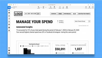
Most of our employees are analysts working with clients. They’re not UI/UX designers, so they don’t have time to learn complicated design tools. And if they must start from scratch with each new project, they’ll simply be less efficient and productive.
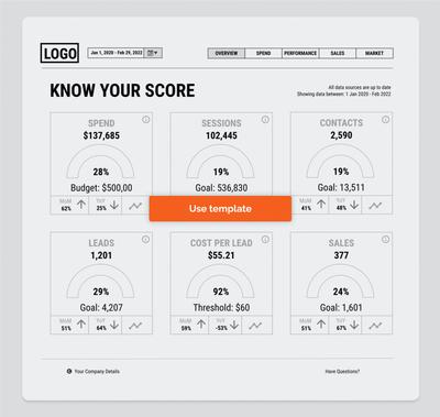
So, our designers have created a series of BI components in Moqups that our analysts can simply drag and drop onto the page. That way, we can say to the analysts, “Look, here are the templates, here’s the workspace… go!”
Kickstarting projects with templates works incredibly well for us. The truth is, starting from one of our industry-specific templates probably captures about 60% of what our clients need. That frees up a ton of time and energy for the remaining 40%, which is building a truly bespoke and nuanced strategy around what they’re trying to achieve.
For us, working with Moqups is a highly iterative process.
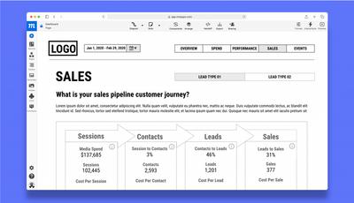
We have a total of five stages in any project. Stage One encompasses onboarding, solutions design, and low-fidelity wireframing. This is a critical first deliverable where we say, “I heard what you said. I’ve wireframed what you said. Have we got this right?”
Normally, we start out with something that is very low fidelity, often from our own baseline templates: top headers, top level widgets, five boxes, and basic navigation. We lay them out functionally as a series of pages within the project.
At this stage, the mockup isn’t done by UI or UX people. That work is completed by rank-and-file analysts who know the data and the constructs.
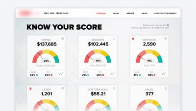
Next, we on-board the actual data. Once we've confirmed that the numbers support the requested widgets, we replace the generic representations in the lo-fi wireframe with client-specific language and visualizations.
As the client gives us feedback, we can iterate within the “soft” Moqups space before going to a “hard” commit. It’s important to incorporate any changes before we start coding because, by that point, it means a change order and that means time and money.
Finally, we polish the interface and turn it into a clickable, mid-fidelity prototype so stakeholders can interact with the interface. This includes clicking to navigate between spaces, switch views, open dropdowns, or hover over icons for tooltips, help, and support.
The purpose of the prototype is to mimic some of the high-level functionality along with the realistic-looking data so the client can say, “Yeah, this is good. This is what I was expecting.”
Why Moqups works for us
Moqups helps keep us focused on the definitive goal: building better data products and experiences for our clients.
Moqups also helps provide accountability for both our clients and us. That level of accountability must be very tight because, when you're talking about data, it can be kind of ambiguous. Moqups helps us take that ambiguity and make it concrete.
Because our clients collaborate on Moqups projects, they can watch them evolve, leave comments, and approve everything from the layout and the experience to the dropdowns and widgets. That means they’ve signed off every step along the way. It’s not that we can’t accommodate requests and changes further down the road, but at least we both have a shared sense of the final product.
For us, “milestone one” is being able to say, “You told me to do the thing. I did that thing. And you signed off on that thing.”
Showing that we’ve listened and understood is important both for the viability of the product and for our relationship with the client. If we get milestone one right, we build a foundation for everything that happens after that.
Moqups is really our North Star. Everybody looks to the Moqups project to verify that we’re all on the same page, and moving in the right direction.
Clients often expect us to have all the answers, but in practice we recommend best practices of all kinds, based on our experience. Nevertheless, we still need lots of client input — we need them to react and respond to our proposals.
Because of the ambiguity and uncertainty in product development, you need to make things clear, clean, and concrete. You need to let the client look, touch, and feel a prototype before development begins.
Moqups lets us create an intermediary where we can talk to the client about those possibilities and be highly creative in our thinking.
We tried alternatives, but...
As you might imagine, we’ve tried Figma. Unfortunately, Figma is geared for people who come from a UI/UX design background. It requires a different skill set and it’s at a different price point. I can’t easily teach my analysts to pick up a system like Figma or Adobe XD. And, candidly, it’s more than we need, especially during the early wireframing and prototyping. For much of this process, what matters is getting the content right, not the pixel-perfect details of design.
I’d say the biggest surprise with Moqups was how quickly clients embrace it. Clients never say, “Oh, this is clunky, this is weird” or “What are you asking me to do?” Moqups is so easy for them that it never slows down our conversations. If anything, it makes clients excited to be hands on and engaged in our product. So, that’s a win for us, in a big way.
The Decision Foundry team has provided this wireframe template so you can experiment with Moqups and build your own BI dashboard. They've chosen 7 of 23 pages from their original project – and included a few clickable hotspots to demonstrate its interactivity.
