At first glance, the term ‘high fidelity wireframe’ might seem like an oxymoron.
After all, when people think of ‘wireframes’, most picture rough drafts of a design, rendered in grayscale, with temporary placeholders standing in for eventual content. And, if they’ve heard the term ‘high-fidelity’, it’s most likely been paired with ‘prototype’ as in “interactive, pixel-perfect high fidelity prototypes.”
So, is a hi-fi wireframe really a contradiction in terms? And what is the difference between a wireframe, a mockup, and a prototype? What’s going on with all this semantic confusion?
Well, keep reading! We wrote this post to clear things up once and for all. We’ll define each of these terms and show why high-fidelity wireframes are such a powerful tool.
We’ve also asked our in-house designer to answer a few frequently-asked questions, and to provide some real-life use cases for high-fidelity wireframes.
- What is fidelity in wireframing?
- What is a high fidelity wireframe?
- When to use high fidelity wireframes and why?
- Advantages and disadvantages of high fidelity wireframes
- Our designer’s answers and advice
- How to build a high fidelity wireframe in Moqups
What is fidelity in wireframing?
Wireframing is a design process during which teams decide on the basic structure, layout and user flow for an app or website. If you’re new to design, and want a full explanation of wireframes, check out What is a wireframe?
‘Fidelity’ refers to the level of detail included in a wireframe as the design evolves from a rough sketch to a polished prototype. Our article Wireframe vs Mockup vs Prototype: What’s the difference? goes into lots of detail about the spectrum of fidelity, but here’s a quick overview.
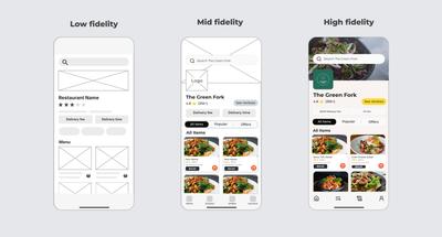
Typically, the wireframing process begins with low fidelity wireframes. Using only simple, greyscale shapes and lorem ipsum text, lo-fi wireframes act as blueprints for the final design. Because they’re cheap and easy to create, design teams use them to sketch out basic layouts, hierarchy, and flow. They are deliberately low in detail because they’re meant to be easily thrown away, or made anew based on feedback. This drafting stage often includes non-designers and stakeholders, since any member of the team can quickly iterate, explore new ideas, or communicate their vision.
As consensus builds and teams settle on a layout, they get more specific about the look and content of the design. Adding draft copy and stock images gives the wireframe a more realistic look. In this way, low-fidelity wireframes evolve into mid-fidelity wireframes or ‘mockups’. Mid-fi can be the most extensive part of the wireframing process because it’s where a lot of decisions are made about specific requirements. Our Complete Guide to Mid-Fidelity Wireframes explores this valuable – and often-overlooked – stage in the process.
The final stage in the wireframing process is high-fidelity wireframes, and that’s the focus of this article.
What is a high fidelity wireframe?
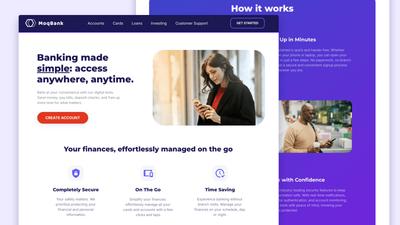
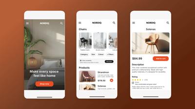
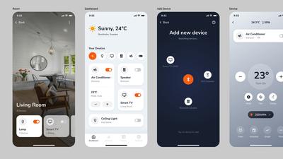
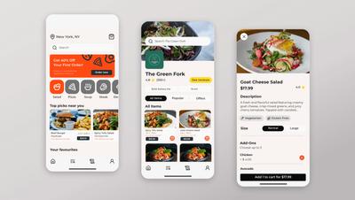
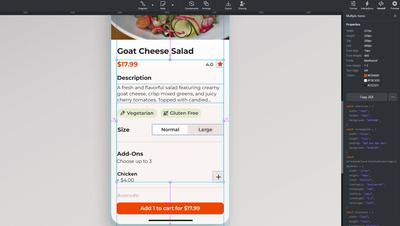
High-fidelity wireframes mimic the look and feel of an app or website before actual development begins. They include the design’s final copy, branding, typography, colors, graphics, and specifications so the dev team knows exactly what to build.
Whereas low and medium fidelity wireframes focus on flow, functionality and user experience, high-fidelity focuses more on design precision and aesthetics: in other words, is the final design beautiful, easy to read, consistent with the brand – and do the most important elements (like CTAs) pop?
A good hi-fi wireframe will be a nearly one-to-one approximation of the final product so that stakeholders can evaluate and sign off on the design before the dev team takes over. It should be almost pixel-perfect so both clients and end users can assess details like text readability, margin sizes and spacing, and the sizes of images and buttons.
For more on the distinction between low and high-fidelity wireframes, check out Low Fidelity vs High Fidelity Wireframes: Which should you use?
Once a full set of interactions are added to a high-fidelity wireframe, it is normally called a hi-fi prototype. It’s commonplace for a few interactions to be added to low or mid-fidelity wireframes during the design process – often to demonstrate a particular effect to the team. But most interactivity is added once the hi-fi work is complete, and the design is ready for demonstration and user testing.
When to use high fidelity wireframes and why?
Most of the time, teams create high-fidelity wireframes at the end of the design process, after the low and mid-fi work has been done. Polishing the design and making it pixel-perfect requires a lot of skilled work, usually by a senior designer. Once that work is complete, it is demoralizing, frustrating, and expensive to make changes. So, normally, you don’t want to go hi-fi until the underlying layout is locked in.
We often use the metaphor of an architectural blueprint to explain the importance and utility of low-fidelity wireframes. That metaphor applies equally well here:
Imagine wanting to relocate windows, change room sizes, or alter the flow of movement through a house once the foundation has been laid, the framing designed, ductwork and plumbing planned, and the builders are ready to start. That’s how it feels for designers to make substantial changes, late in the game.
So, you’ll want to move to high-fidelity once you’re confident that the basic layout – and the hierarchy of information in the UX – won’t change. There are some exceptions to this rule, so we’ll explore them below. But first, here are the most common use cases for hi-fi wireframes.
When building a product from scratch
If you’re designing a brand new product, then there’s no established system to work from. And both the design and development teams may be unfamiliar with the brand’s standards and requirements. In this case, it’s vitally important to minimize unnecessary back-and-forth and to secure final approval before coding begins. The best way to avoid miscommunication is by creating a high-fidelity wireframe that’s clear and precise about the design’s details.
You already have a design system
This is one scenario where you might want to jump straight into hi-fi. A well established design system will define everything from typography and color palettes, to content spacing and interactions. If that’s the situation, it may be faster and more efficient to use the existing high-fidelity UI components, or even build directly on top of screenshots.
Investor and client presentations
If you’re trying to impress clients or inspire potential investors, high-fidelity wireframes are the way to go. Sure, you can use low or mid-fi for ongoing work with stakeholders during the design process. But, when you’re ready for prime time, a pixel-perfect, high fidelity wireframe is more likely to win over clients and boost investor confidence.
Usability and UX testing
Most comprehensive user testing is done towards the end of the process using high-fidelity prototypes with clickable elements and realistic user flows. This allows participants to interact with the design in a way that mimics the actual experience of the final product. This, in turn, improves the precision, accuracy, and relevance of their feedback. Once you have a hi-fi wireframe in place, it’s easy to add the required interactivity.
Marketing and print materials
If you are working on things like newsletters, email promotions, or ad campaigns, you’ll want to complete your design in high-fidelity. This is especially true if your work is going to be included in a printed product like brochures or manuals. In these cases, the hi-fi design is actually the finished product.
Advantages and disadvantages of high fidelity wireframes
Here’s a quick summation of both the pros and cons of high-fidelity wireframes:
Hi-fi Advantages
- Representative of the final product
- Clarifies hand-off to developers
- Impressive for presentations
- Accurate for UX research and testing
Hi-fi Disadvantages
- Resource intensive
- Time consuming
- Difficult to change
- Requires design expertise
Our designer’s answers and advice
Do you ever work in hi-fi without ever making low-or mid-fi?
Yes. Often at the very beginning of the design process, I’ll create a high-fidelity wireframe to get sign off from clients on the overall concept. I may even create a couple of competing design options. I generally just mock up the main screen, but that’s usually enough to get their approval and sell stakeholders on the direction of the design.
Why is there so much confusion around terms like wireframes, mockups and prototypes?
It’s important not to get too hung up on textbook definitions. In the real world, each design team or client may use these terms differently or interchangeably. Just figure out what your stakeholders are comfortable with and go with that, or try and gently re-educate them! The most important thing is clarity, so always include the degree of fidelity in your communication so you know the amount of detail you’re expected to deliver. Be aware that ‘mockup’ is often used as an umbrella term for everything from lo-fi wireframes to hi-fi prototypes.
Do you always need a fully interactive prototype?
No. High-fidelity wireframes with a few hotspots (like clickable buttons or basic navigation) will often suffice for stakeholder reviews, usability testing, and developer handoff. Full interactivity is more important for advanced UX testing where animations and micro-interactions are critical. It’s also great for pitches to potential investors or buyers.
How to build a high fidelity wireframe in Moqups
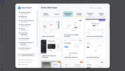
Step 1: Sign up for free
Sign up for free with no credit card required. You can start from a blank page, one of our templates, or import screenshots from an existing UI and build upon those.
Step 2: Build on your low or mid-fi wireframe
Start with an existing wireframe structure rather than beginning from scratch. If you’ve been working on your design in low or medium fidelity, use that as the foundation for your hi-fi work. If not, use one of our pre-made wireframe templates to kick-start your design. Either way, you’ll save time by having the fundamental layout already in place.
Step 3: Add final images and logos
Use our image replace tool to swap out placeholder graphics for final or near-final visual elements. Make sure to use actual product photos, properly sized icons, and realistic hero images. Add high resolution versions of brand elements like logos and wordmarks – and don’t forget to include any important badges or certifications.
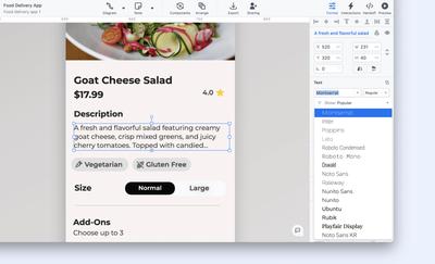
Step 4: Add final copy, text, and data
Replace any lorem ipsum or draft content with finalized and approved headlines, body text, and UI labels. Make sure that your typography – font styles, sizes, and hierarchy – follows the brand’s guidelines. For any dashboards or data-heavy screens, import CSV files to add more realistic datasets. The closer you can mimic real-world functionality, the better your chances of getting meaningful feedback from stakeholders and end-users.
Step 5: Add colors, gradients and effects
Apply your brand’s color palette, systematically, across all your UI elements. Where appropriate, add gradients and effects (like drop shadows, blurs, or transparency) to create a bit of visual depth, and to enhance the design’s overall readability. Subtle, finishing touches like these go a long way towards making a hi-fi design feel more like the final product.
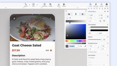
Step 6: Adjust margins, size and spacing
Fine-tune the size, alignment, padding, and spacing of elements with our grid system – and remember to check margin consistency across your entire project. Final, pixel-perfect refinements like these really help polish your composition so the design is ready for review, approval, and handoff.
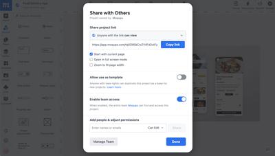
Step 7: Share and gather feedback
Throughout the entire process – from low to high-fidelity – you can collaborate in real time with stakeholders. Edit together, mock up alternatives, and add feedback as both comments and annotations – right on the design. Once you are ready to share your hi-fi wireframe, you can simply create a link to the project, or export as a PDF or PNG.