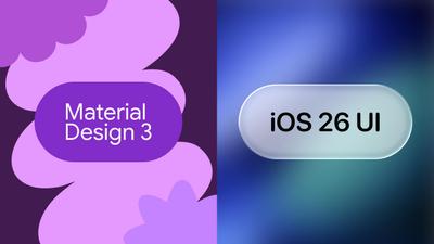
Two of the most widely used design systems are now available as stencil kits in Moqups — and both are ready to use today.
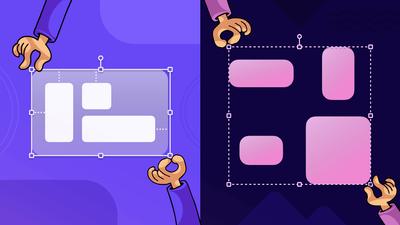
Last month, when we released Resize Constraints, we explained that we developed the feature, in part, because it would “help our own team create better stencils and templates for our users.”
Not only did we want you to have the most recent UI kits at your fingertips, but we wanted them to resize without the layout breaking. Well, promise kept.
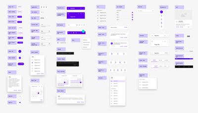
We've added a complete iOS 26 UI kit and a brand-new Material Design 3 kit to the Stencils panel. So, whether you're designing for Apple platforms, Android, or both, you now have the components you need to move quickly from early wireframes to high-fidelity mockups without ever leaving Moqups. We’ve also added an M2 kit for teams working on desktop applications.
iOS 26 UI Kit
Our new iOS 26 kit includes a full set of components – navigation bars, tab bars, buttons, toolbars, alerts, form controls, and more – available in both light and dark mode. Our new resize constraints are built in, so elements hold together properly as you adjust layouts, and adapt easily and cleanly between iPhone and iPhone Plus viewport sizes.
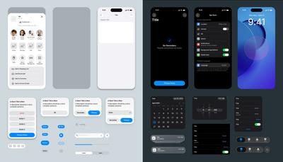
Two quick notes about the iOS kit:
- We chose not to replicate the Liquid Glass effect due to performance considerations and uncertainty around its longevity in future Apple releases. It just felt like the wrong tradeoff.
- Similarly, Apple's San Francisco font isn't available for bundling due to licensing restrictions, so we've substituted a close alternative that keeps the look and feel intact.
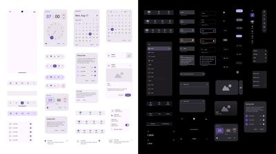
Material Design 3
Our new M3 kit covers the full component set, including the recent M3 Expressive update, which introduced split buttons, button groups, docked toolbars, and expanded FAB menus.
Everything is fully resizable and available in both light and dark themes. We've also added the latest Material Symbols icon set, so you're working with the same icons used across the M3 system.
Material Design 2
Since M3 adoption on the web is still catching up, we've also included an M2 kit that’s focused on web design. If you're building web interfaces, or your projects are still built on M2, this kit provides a solid set of elements to work with. Together, these two Material Design kits should cover most of what you'll need, no matter whether you're working for mobile, web, or both.
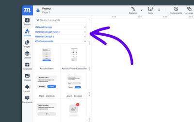
Where to Find Them
All of the above – the iOS 26 kit, Material Design 3, Material Design 2 – are available now in the Stencils panel, under their respective categories. Just search by name to get started.
As always, we'd love to hear what you think, so drop us a line at support@moqups.com.
What's Next
We’re already working on a set of new Misc UI Stencils – things like File pickers, WYSIWYG, Colorpickers, Dialogs, Captchas etc. – that will fit naturally alongside anything you’re building. All these new elements will have constraints applied, so they’ll be easy to adjust and adapt. And that’s not all. We’ve also got new Bootstrap 5 and shadcn/ui UI kits in the pipeline, so stay tuned!