The deepening of blue as you move from dock to sea. The waves of color in autumn hills.
The slow ripening from green to red on a mango’s skin. Subtle gradations of wet sand along a shoreline’s footprint. The sudden blush of a baby’s cheek. And the lustrous waves of orange, pink and blue as the sun finally leaves the sky.
Gradients grab our attention because they depict momentous movements from one state to another. That’s why we take so many pictures of the natural gradients in our world – and in our lives.
And that’s why a gradient was a natural choice for Instagram when they redesigned their logo in 2016. That controversial move began the rediscovery of gradients after the era of flat design. Spotify’s rebranding in 2017 – using gradients and duo-tone color – was a clear signal that gradients have become a significant trend.
The rehabilitation of gradients is not just because they compel and draw our gaze, but because – especially in an era of hi-def screens – they are highly effective at moving a users attention through a design.
Because the human eye invariably lands on the brightest point on the screen, and then follows changing hues and shadows to explore the page, gradients can be used to put the focus on a logo, to highlight content, or to coax the user’s eye below the fold. And by mimicking light sources, and providing shadow effects, they can add texture, depth, dimension, and realism to backgrounds, UI elements, and image overlays.
A great gradient becomes almost a color onto itself – instantly recognizable and at the core of branding.
Gradients have been one of our most requested features, and we are proud announce that to this powerful branding tool is now available for your designs. Gradients easily applied to both Fills and Strokes.
To apply a gradient…
- Click on the Fill or Stroke Color
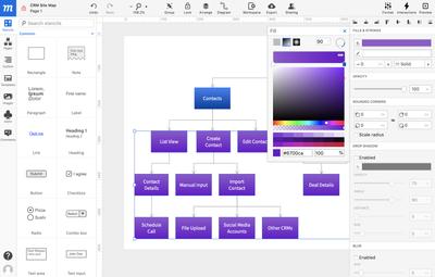
- At the top of the Color Picker Popover, you can choose from three Fill Types: Solid, Linear gradient, and Radial gradient.
- For gradients, select either Linear or Radial gradient.
- The Gradient Slider has two default Stops that can be moved back and forth to adjust the start and end point of the gradient.
- Click on a Stop to apply a color from the Color Field. The Stop will remain blue while active. You can make further color adjustments below by using either the Hue or Opacity sliders, or by selecting from a range of color swatches derived from the currently active color.
- To add more stops, hover over the Gradient Slider until you see the ‘+’ icon; click on the slider to add a new stop.
- To remove a stop, drag it downward until it disappears.
- Use the Flip icon on the right of the Gradient Slider to reverse the order of colors.
The controls in the upper-right corner let you adjust the gradient’s Angle (for Linear) or Center (for Radial). For even more precision, you can set the Linear Angle by degree, or the Radial’s Center by X/Y coordinates in the accompanying input fields.
The Radial gradient also has a Stretch option that expands the Radial gradient to the margins of the object.
As always, we love your feedback! So play, experiment and work with our new Gradient feature, and let us know about your experience, suggestions, or advice. Write us at support@moqups.com, or just leave us a comment below.
