Everything at a glance
- Page zoom
- Editable groups (works with nested groups too)
- Resize multiple objects at the same time
- Rotation (finally!)
- Flip horizontal/vertical
- Rulers & guides
- Hundreds of web fonts
- More typography settings (letter spacing, small caps/all caps, strikethrough)
- Crop your images
- In-place comments
- Reusable stencil templates
- Rich text editing
- Drop shadow
- Border radius
- Pan with the space key
- Thousands of icons from the most popular libraries
- Replace icons by drag & drop (magically inherits the existing style, position and relative size)
- Smart shapes (wedge, arrow, polygon, callout)
- More prototyping actions (Go to URL/Next page/Previous page/Back)
- Redesigned color picker with swatches and color variations
- Consolidated most stencil properties
- Completely rewritten from scratch
- Brand new user interface
We had to look at the app several times to make sure we didn't miss anything. We probably missed something :-)
A new beginning
It's been a long time since the last update, hasn’t it? We’re often asked if we’re still alive or if the project is still maintained. Truth be told, for the past 1.5 years we’ve been hard at work for a brand new release.

Since our first release in 2012, we’ve been constantly amazed by your designs. Not only once we’ve scratched our heads and wondered “How did they do that? Moqups can’t do that yet!”. We’ve seen you improvising, pushing the app to the limits, way beyond the quickly get-that-idea-out-of-your-head concept we started with. We’ve got tremendous feedback and feature requests from our community, continuously validating an emerging pattern: many of our users wanted to go from low-fidelity wireframes to high-fidelity mockups, without having to switch between apps. Can we do something to help?
Now, developing an app like Moqups is far from being an easy task. No matter the programming language or framework you’re using, dealing with so much complexity won’t get your team too far. Doing this in a web browser is even harder. Browser compatibility shenanigans, performance bottlenecks, unpredictable network conditions and whatnot. When we wrote the first version of Moqups, we relied heavily on the tools and libraries created in a time when the web, as an app platform, was still in its infancy. A lot has changed since then and the web we know today is more mature and fully capable of delivering great user-experience and performance. After pondering with many refactoring strategies (and ditching every one of them), we realized that in order to push things forward,we needed a new foundation with an architecture that makes complexity manageable and allows us to move faster. Complete rewrites are against conventional wisdom in the software industry but we've done crazier things before.
Zooming
You can now easily zoom in to fine tune specific details or zoom out to get the bird’s-eye view of your projects. Hold the spacebar to pan the page with your mouse like a pro.
Precision: Rulers and Custom Guides
Take out the guesswork when aligning objects. Precision baby! You can add custom guides in two ways:
- Double click the rulers to quickly add a guide at specific coordinates
- Click and drag from the ruler area to the page to add custom guides
Guides are draggable, so click and drag each of them to readjust their position. To clear a guide, drag it out of the page. If you’re familiar with any popular graphic editor, you’ll feel at home with some keyboard shortcuts (CTRL/CMD+ ; to toggle your custom guides and CTRL/CMD + ALT/OPTION + R to toggle the rulers)
Editable Groups
Resizing multiple objects and groups is now a breeze. Also, you’re no longer forced to unwrap a group to access and modify the contents inside it. Yeah, that annoying task of grouping-ungrouping-grouping objects a gazillion times is no longer necessary. Simply double click a group to access and modify its contents. Click outside to exit the group hierarchy and presto!
Rotate Objects
Drag the circle handle to rotate one or multiple objects. Hold Shift to rotate in 15˚ increments. This was one of the most requested features and probably the hardest to implement.
Web Fonts
Eliminate monotony from your designs with a choice of more than 600 web fonts integrated in the new app. Bonus: More advanced typographic settings like letter spacing, small caps/all-caps and strikethrough.
Border Radius
Customize the radius for individual corners in rectangles. Sharp, round, just a little bit sharp, just a little bit round… you’ll love this one!
Drop Shadow
This is self-explanatory. Make your objects stand out from the crowd with a touch of shadow.
Smart Shapes
Who said you need surgical graphic skills for creating complex shapes? Create arrows, callouts, polygons, stars, wedges in less than a jiffy!
Templates
Reuse your work easily by saving groups of objects as templates. Save frequently used user interface patterns, compose new user interface widgets and so on! We’re eager to hear your say on this one, since we feel it has a lot of potential for improvements
Icon Library
With the current flat design trends, having the right icon for the right action is extremely important. That’s why icons have a special place in the new release. We’ve integrated the most popular design packages and more are on the way. Font Awesome, Material Design, Hawcons or Entypo. Drop us a note if you’d like to see your favorite package integrated in Moqups and we’ll take a look!
Hat tip: Replace icons by simply dragging and dropping on top of another icon.
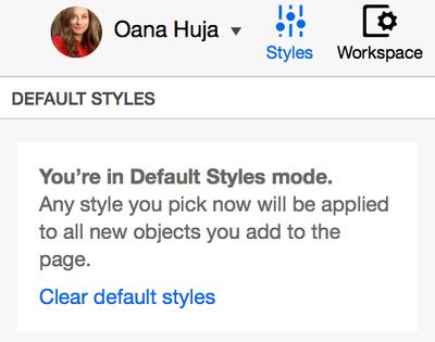
Project Defaults
Customize the default theme of your project. Select your favorite colors, fonts and other style settings for keeping a consistent look & feel across your project pages.
Color Schemes
The new app has support for multiple color schemes and we’ve integrated a few common ones like iOS and Material design. Soon you’ll be able to import others, as well as defining your own
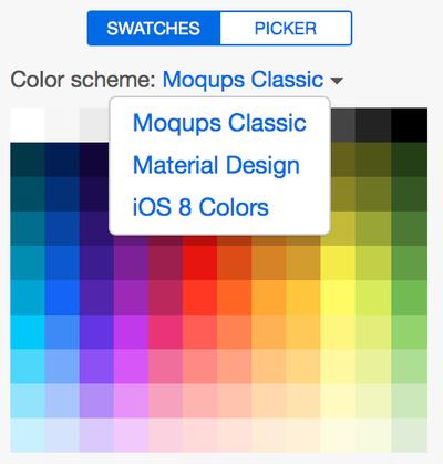
Image Cropping
Remember when you had to use another app to crop your images, wasting minutes between time consuming uploads? Those days are gone! Now you can easily crop any image by simply double clicking it and adjusting the black resize handles (Pro tip: Hitting Enter works too). Crops don’t affect the original image, so you can always change your mind in case you need further adjustments or crop the same image multiple times
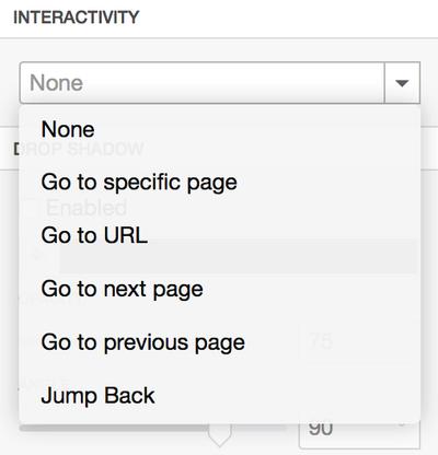
Better at Prototyping
articular page as the click target. As your projects grew in size and pages shuffled around, it was hard to update each hotspot on every project update. Now you can simply use the Go to next page and Go to previous page settings to automate the navigation between pages. Jump back is the more powerful version of Go to previous page as it gets you back to the page which originated the click. By popular demand, you can now also specify custom URLs as click targets (Go to URL)
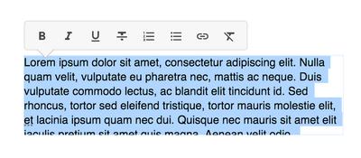
Rich text editing
Most stencils having text now support rich text editing. The only exceptions are the ones that require a special syntax for their structure
A brand new design
As we added more functionality, the old user interface started to show its limits – aaand it also felt a bit dated. Back from the drawing board, we’ve tried to make various functionalities a bit more visible and easy to discover, as well as leave room for future improvements. Here’s a summary of changes:
- Resize the left sidebar by dragging from the right edge
- Toggle active panel’s visibility by clicking its icon
- The “Styles” panel on the right sidebar is the place where you can configure the properties for the current selection
- The “Workspace” panel is where you Configure most app and project setting like page size, project title, rulers, guides and snapping
Transitioning to Moqups 2
We’ve received a lot of feedback on this topic during the beta period. Some users are in the middle of huge projects and some just want to take their time to do the switch. We do realize that adjusting to something so different takes time and most of all, we want to avoid disrupting your work in any possible way.
So here’s our plan:
- The old app is now Moqups Classic. You can still find it under the old address for now (https://moqups.com ) . We’ll be supporting it for as long as it is used by a significant number of users.
- You can find Moqups 2 at https://app.moqups.com
- You can use both apps in parallel on the same account and subscription.
- You can easily migrate the projects created in Moqups Classic to the new version. Open the projects dialog ([M]oqups menu → Open Projects)
- Click the Edit on the desired project
- The Migration assistant will guide you through the migration process
Please keep in mind that there are some important differences between the two versions. We suggest playing with the new version on a blank project before migrating your older project so you can get used to how things work
- Icons are now standalone objects as opposed to being part of the stencil. This allows you to have full control over the icon placement as opposed to being constrained by a few specialized settings. So, if ,for example, you want to add an icon to a button, you can simply drop an icon on top of the button and then group the two so they stick together when moving them around
- We're exploring a new approach to working with complex stencils. If you navigate to the "iOS Components" category in the Stencils sidebar, you'll notice a whole new set of stencils that mimic the real user interface from iOS devices. The major difference from the common stencils (great for quick wireframing) is that these are in fact compound objects created from simple shape stencils (we call them primitives) and text, which are then grouped together. The biggest advantage with this approach is that you have free-form control on how things look and feel (great for high fidelity mockups). This is in contrast with the rigid approach of the basic stencils where the customization is limited for the sake of convenience and speed editing. Depending on your feedback, we'll fine tune the approach and also integrate more UI kits using this approach (BTW - Material Design is on the way)
As always, your amazing suggestions are helping us make Moqups a great product. This is only the beginning. We can't wait to show you what's in store for 2016 and beyond!
