
Our team did a hands-on test of top Figma alternatives. Here are our recommendations, and an honest report of what they found.
If you’re reading this post, it’s likely because you’re seeking an alternative to Figma. Maybe you’re a Figma user who’s looking to switch. Or, maybe you’re considering subscribing to their app, but want to explore all options first – so you can choose what’s best for your team.
- Why look beyond Figma?
- Comparison table
- How we compare wireframing apps
- Moqups
- Balsamiq
- Miro
- Uizard
- Justinmind
- Lucidchart
Why look beyond Figma?
The truth is, despite Figma’s dominance in design, it isn’t the right tool for everybody. We hear this all the time from our own customers. Often, they tried Figma first – before jumping to Moqups (we even built a Figma-to-Moqups plugin to help folks bring their Figma designs into Moqups.)
And, generally, the reasons they abandon Figma fall into three categories:
-
Learning curve: Many teams find Figma too complex and hard to learn. They want to get down to work without a long and difficult onboarding process. And, they want every member of the team to contribute, not just trained designers. They are looking for tools like Figma, but one that’s simpler and much more user-friendly.
-
Workflow: A lot of teams prefer wireframing tools without the complexity of a full design suite. Figma may be overkill for these use cases, especially if they want a fast, lightweight UI for real-time collaboration. They may also need additional or specialized functionality like diagramming, whiteboarding, or specific UI kits.
-
Price: Figma becomes pricey as teams scale. That can push it out of reach for agencies and startups that need multiple seats on tight budgets. And, for large teams where many people need edit access (i.e. product managers, content writers, marketing), Figma can get very expensive, very fast.
So, if you’re looking for apps like Figma that might better suit your team, read on!
Comparison Table: Top Figma Competitors
| Tool | Primary Strenght | Best For | Fidelity | Learning Curve | Starting Price * |
|---|---|---|---|---|---|
| Figma | Advanced Design Tool | Design systems and pixel-perfect layouts | High | Hard | $21/seat |
| Moqups | All-in-one Wireframe, Prototype, Diagram | Big projects with wireframes, diagrams, and prototypes | Low, Mid, High | Easy | $4/seat |
| Balsamiq | Speed & Simplicity | First drafts and low fidelity layouts | Low | Easy | $12 per 2 projects |
| Miro | Collaboration & Whiteboarding | Whiteboarding that includes wireframes | Low to Mid | Easy | $8/seat |
| Uizard | AI-Powered design & Prototyping | Reapid AI-driven concept generation | Mid-High | Easy | $12/seat |
| Justinmind | Advanced Prototyping & Simulation | Advanced prototyping for UX research and testing | High | Hard | $19/seat |
| Lucidchart | Diagramming & Process Mapping | Diagramming that includes simple wireframes | Low | Easy | $9/seat |
How we compare wireframing apps
In this article, we compare six wireframing and prototyping tools, explore the pros and cons of each, and make recommendations based on different use cases.
Obviously we’re biased. We think Moqups is the best wireframing tool out there – and the best deal in the wireframing/diagramming/whiteboarding space. But, we understand that every team has their own preferred workflow and particular focus. So, we’re also determined to be objective, fair, and honest in our assessments.
There are a ton of comparison articles out there, but a lot of them are AI slop filled with generalities and misinformation. We wanted something more accurate, specific and practical – so we asked our own team to take the following apps for a test drive, and then tell us what they found. But, before we look at Figma alternatives, let's take a look at Figma itself. It’s important to understand why it became so popular, and why it might not be right for every team.
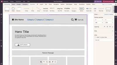
Figma
Figma has been around for a decade now, and has usurped Adobe XD by combining functionality from Photoshop and Illustrator. As the dominant app in UI/UX design, Figma shines for pixel-perfect, high fidelity design and prototyping. It offers powerful vector editing tools, an extensive plug-in ecosystem, live collaboration features, and developer hand-off. So, if your team is building a design system, then Figma is the logical choice.
However, as we hinted at earlier, Figma isn't perfect for every scenario or workflow. Figma is a highly capable and complex design tool – but its difficulty, depth and cost may be unnecessary for teams that focus more on ideation, user‑flow mapping, and low or mid-fidelity wireframing. More importantly, its complexity may act as a barrier for team members who are non-designers – and who contribute to early-stage concepts.
Our Take
Here’s what we found most noteworthy during our hands-on testing with Figma.
Elements and Components
Figma’s strengths are in both its system of components and its constraints feature. Components can be nested, have multiple variants, sync across complex projects, and there’s a handy component list in the sidebar. For teams that are building scalable design systems, this is terrific.
But its out-of-the box elements can also be hard to access, or insufficient, for quick mockups, brainstorming or annotation. Figma’s own “Simple Design System” – and its default UI kits – seem too detailed, or tied to specific functions, for wireframing. They’re fine for precise editing in hi-fidelity, but can feel more restrictive than helpful when working in lo-fi.
Templates
As for templates, Figma relies mostly on their Community. That’s a bit of a double edged sword, depending on your perspective and requirements. There are a lot of pre-made resources there, but they tend to be very use-case specific, and finding and importing them is unnecessarily cumbersome. Well-defined templates can definitely make work faster, especially if you're familiar with Figma. But overly defined examples – with variables, style guides, auto-layouts – can be slow and hard to edit, even for experienced Figma users. For example, simply moving a button can require dismantling complex instance relationships – and this requires advanced Figma knowledge.
Working with community templates and UI kits can also feel like using someone else’s computer because each has its own learning curve, and requires a significant adjustment period.
Beyond Wireframing
If your team does a lot of brainstorming, annotation, and diagramming, Figma has separate tools for that (like FigJam), but switching back and forth can add friction and be frustrating.
Best Use Cases vs. Limitations
Where Figma excels:
- High-fidelity design and prototyping
- Complex design systems management
- Team collaboration on detailed interface work
- Developer handoff and implementation
- Projects requiring sophisticated interactive prototypes
Where alternatives might serve better:
- Rapid concept wireframing and ideation
- Early-stage validation where simplicity outweighs sophistication
- Simple stakeholder communication and feedback gathering
- Projects involving non-designers in the wireframing process
- Teams needing quick iteration without component system overhead
Is this tool right for you?
Figma is a sophisticated tool for trained designers. If your end-goal is super-high fidelity and production-ready design then Figma is a good choice. However, the very features that make Figma excellent for final UI design can work against it in low and mid-fi wireframing. There's a lack of versatile, general-purpose elements that let you start from scratch or mock up quick concepts. To work effectively in Figma, it’s almost as though you have to build your own design system before starting.
If you don’t have a team of designers, then Figma may not be your best choice for wireframing. It’s intimidating, hard to start from scratch, and it may exclude non-designers, domain specialists, and other stakeholders who need to contribute to projects.
Figma price: There's a limited free plan, and paid full seats run from $21- $120 per month depending on the plan.
Now, let’s take a look at six Figma alternatives for wireframing, starting with Moqups.
Moqups: The Top Alternative to Figma for Wireframing
Launched in 2012 as an online wireframing app, Moqups has evolved into a versatile tool for both product and project management. It’s one of the few apps in the wireframing space that’s equally adept at diagramming and whiteboarding.
With Moqups, your team can develop concepts all the way from ideation to prototyping, and move seamlessly through low, mid and high-fidelity. The app has extensive, out-of-the-box libraries of wireframing stencils, diagram blocks and icon sets, as well as robust commenting, annotation and live editing tools. That makes Moqups perfect for cross-functional and remote teams looking for an all-in-one visual collaboration tool.
Moqups also has well-developed charts, graphs, and tables that are great for dashboards and data visualization. This makes it a good choice for teams working on complex, logistical projects where data representation is more important than aesthetics (i.e. health, energy, shipping, fintech, etc.) – especially if users want their mockups to live in the same space as their user flows, network and UML diagrams.
However, if you’re a designer creating fully functional, pixel-perfect prototypes, there are probably better tools. Sure, you can build a high-fidelity design system in Moqups, but that isn’t its real strength.
Our Take
Ease Of Use
Moqups is very fast, lightweight and easy-to-learn. The app’s strength is that all its assets come pre-loaded and ready to go, including wireframing shapes, UI elements, icons kits, and diagram blocks. You can sign up and get right to work, with little to no learning curve.
Templates
If you don’t want to start from scratch, Moqups also has an extensive in-app library of templates. These cover wireframing (in both low and high fidelity), as well as all kinds of diagrams, charts and graphs, and project management frameworks. The templates are professionally designed and well-thought out, but Moqups doesn’t have a community library with as many niche use-cases as some competitors.
Advanced Capabilities
Moqups is not a complicated design app with the functionality of Figma, Sketch or Photoshop. Nevertheless, it’s easy to create a quick layout in lo-fi, and add detail until you have a polished, hi-fi prototype of your mobile app or website. You can make designs interactive by applying hotspots, page, or object interactions, but Moqups lacks the pre-built animations of dedicated prototyping apps.
Constraints and Components
Moqups has both auto and manual constraints, something that most Figma alternatives lack. Constraints anchor elements to the areas of a design to make adjusting and resizing layouts quick and easy. And, like Figma, Moqups has a system of components that sync across all instances within a project. That means you can make changes to a 'parent' element, and have those changes propagate to all copies made from that original. This makes late-stage changes and maintenance much easier. However, unlike Figma, Moqups doesn't have a dedicated component library.
Page Structure
One of the features that distinguishes Moqups from other wireframing apps is its page structure. You can create an almost infinite canvas if you want to, but Moqups is set up for folks who want to create a separate page for each screen or modal. Pages can be pinned, nested, hidden, and color-coded for status and project management. This is a key advantage if you’re working on complex apps with hundreds or thousands of screens. At that scale, an infinite canvas can get very cluttered and hard to navigate.
Commenting
Moqups’ commenting tool is another great feature for big projects. Comments are sticky, expandable, and have a shape and color system for assignment and tracking. The ability to add comments right on the design, combined with a wide range of notes and annotations, makes it easy to communicate requirements, and document business rules.
Best Use Cases vs. Limitations
Where Moqups excels:
- Rapid wireframing and early-stage ideation
- All-in-one workflows (wireframing + diagramming)
- Cross-functional team collaboration with non-designers
- Information architecture and user flow planning
- Strategy-to-execution transitions in one platform
Where alternatives might serve better:
- Complex design system management
- Pixel-perfect high-fidelity design work
- Advanced animation and micro-interaction prototyping
- Specialized single-purpose tool ecosystems
- Reliance on AI to build designs
Is our free Figma alternative right for you?
In terms of best use cases, Moqup is a bit of a paradox: It is an easy app for inexperienced users new to wireframing and design. But it’s also a powerful workhorse for teams building complicated projects in technical and industrial domains. And for cross functional teams who want wireframe, whiteboard, diagram and prototyping without changing apps or creative context, it’s the best choice out there.
Moqups price: There's a limited free plan, and paid seats run from $4 - $8 per month depending on the plan.
Balsamiq
Balsamiq is a no-frills wireframing tool that’s the digital equivalent of a pen and paper sketch. It’s one of the oldest names in the wireframing space, and its hand-drawn style serves to keep the spotlight on structure and function, rather than design aesthetics.
This app’s design philosophy offers minimal styling options, rough-sketch visuals, and a feature set that stops short of high-fidelity. The intent is to help stakeholders concentrate on layout, flow, and structure – without getting distracted by fonts, gradients, or colors. Balsamiq’s narrow focus makes it good for quick, low-fidelity drafts where clarity matters more than polish.
The trade-off is that Balsamiq is not well suited for mid or high-fidelity work and it lacks the diagramming, whiteboarding, and prototyping capabilities of modern competitors.
Our Take
Ease of Use
Balsamiq is very approachable for beginners. Its simple drag-and-drop interface, keyboard shortcuts, and limited formatting options make it hard to over-complicate a design. This simplified-on-purpose approach can be very helpful for users new to design.
Still, the experience isn't friction-free. Since objects are listed alphabetically, users will often have to rely on search to find what they need. And, while adding and rearranging elements is easy, both selecting and resizing small objects can be awkward. Additionally, editing text in Balsamiq is still syntax-based, so you can’t just type and see a live preview; the text-editing interface also occupies a huge part of the screen, so working with small objects or complex data tables can be frustrating. The result is a tool that’s simple on paper, but not always smooth in practice.
Templates
Balsamiq has a solid, well categorized library of templates. In general, their website templates are better designed than their mobile app ones and, unlike some of their competitors, Balsamiq only has single-page templates; there are no template bundles, which can be limiting if you’re trying to build out a multi-screen design.
Their templates mostly mimic popular, real-world apps and websites. These can be helpful for inspiration, though they sometimes feel too tied to existing brands to serve as true starting points. That said, the UI bits within these templates can be very useful (e.g. the Stripe payment form).
Advanced Capabilities
Balsamiq deliberately avoids advanced capabilities. For instance, the app doesn’t offer auto-layout or constraints. The app’s focus is clearly on basic editing, and that includes a transform tool that lets users turn one kind of UI element into another with a single click.
The app includes basic interactions that link elements to other pages using hotspots. However, managing more than a few clickable areas can be a chore. And Balsamiq doesn’t have the kind of animations found in dedicated prototyping tools.
Balsamiq does have a syncable component system, but editing these also requires switching contexts entirely. This constant toggling between component mode and group mode can slow down workflow, especially compared to tools like Moqups or Figma.
Page Structure
Balsamiq uses a multi-page project structure, which is excellent for organizing individual screens of an app or website. However, it does not offer nested pages, or the advanced project management features like color-coding or pinning that are useful for large, complex projects.
Comments and Annotations
Commenting is not Balsamiq's native strength. While you can add text notes as objects, it lacks the sticky, assignable, and trackable commenting systems built for team collaboration. For detailed feedback, teams might need to rely on a separate platform.
Best Use Cases vs. Limitations
Where Balsamiq excels:
- Replaces pencil and paper sketches
- Rapid lo-fi wireframing
- Initial drafts and concept exploration
- Stakeholder presentations where you need to prevent aesthetic fixation
- Non-designers who need an approachable entry point
Where alternatives serve better:
- Mid to high-fidelity design
- Team-based collaboration and annotation
- Complex projects with data-driven layouts
- Prototypes and interactive demos
- All-in-one workflows with diagramming and whiteboarding
Is this tool right for you?
Balsamiq occupies a specific niche: it's the best tool for keeping wireframes deliberately rough. If you need to work with screenshots, create quick demos of existing designs, or progress beyond the initial concept phase without switching tools, you'll likely find Balsamiq's constraints more limiting than liberating. But for teams who value the enforced discipline of lo-fi work, Balsamiq remains the perfect choice.
Balsamiq price: Their unusual pricing structure is based on numbers of projects, not on numbers of seats. Plans start between $12 and $18 per month for 2 projects.
Miro
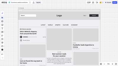
Launched as a digital whiteboard in 2011, Miro has a full complement of terrific real-time, visual collaboration features like sticky notes, voting, timers, and a native video chat. It also has integrated AI tools, a wide range of templates, and its own community. Miro’s clear focus is to help teams with their real-time brainstorming and strategy sessions, but it has begun to expand into the wireframing space as well.
Miro categorizes wireframing under the label ‘Prototyping’, suggesting that its toolset is geared more toward user testing and stakeholder presentation. But this is a bit of a misnomer. Sure, you can make designs interactive in Miro, but it’s a paid functionality, and the app generally lacks the feature-set to take your ‘prototype’ much beyond rough drafts. They also have a paid AI prototyping feature, but it still relies on their limited library of elements.
If your only use case is low-fidelity and collaborative sketching, then Miro’s wireframing capabilities may be sufficient. But if you design in mid or hi-fi – or build complex, data-heavy apps – then a wireframing-first solution might work better.
Our Take
Ease of Use
Miro is intuitive for diagramming and whiteboarding, but wireframing with the app is less fluid. Its wireframing UI kits are tucked away in the menu, feeling more like an afterthought or plugin than a core function. Basic shapes are presented in a diagramming context, and the tool lacks fundamental design aids like rulers, guides with measurements, or resize constraints.
On the plus side, click-through prototyping is fast and easy. Each object or group has a built-in option for linking to other frames, and drag-and-drop connections are intuitive. Interactions are right next to selected objects or groups, allowing for simple drag-and-drop to target frames. Fullscreen previews are available for each screen, and they effectively emulate a device look, but the device frames themselves don't feel as polished as Figma’s equivalents.
Templates
In Miro, getting started with wireframe templates requires much more effort than it should. Wireframe templates aren’t highlighted in the main dashboard, and you have to dig into “Explore more templates” to find them. And once you open a template, all objects are auto-selected by default — an odd quirk that adds friction right away. The app does offer a respectable library of templates, but they often feel like afterthoughts compared to its main whiteboarding and brainstorming sets.
Advanced Capabilities
Miro’s wireframing tools are focused on lo-fi work. There are no shadows, gradients, rounded corners, or detailed styling options – nor is there an image-function to swap placeholders for actual images. That makes it hard to transition from low to high-fidelity as projects evolve. For any kind of detailed work, the contextual toolbar feels both inadequate and frustrating. And the lack of proper measurement tools makes it difficult to maintain consistency across screens.
The resize tool ‘scales’ elements – rather than resizing them precisely – and that can cause misalignment and mismatched font sizes. Customization is also restricted, as there’s only one icon set and about twenty fonts available, while brand-colors and custom fonts require a premium plan. For quick sketches and workshops, these limits aren’t dealbreakers, but they do make it hard to advance beyond early-stage wireframes.
Elements and Components
Miro does not have a true component system like Figma or Moqups. You can create and reuse your own elements, but they do not sync as instances. Changes to a parent component are not propagated, making late-stage edits on a large project both a manual and a time-consuming process.
Canvas & Frame Structure
Miro’s infinite canvas can be both a strength and a drawback for wireframing. It's perfect for free-form brainstorming and connecting ideas across a vast space, but can quickly become cluttered when organizing multi-screen apps. The lack of a structured page system – with nesting and status tracking – makes it hard to manage complex projects with hundreds of screens.
Commenting & Collaboration
This is where Miro really shines. Since it’s fundamentally a big whiteboard, multiple team members can work together in real time, adding sticky notes, diagrams, and wireframes in the same space. Comments are sticky, assignable, and threaded. This ability to have dozens of stakeholders view and comment makes Miro perfect for gathering feedback and running collaborative workshops.
Best Use Cases vs. Limitations
Where Miro excels:
- Early-stage brainstorming and strategy sessions
- Workshops where wireframing is one activity among many
- Gathering feedback from cross-functional stakeholders
- Clickable lo-fi prototypes for quick demos
- Fast AI diagram building and sticky-note ideation
Where alternatives serve better:
- Workflows where wireframing is the primary activity
- Mid to high-fidelity interface design
- Pixel-perfect prototyping
- Complex and multi-page projects
- Design system development and management
Is this tool right for you?
Miro’s wireframing tools are best seen as an extension of its whiteboarding platform, not a replacement for dedicated design software. For quick sketches, interactive click-through demos, and collaborative workshops, it fits the bill. So, if your team already lives in Miro, the wireframing features may be good enough. But if you need a true design tool – something for scalable wireframes, polished prototypes, or handoff-ready systems – Miro is unlikely to meet your needs.
Miro’s price: There's a limited free plan, and paid seats run from $8 - $16 per month depending on the plan.
Uizard
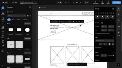
Uizard is an AI-powered design tool that can generate wireframes, mockups, and prototypes from prompts, screenshots, or hand-drawn sketches. Next to Adobe, it was one of the first design tools to incorporate LLMs, and those in-house AI features remain its main differentiator. The app’s core promise is speed: describe an app, and have an editable mockup in minutes.
The tool’s AI features – branded as ‘Magic’ are clearly targeted at non-designers who need to quickly produce professionally-looking mockups. This can be really useful for users who are new to wireframing and have never designed before. But the app’s focus on AI comes at the expense of the precision, control, and craft that more experienced users may expect. Uizard feels more like a design generator than a genuine design tool – great for visualizing a concept, but frustrating for detailed or intentional work.
Our Take
Ease of Use
Uizard promotes its AI-assisted workflow above all other approaches. The app’s onboarding suggests starting from an AI prompt or scanned sketch, instead of building manually. The app includes AI buttons in nearly every toolbar and menu. This makes it easy for beginners to get rolling, but it can also feel more intrusive rather than intelligent once the novelty wears off.
For basic wireframing, Uizard offers lots of blocks and pre-built UI elements, but building from scratch can be challenging. Their UI library, in the left sidebar, is chaotic and hard to navigate; categories are poorly organized, and search queries often show irrelevant results.
The app also restricts users to three preset screen sizes (Mobile, Tablet, and Desktop) and you can only adjust height – not width. This focused approach works for standard responsive designs, but it's limiting when working on custom or proprietary interfaces. It’s also a barrier for teams who want to build diagrams or whiteboards alongside their wireframes.
AI Features
With the app’s ‘Magic’, you can use a text prompt to create screens, fix a design, or propose alternatives. It can also transform screenshots into editable layouts and provide AI-generated feedback on your work.
How much you like Uizard’s AI features will probably depend on your own workflow and design capabilities. The AI functionality is impressive on the surface, and may meet the needs of non-professionals wanting a quick mockup or prototype. So, if you’re new to the game, you’ll likely love the speed and ease with which you can create.
But experienced designers will notice its drawbacks right away. For one thing, the AI output tends to be generic, repetitive, and image-heavy. And in our own testing, we found editing with the AI both slow and disruptive. Even small adjustments – like asking it to “update colors” or “improve layout” – can take several minutes to process, so you end up staring at the screen instead of moving on to other work. And, regardless of your prompt, the AI often insists on creating five or six screens. For all these reasons, we found that using the AI for edits was more cumbersome than simply adjusting the designs manually.
One important caveat here is that most of the ‘Magic’ main outputs are hidden behind upgrade prompts, so the best-looking results often sit behind a paywall.
Advanced Capabilities
There's no true component system comparable to Figma or Moqups; you can reuse elements, but there's no syncing, no instances, and no systematic approach to maintaining consistency across large projects. And the mode switcher between wireframe and mockup fidelity is conceptually interesting but doesn't quite compensate for the lack of precision tools.
On the plus side, creating click-through prototypes is quick and straightforward. Linking screens together into flows is really easy. Uizard’s integrations with Unsplash and Giphy are also handy for populating quick mockups, and you can import designs from Figma, Sketch, and Adobe XD.
Uizard supports real-time collaboration, which is good for quick workshops, but it lacks the kind of structured commenting, assignment, and tracking features that are needed for serious design reviews. Teams working on a larger scale may also miss having structured page hierarchies, batch operations, or advanced status labeling for managing hundreds of screens.
Best Use Cases vs. Limitations
Where Uizard excels:
- Rapid, AI-driven concept generation
- Transform screenshots or photos into editable designs
- Fast, professional-looking mockups for non-designers
- Quick clickable prototypes for early-stage validation
- Import from XD /Sketch /Figma for AI iteration
Where alternatives serve better:
- Large, complex projects requiring handcrafted design
- Design systems and component management
- Teams needing precise layout control and constraints
- Workflows that include diagramming, whiteboarding, and annotation
- Project management with page structure and labeling
Is this tool right for you?
Uizard’s AI-driven workflows tend to skip over both the wireframing and handcrafted design process. In that sense, the app feels more like a production engine than a design tool. You don’t really design in Uizard, you produce outputs. For teams that just need something clickable, visual, and shareable – especially for pitches or early validation – it may be a great solution. But for teams working on complex projects where domain-specific design, structure, and precision are important, the app’s AI-generated designs may seem too generic and restrictive.
Uizard’s price: There's a limited free plan, and paid seats run from $12 - $39 per month depending on the plan.
Justinmind
Justinmind is a desktop-based prototyping tool that specializes in interactive, high-fidelity simulations for mobile and web apps. Its main strength is its extensive prototyping features – something missing from simpler wireframing tools.
The app offers an impressive range of interactions, animations, and conditional logic that lets you create fully functional prototypes. You can set hover states, transitions, form validations, and even embed actual HTML or websites within projects. This endgame makes it an obvious choice for UX researchers that want to do user testing on realistic prototypes.
However, these capabilities also come with significant complexity. Justinmind has a steep learning curve, with complicated elements, context-switching workflows, and an interface that prioritizes prototyping features over basic wireframing. For teams that just need to sketch concepts or create straightforward mockups, Justinmind may feel like overkill.
Our Take
Ease of Use
Justinmind’s extensive prototyping capabilities come with a complicated setup. The UI dedicates a large portion of its space to interaction panels, state management, and conditional logic, all of which can be overwhelming for newcomers. Still, once you know your way around, the ability to work offline and fine-tune every property provides lots of control for advanced users wanting to simulate real app logic.
Nevertheless, the experience is complicated by an inconsistent editing experience. The app mixes clickability with editing in a way that often feels confusing, and many of its basic stencils are surprisingly complex. Additionally, basic UI kits are not enabled by default, hard to find, and require manual setup before you can begin.
Unlike Figma and Moqups, Justinmind lacks constraints which help layouts stay consistent and predictable when elements or frames are resized.
Elements and Formatting
Justinmind comes with a full library of elements, but many are pre-loaded with intricate, nested interactions that can feel excessive for basic wireframing. For instance, a dropdown menu element comes with 10 submenus, icons, and pre-built interactions. Justinmind also includes vector editing capabilities; every element is a vector that you can subtract, extend, and perform other vector operations upon. You can manually edit default styles for basic elements in a separate modal, control individual borders, and even apply margins around elements, a feature that’s relatively unique among design tools.
Components and Libraries
Justinmind’s syncable components are called Masters, and the panel displays them as a list. This makes it very easy to locate and reuse them across projects. On the other hand, unlike other tools like Figma or Moqups, editing them requires switching to a separate screen; this tends to break your workflow context and makes it less convenient for quick iterations.
Justinmind's UI libraries are almost entirely community-made, and elements often have pre-set interactions (hover states, cursor changes), which can be helpful – but can also mean more to learn, and potentially undo.
Overall, Justinmind has an impressive object library, but most elements break when you try to resize them, and this is a real limitation for quick wireframing.
Advanced Features and Prototyping
This is Justinmind’s true standout capability. The app dedicates a lot of UI space to interactions, offering every type of behavior you can imagine: transitions, animations, conditional logic, and more. You can create fully functioning demos by adding interactive text inputs, allowing testers to type directly into fields. For teams doing heavy interactive UX testing, these features are a real selling point.
Of course, the trade-off here is complexity. Setting up these interactions requires both time and expertise. For teams just wanting simple, clickable wireframes, it's more than they’d need – and the learning curve can be prohibitive.
Commenting & Collaboration
Justinmind’s feedback system is different from most Figma alternatives. Users can add detailed comments and requirements, but not directly on the design. Instead, comments live in a dedicated screen that can be sorted by author or date, more like a research repository than a quick collaboration tool. It’s obviously tailored for formal UX research, not casual team conversations. It works well for usability studies, but less so for the quick back and forth of live collaboration and internal design reviews.
Best Use Cases vs. Limitations
Where Justinmind excels:
- High-fidelity, interactive prototyping and simulation
- Making static wireframes and mockups interactive
- UX research, usability testing, and behavioral validation
- Offline work without internet dependency
- Teams that prioritize interaction realism over quick iteration
Where alternatives serve better:
- Fast, low-fidelity wireframing and early-stage ideation
- Cross-functional collaboration with non-designers
- All-in-one workflows that include diagramming and whiteboarding
- Users seeking minimal learning curves
- Browser-based tools without installation requirements
Is this tool right for you?
Justinmind is a serious prototyping tool that includes wireframing capabilities, rather than a wireframing tool with prototyping features. The app is powerful for testing and demonstrating user flows but heavy for visualizing concepts or quick iteration. So, if your workflow depends on prototyping real behavior with user input and conditional logic, then Justinmind is a great option.
However, its steep learning curve and desktop approach make it less suitable for teams that prioritize speed, simplicity, and seamless collaboration with stakeholders. If your goal is fast wireframing, documentation, or diagramming, then other tools, like Moqups, are a better choice.
Justinmind’s price: There's a limited free plan, and paid seats run from $19 - $59 per month depending on the plan.
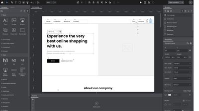
Lucidchart
Lucid was launched in 2010, primarily as a diagramming app, but they now offer two products under one umbrella: Lucidchart for diagramming and Lucidspark for brainstorming. This addition brings them close to Miro as an online collaboration platform; but, whereas Miro’s roots are in whiteboarding, Lucid’s are in diagramming.
Recently, Lucidchart has also expanded into wireframing with its "UI mockup" shapes, putting them in competition with an all-in-one tool like Moqups that also offers wireframing, diagramming and whiteboarding. That’s why we tested it – to see how it stacks up against the other wireframing apps.
The quick answer is that Lucidchart is a great tool for creating flowcharts, network diagrams, org charts, and a variety of technical and business documentation. However, its wireframing capabilities feel too much like an extension of its diagramming engine, rather than a dedicated feature set.
Our Take
Ease of Use
Lucidchart is easy to use and well organized, but everything seems oriented toward diagram creation. All shapes behave like diagram nodes: they snap to grids, automatically suggest connectors, and move in ways that make sense for flowcharts but feel clunky and unintuitive for UI design.
The app also lacks fundamental design tools like layout constraints, rulers, and precise measurement guides. Formatting options are very limited, with no color palettes, few font choices, and minimal styling controls. These exclusions make it difficult to create anything beyond a basic low-fidelity boxes-and-lines sketch. For diagrams, this simplicity works, but for wireframing, it can feel restrictive.
Templates and UI Elements
Lucid's template library is comprehensive for diagramming and process mapping, but very limited for wireframing. The selection of mobile and web examples is underwhelming, and even the most basic ones require a premium subscription. It’s unclear why these simple templates are paywalled, but it creates a poor user experience from the start. The platform does support custom data sources so, in theory, you can populate dashboard templates with CSV data, but the process is neither easy nor automatic.
The UI mockup shapes – Lucid's wireframing toolkit – are also premium-only. We tested them and found them outdated, frustrating to edit in lo-fi, and insufficient for mid-fi design work – especially the iOS and Android UI kits. They're roughly comparable to legacy stencil sets that other tools offer for free.
Advanced Features and Prototyping
Because Lucid lacks a true component system, you can't create syncing instances where changes to a parent element propagate across all copies. If you’re working on projects with repeated UI elements, this means tedious manual updates. And, although Lucid does have ‘assisted layout’ containers that helps preserve the basic layout within groups, it lacks a full constraints feature like Figma or Moqups.
The concept of "Frames" in Lucid acts primarily as a container, not as a functional artboard or screen-frame found in dedicated design tools. This, combined with the infinite canvas, can lead to disorganization on multi-screen projects. And there is no structured page system with either folders or nesting, so it can be difficult to manage complex apps at scale.
As far as interactions and prototyping go, the app offers simple linking to pages or urls like Balsamiq, or to other projects within Lucid. But it doesn’t support object interactions or animations.
Commenting & Collaboration
On the collaboration side, Lucidchart works well. You can share, live-edit, embed, and export. Lucid’s commenting system supports replies, linking, resolving, mentions, and task assignments. There’s a dedicated comments panel for managing feedback, but comments aren't sticky on the canvas and there's no search functionality. For quick team collaboration, it gets the job done, but it lacks the sophistication of tools built for design review workflows.
Best Use Cases vs. Limitations
Where Lucid excels:
- Diagramming and process mapping with light UI sketches
- Teams already using Lucid for architecture or flow diagrams
- Integrations across enterprise platforms
- Auto-converting existing infrastructure setups into diagrams
- Data-linked diagrams for dashboards and reporting
Where alternatives serve better:
- Detailed wireframing or UI design work
- Complex multi-screen projects
- Projects requiring mid to high-fidelity mockups
- Teams needing robust formatting and design controls
- Workflows combining wireframing, prototyping, and diagramming
Is this tool right for you?
Lucidchart is a diagramming tool that happens to include wireframing shapes. So, if your team spends most of its time mapping processes, documenting systems, or creating flowcharts, and only needs occasional rough UI sketches, Lucid might be sufficient. But if wireframing is a core activity – or if you need to move beyond basic lo-fi mockups – you'll quickly hit Lucid's design and prototyping limitations. In a way, Lucid feels like a more technical, corporate version of Miro.
The premium paywall for basic wireframing features is particularly frustrating. Shapes and templates that should be standard are locked behind subscriptions, and when you do pay for access, the quality doesn't really match the price. For teams serious about wireframing, tools like Moqups offer far more capability at a better value – and without forcing diagram-centric workflows onto interface design work.
Lucid's price: There's a limited free plan, and paid seats run from $9 - $10 per month depending on the plan, but bundled together, Lucidchart and Lucidspark run from $13.50 - $15 per seat.
Final Thoughts
If you're looking for Figma alternatives, the wireframing space isn't short of options. The goal of this guide is to help you narrow the field and make a decision that suits your workflow. A solo founder pitching an idea has different needs than a cross-functional product team documenting complex flows, or a UX researcher building testable prototypes.
Every app we tested excels in different areas – from low-fidelity ideation to polished prototypes, from simple sketches to complex systems. The right choice depends on who's doing the work, what stage you're at, and how your team collaborates. So, we hope this hands-on comparison helps you find the best match for your own team.